Designed by: PepsiCo Design & Innovation
Country: United States

Silver Hills Bakery

silver1

Designed by Karacters Design Group | Country: Canada

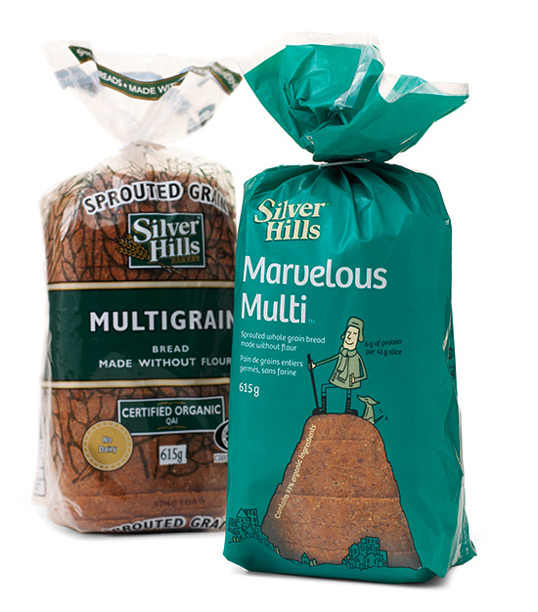
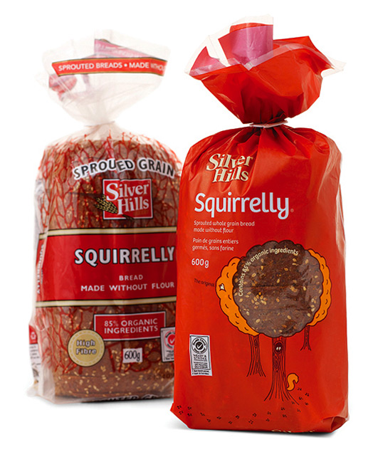
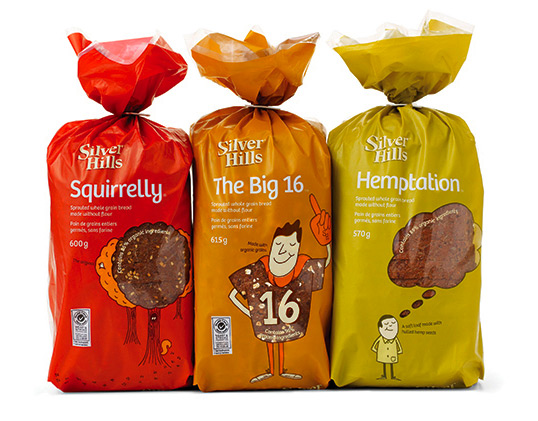
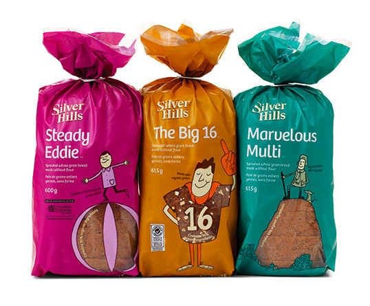
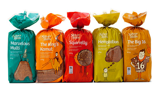
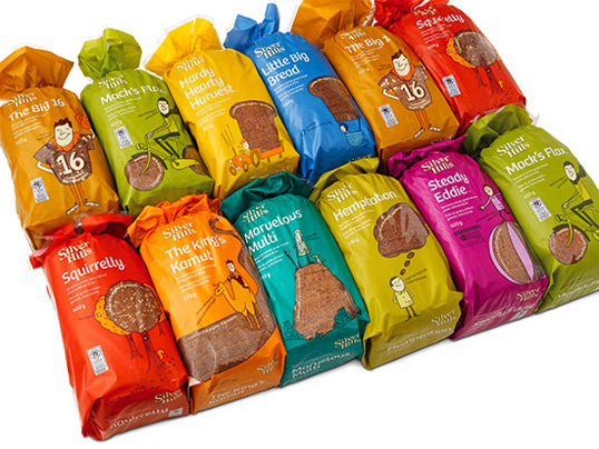
“The new creative concept was prompted by an insight discovered during brand strategy development that the bakery’s “Squirrelly” bread had higher brand recognition and recall than the Silver Hills’ parent brand.  Karacters Design Group’s brand identity experts used this insight as an interesting naming strategy for the other breads and counseled Silver Hills to rename them with the following unusual, unique names:  Squirrelly, The Kings Kamut, Hemptation, The Big 16, Little Big Bread, Hardy Hearty Harvest, Mack’s Flax, Marvelous Multi, Radiant Raisin and Steady Eddie.

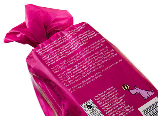
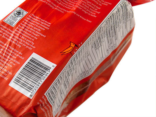
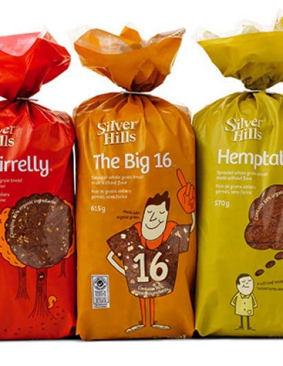
The re-branded packaging has a distinct shelf presence that beckons to be picked up and examined. Using solid, matte colours, which are unusual for the category, the colourful, biodegradable bags include witty illustrations by Robert Hanson.  The lighthearted illustrations evoke the new names visually and cleverly incorporate captivating bread windows to display the product.

“The sliced bread category is very dull and one dimensional with most brands sharing the same visual wheat sheaf-cues, functional descriptors and clichéd good-for-you health claims.  Our goal was to develop new packaging that would break through the homogeneity and connect with consumers in a humanistic way,” says James Bateman, creative director, Karacters Design Group. “The witty illustrations and unique names engage customers on an emotional level that makes you want to smile, while the short stories reveal the authenticity and integrity behind each carefully crafted loaf.”
silver2

silver3

silver4

silver5

silver6

silver7

silver8

Get the latest packaging design inspiration in your inbox:

Popular designs

Designed by: PepsiCo Design & Innovation
Country: United States

Silver Hills Bakery

silver1

silver1

Designed by Karacters Design Group | Country: Canada

“The new creative concept was prompted by an insight discovered during brand strategy development that the bakery’s “Squirrelly” bread had higher brand recognition and recall than the Silver Hills’ parent brand.  Karacters Design Group’s brand identity experts used this insight as an interesting naming strategy for the other breads and counseled Silver Hills to rename them with the following unusual, unique names:  Squirrelly, The Kings Kamut, Hemptation, The Big 16, Little Big Bread, Hardy Hearty Harvest, Mack’s Flax, Marvelous Multi, Radiant Raisin and Steady Eddie.

The re-branded packaging has a distinct shelf presence that beckons to be picked up and examined. Using solid, matte colours, which are unusual for the category, the colourful, biodegradable bags include witty illustrations by Robert Hanson.  The lighthearted illustrations evoke the new names visually and cleverly incorporate captivating bread windows to display the product.

“The sliced bread category is very dull and one dimensional with most brands sharing the same visual wheat sheaf-cues, functional descriptors and clichéd good-for-you health claims.  Our goal was to develop new packaging that would break through the homogeneity and connect with consumers in a humanistic way,” says James Bateman, creative director, Karacters Design Group. “The witty illustrations and unique names engage customers on an emotional level that makes you want to smile, while the short stories reveal the authenticity and integrity behind each carefully crafted loaf.”
silver2

silver3

silver4

silver5

silver6

silver7

silver8

Explore more great package design

Get the latest on packaging design in your inbox: