Designed by: PepsiCo Design & Innovation
Country: United States

Skinns

Skinns

Designed by The Creative Method | Country: Australia

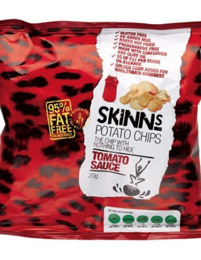
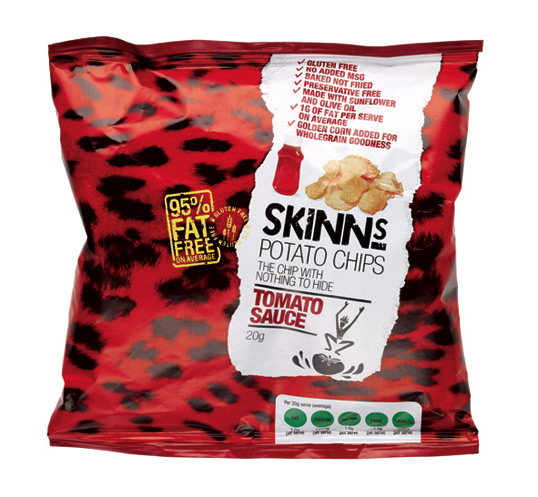
Brief: Potato Magics created a new generation of chip that is lighter, less fattening and ultimately healthier than the competition. Off the back of this they were able to get chips into the primary schools as part of a healthy choice range. They needed to appeal to the 5-12 year old bracket, they also needed to be bright and bold and inform children, teachers and parents about their benefits.

Solution: As part of the process is to process and cook the chips with their skins on this was settled on as the final name. From here the design solution was simple, create a range of packages that looked to re-enforce the name skins whilst also bringing a new dimension. The range consists of a number of different animal skins that have been re-coloured to reflect the different flavours. A rip in the packaging is used to communicate the benefits while while stamps are also used to pull out other useful nutritional information.”

Skinns

Get the latest packaging design inspiration in your inbox:

Popular designs

Burma Love Rebrand

Love at First BiteAs an extension of the Burma Superstar restaurant in San Francisco, Burma Love Foods gives diners an opportunity to

Pure Persian Honey

When we look closely at honey packaging, they are almost all in the usual format, and the ultimate in creativity is that

Over the wave

This Kombucha originates in Lombok, Indonesia, where its paradise beaches attract hundreds of surfers eager to ride the waves. When you surf,

Designed by: PepsiCo Design & Innovation
Country: United States

Skinns

skinns1

Skinns

Designed by The Creative Method | Country: Australia

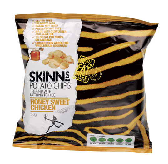
Brief: Potato Magics created a new generation of chip that is lighter, less fattening and ultimately healthier than the competition. Off the back of this they were able to get chips into the primary schools as part of a healthy choice range. They needed to appeal to the 5-12 year old bracket, they also needed to be bright and bold and inform children, teachers and parents about their benefits.

Solution: As part of the process is to process and cook the chips with their skins on this was settled on as the final name. From here the design solution was simple, create a range of packages that looked to re-enforce the name skins whilst also bringing a new dimension. The range consists of a number of different animal skins that have been re-coloured to reflect the different flavours. A rip in the packaging is used to communicate the benefits while while stamps are also used to pull out other useful nutritional information.”
Skinns

Previous slide
Next slide

Explore more great package design

Get the latest on packaging design in your inbox: