Designed by: PepsiCo Design & Innovation
Country: United States

Smirnoff Year of the Tiger

Smirnoff Year of the Tiger

Designed by The Creative Method | Country: Australia

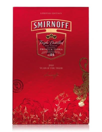
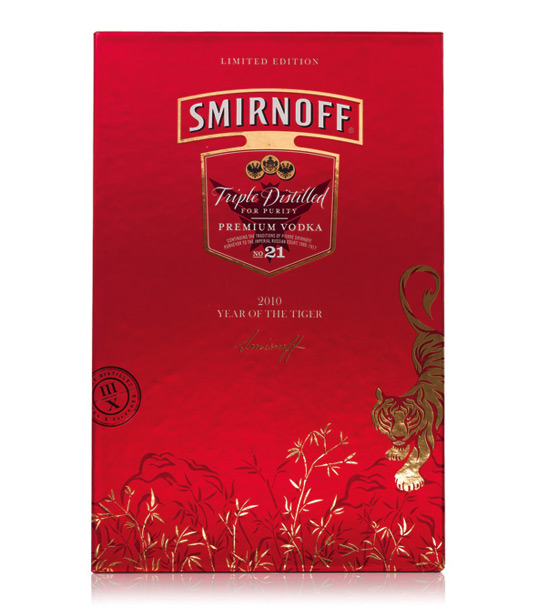
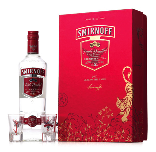
Brief: The brief was to create a limited edition secondary pack to celebrate the Chinese New Year in 2010, The Year of the Tiger. The pack needed to reflect Asian premium cues and a ‘special occasion’ feel whilst supporting the Smirnoff core brand essence of originality, boldness and possibilities. It also needed to stand out on shelf and promote the gifting occasion.

Solution: Red and gold are perceived as premium colours in Asian culture and are also considered the colours of luck. The red background was the starting point to promote the brand, communicate the Chinese New Year and create stand out on shelf. The use of gold stylized graphics illustrate ‘The Year of the Tiger’ in a premium and sophisticated way whilst retaining the Asian look and feel required.

Smirnoff Year of the Tiger

Get the latest packaging design inspiration in your inbox:

Popular designs

The Port Vodka Lemon Water

Overview: In response to my client’s vision for a Cape Cod themed beverage brand, I embarked on the journey to create The Port

Burma Love Rebrand

Love at First BiteAs an extension of the Burma Superstar restaurant in San Francisco, Burma Love Foods gives diners an opportunity to

Pure Persian Honey

When we look closely at honey packaging, they are almost all in the usual format, and the ultimate in creativity is that

Over the wave

This Kombucha originates in Lombok, Indonesia, where its paradise beaches attract hundreds of surfers eager to ride the waves. When you surf,

Designed by: PepsiCo Design & Innovation
Country: United States

Smirnoff Year of the Tiger

smirnoff1

Smirnoff Year of the Tiger

Designed by The Creative Method | Country: Australia

Brief: The brief was to create a limited edition secondary pack to celebrate the Chinese New Year in 2010, The Year of the Tiger. The pack needed to reflect Asian premium cues and a ‘special occasion’ feel whilst supporting the Smirnoff core brand essence of originality, boldness and possibilities. It also needed to stand out on shelf and promote the gifting occasion.

Solution: Red and gold are perceived as premium colours in Asian culture and are also considered the colours of luck. The red background was the starting point to promote the brand, communicate the Chinese New Year and create stand out on shelf. The use of gold stylized graphics illustrate ‘The Year of the Tiger’ in a premium and sophisticated way whilst retaining the Asian look and feel required.
Smirnoff Year of the Tiger

Previous slide
Next slide

Explore more great package design

Get the latest on packaging design in your inbox: