Designed by: PepsiCo Design & Innovation
Country: United States

Packaging Design: Sodiko’s Retro Cocktails

Designed by: 43’oz Design Studio | Country Moldova

Experimentation is the key word when it comes to defining the dynamic world of alcoholic cocktails. If it were not for experimentation, mankind would never have encountered the fascinating world of cocktails. While there are several new solutions that come up to the surface every year, consumers always find their way back to the classics time and time again. “It is these cocktails that formed the basis of the new Sodiko product line – Retro Cocktails.”

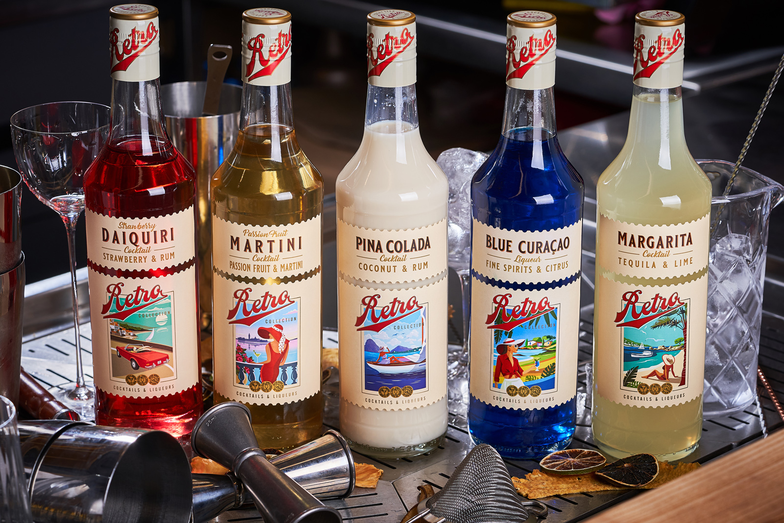
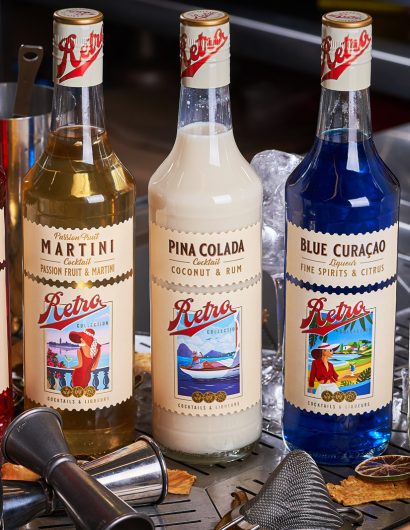
“Continuing the trend of producing ready-to-drink cocktails from quality ingredients, the company’s new line consists of five positions, each of which is imbued with a long and interesting history. Accordingly, the packaging design for such drinks had to reflect the general spirit of retro cocktails, and emphasize the simplicity of their consumption. This is how the label design for the Retro Cocktails series from Sodiko was developed.

Packaging Design: Sodiko’s Retro Cocktails

The packaging

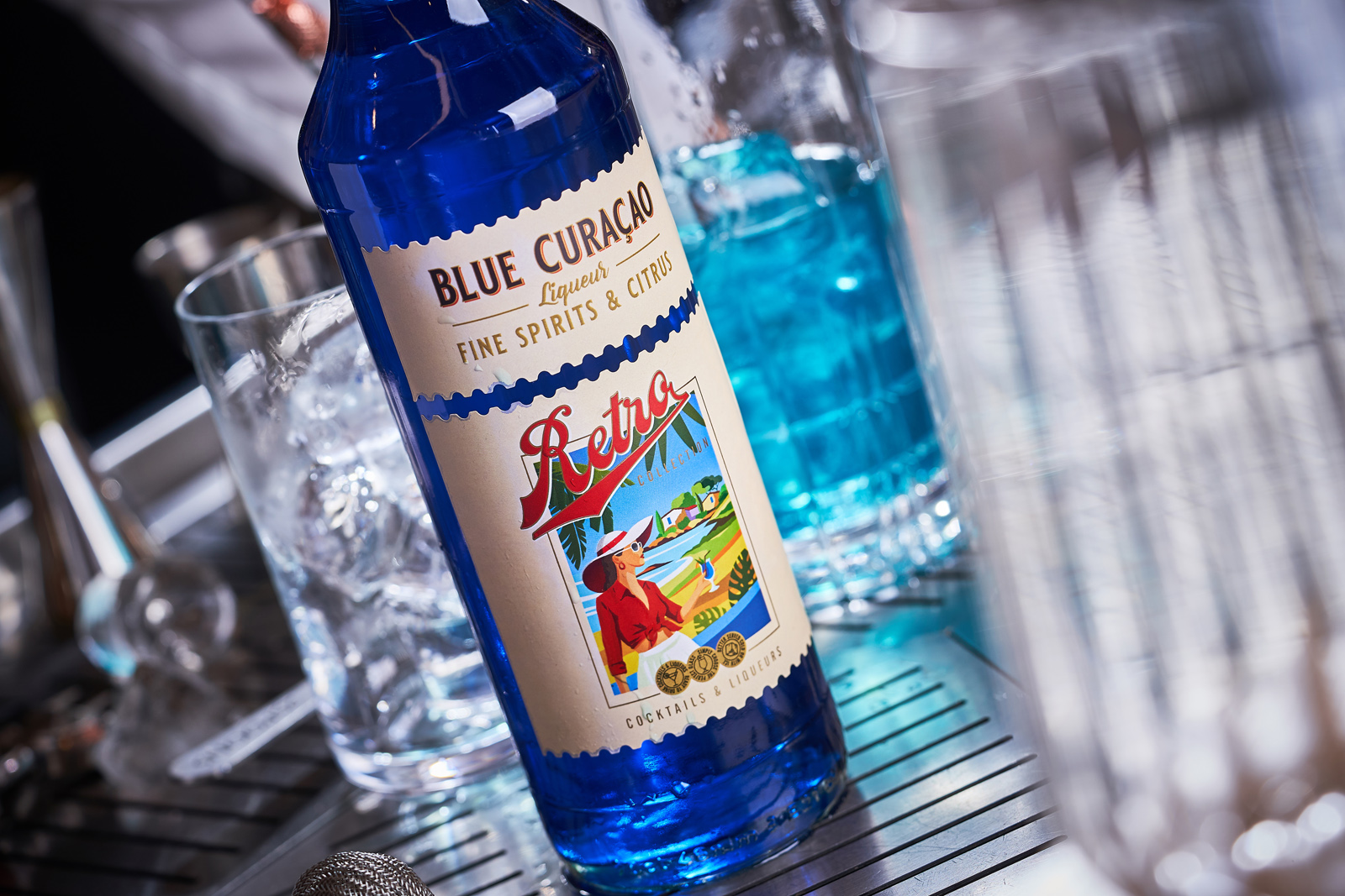
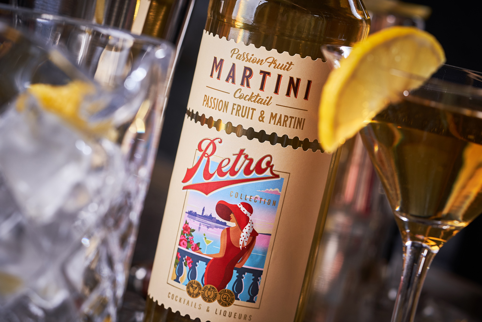
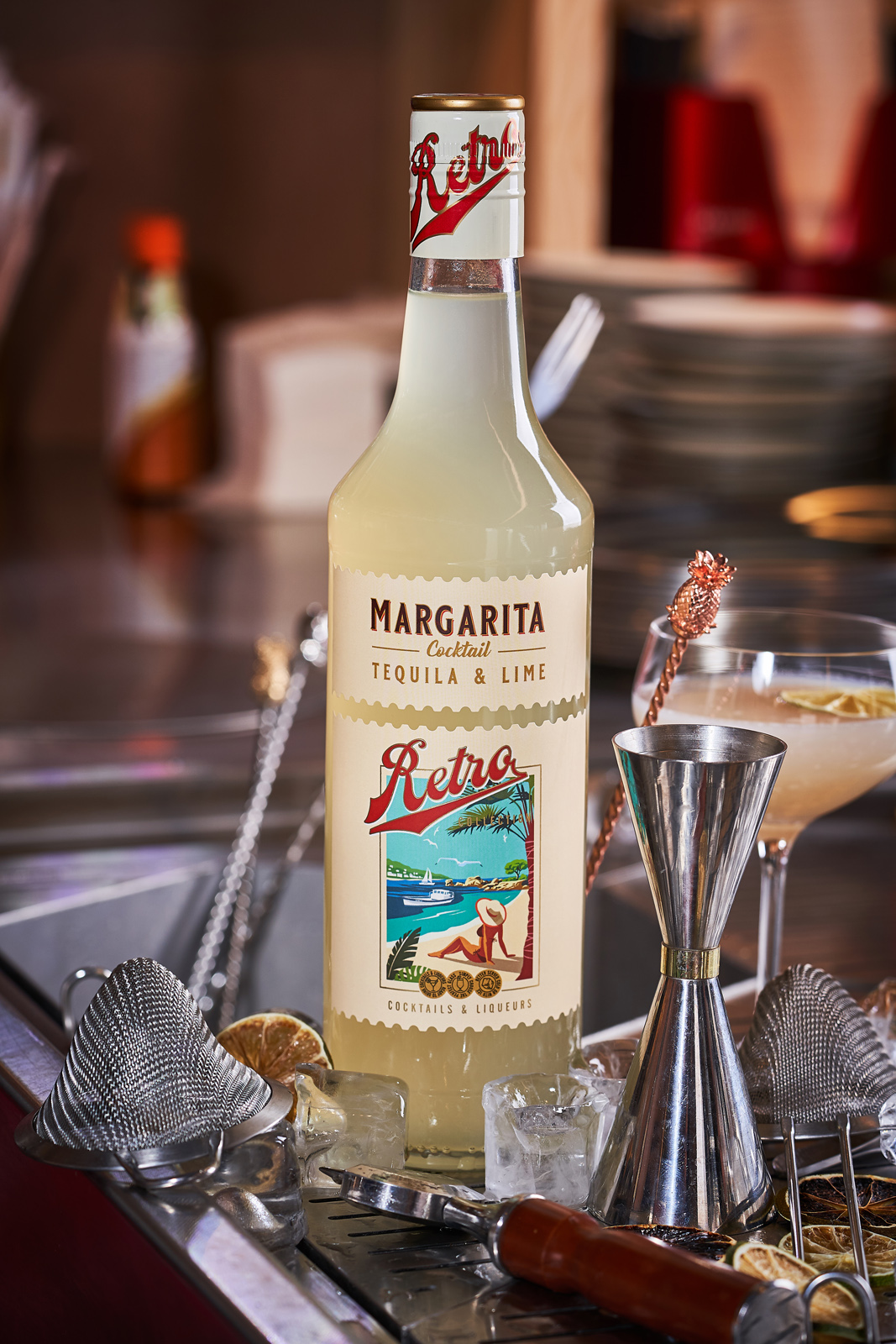
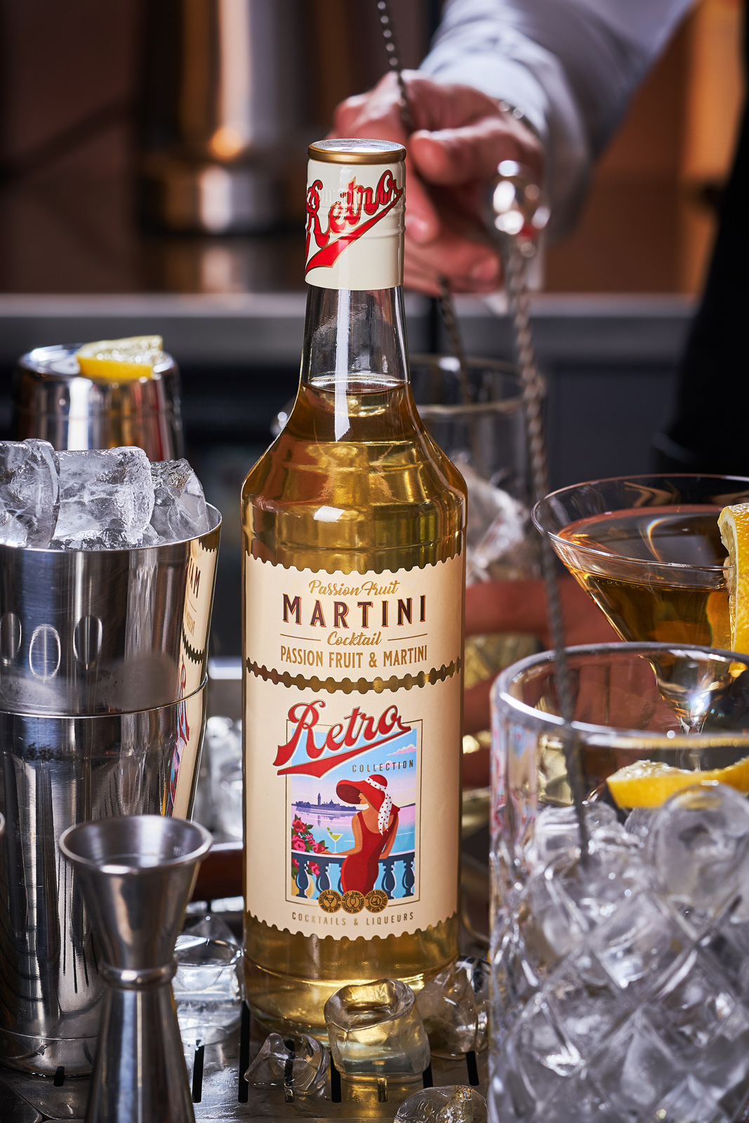
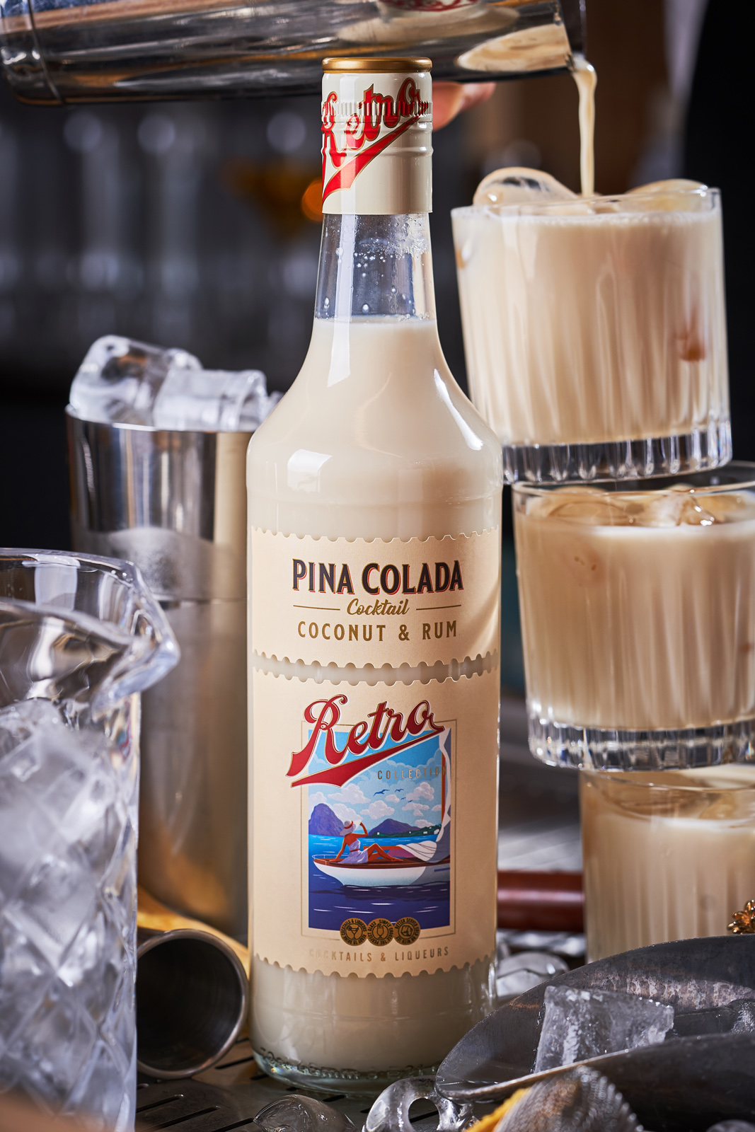
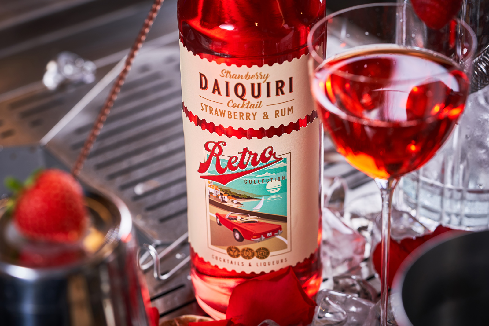
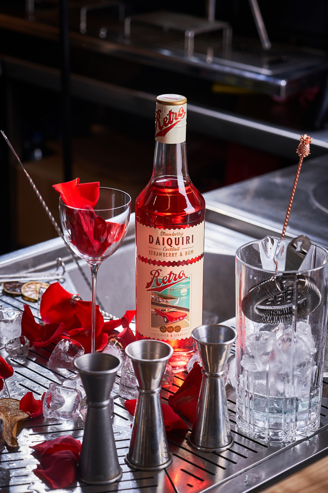
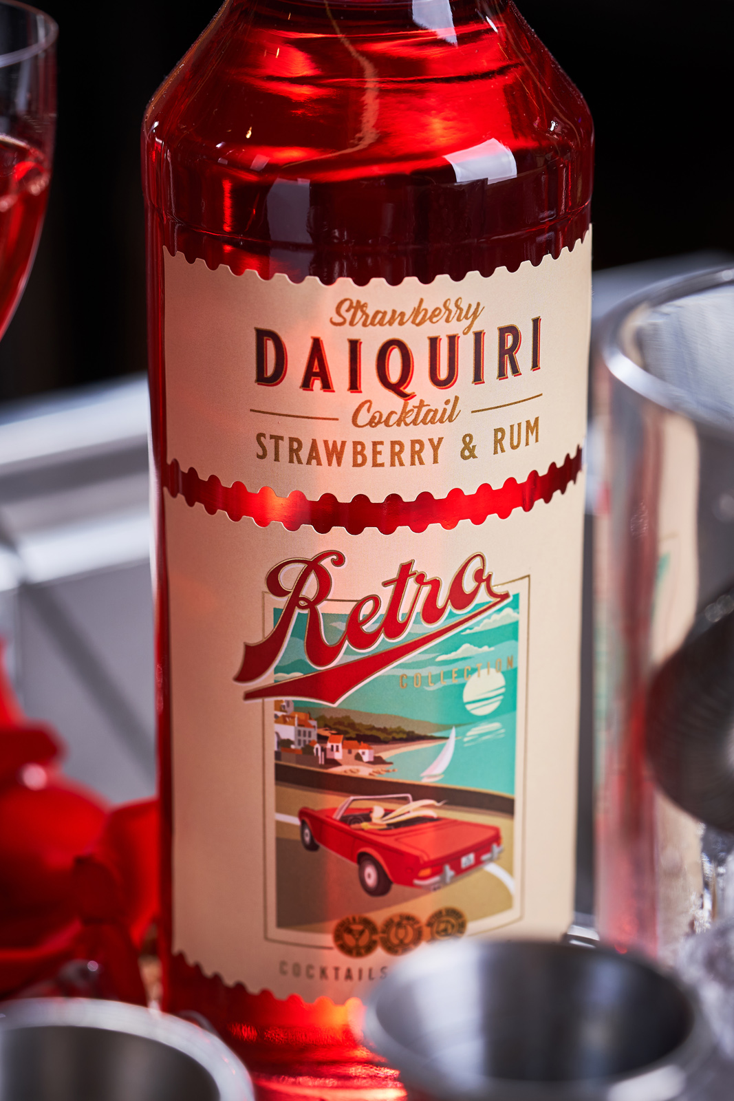
Inspired by the 1960s and 70s retro posters, 43’oz Design Studio created these amazing-looking packaging designs for Sodiko’s new Cocktail range. These were the decades when most of the classic cocktails we know today came into existence.

The centerpiece of each label is a stylized illustration that depicts an idyllic picture of the consumption of the corresponding cocktail, made in the spirit of movie posters and books of the time. The typography of the cocktail name at the top of the label emphasizes the visual style of the era. And the die-cut shape of the two-piece label repeating the shape of a postage stamp enhances the overall vintage image of the package. As a result, the product looks bright, stylish, and effectively communicates the character of the drink inside the bottle to the potential consumer.

Get the latest packaging design inspiration in your inbox:

Popular designs

Designed by: PepsiCo Design & Innovation
Country: United States

Packaging Design: Sodiko’s Retro Cocktails

019

Designed by: 43’oz Design Studio | Country Moldova

Experimentation is the key word when it comes to defining the dynamic world of alcoholic cocktails. If it were not for experimentation, mankind would never have encountered the fascinating world of cocktails. While there are several new solutions that come up to the surface every year, consumers always find their way back to the classics time and time again. “It is these cocktails that formed the basis of the new Sodiko product line – Retro Cocktails.”

“Continuing the trend of producing ready-to-drink cocktails from quality ingredients, the company’s new line consists of five positions, each of which is imbued with a long and interesting history. Accordingly, the packaging design for such drinks had to reflect the general spirit of retro cocktails, and emphasize the simplicity of their consumption. This is how the label design for the Retro Cocktails series from Sodiko was developed.

Packaging Design: Sodiko’s Retro Cocktails

The packaging

Inspired by the 1960s and 70s retro posters, 43’oz Design Studio created these amazing-looking packaging designs for Sodiko’s new Cocktail range. These were the decades when most of the classic cocktails we know today came into existence.

The centerpiece of each label is a stylized illustration that depicts an idyllic picture of the consumption of the corresponding cocktail, made in the spirit of movie posters and books of the time. The typography of the cocktail name at the top of the label emphasizes the visual style of the era. And the die-cut shape of the two-piece label repeating the shape of a postage stamp enhances the overall vintage image of the package. As a result, the product looks bright, stylish, and effectively communicates the character of the drink inside the bottle to the potential consumer.

Previous slide
Next slide
Get the latest on packaging design in your inbox: