Designed by: PepsiCo Design & Innovation
Country: United States

Spotless Food Spa Branding And Packaging Design

Designed by: Craft Mark Studio | Country: Lithuania

Food Spa offers its customers products with excellent nutritional value and a “pleasurable consumption experience.” The company’s Spotless brand is a class of specially-designed food that has natural health-enhancing qualities. The branding and packaging reveal “the premium nature of these products,” which allows them to stand out from competitors.

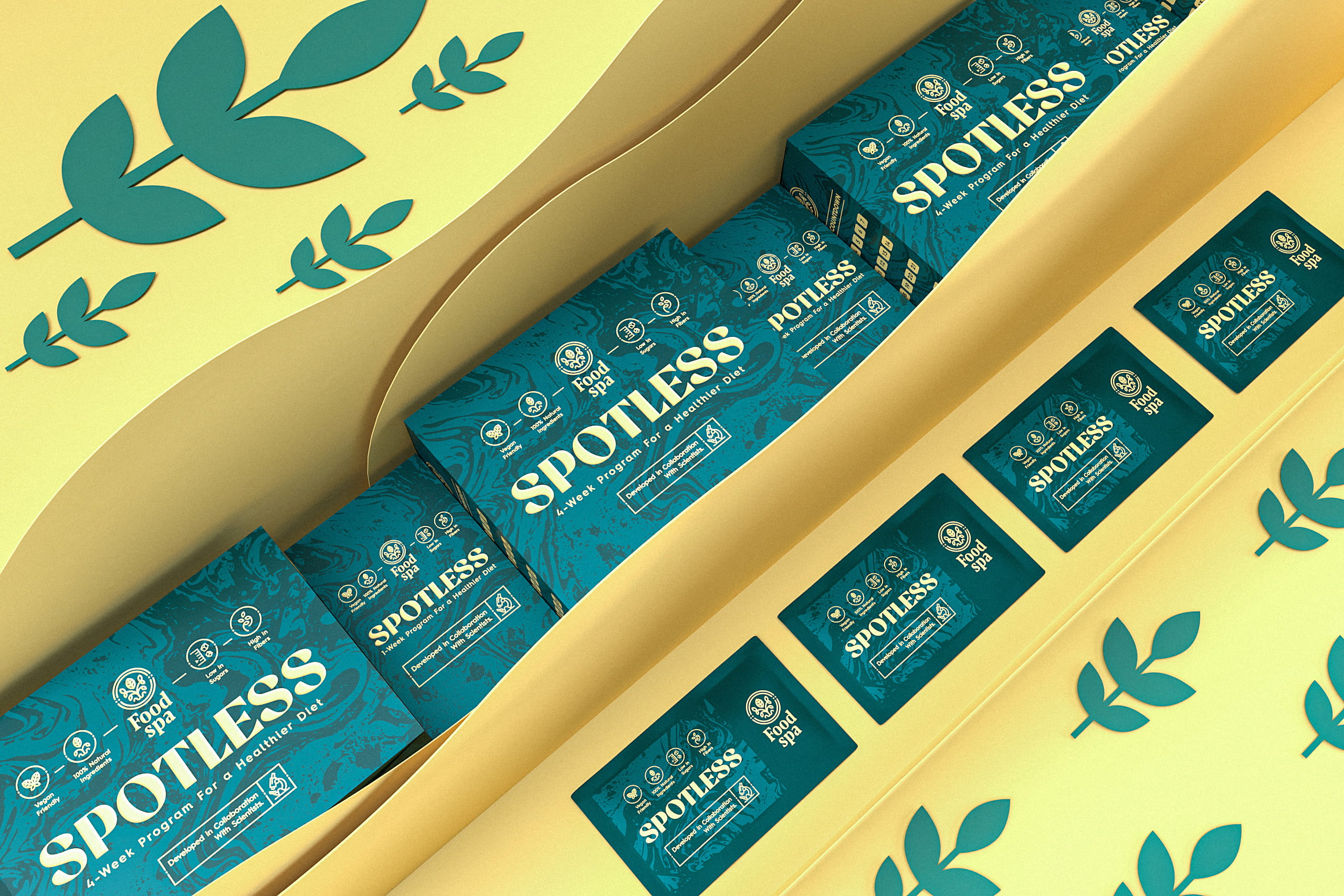
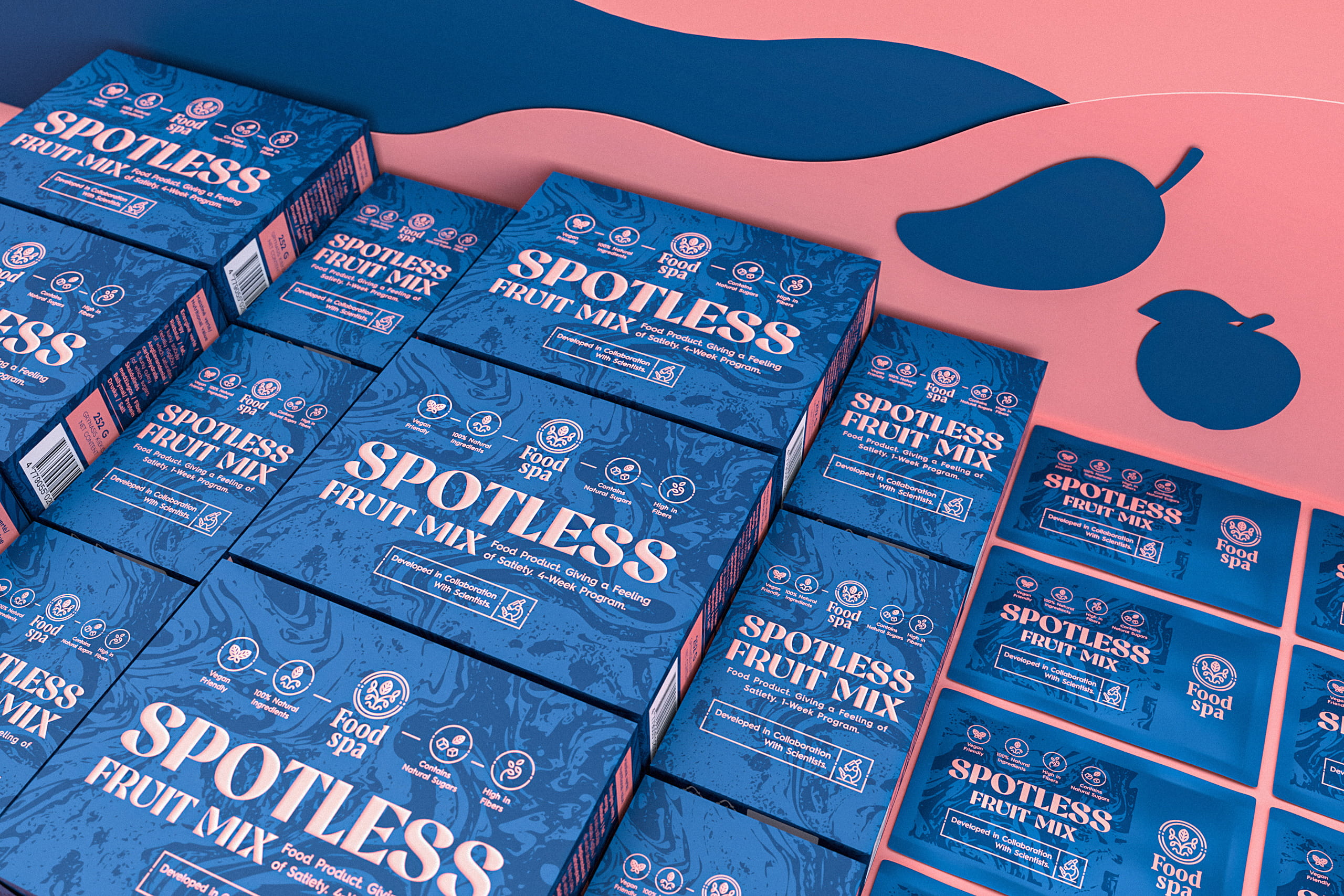
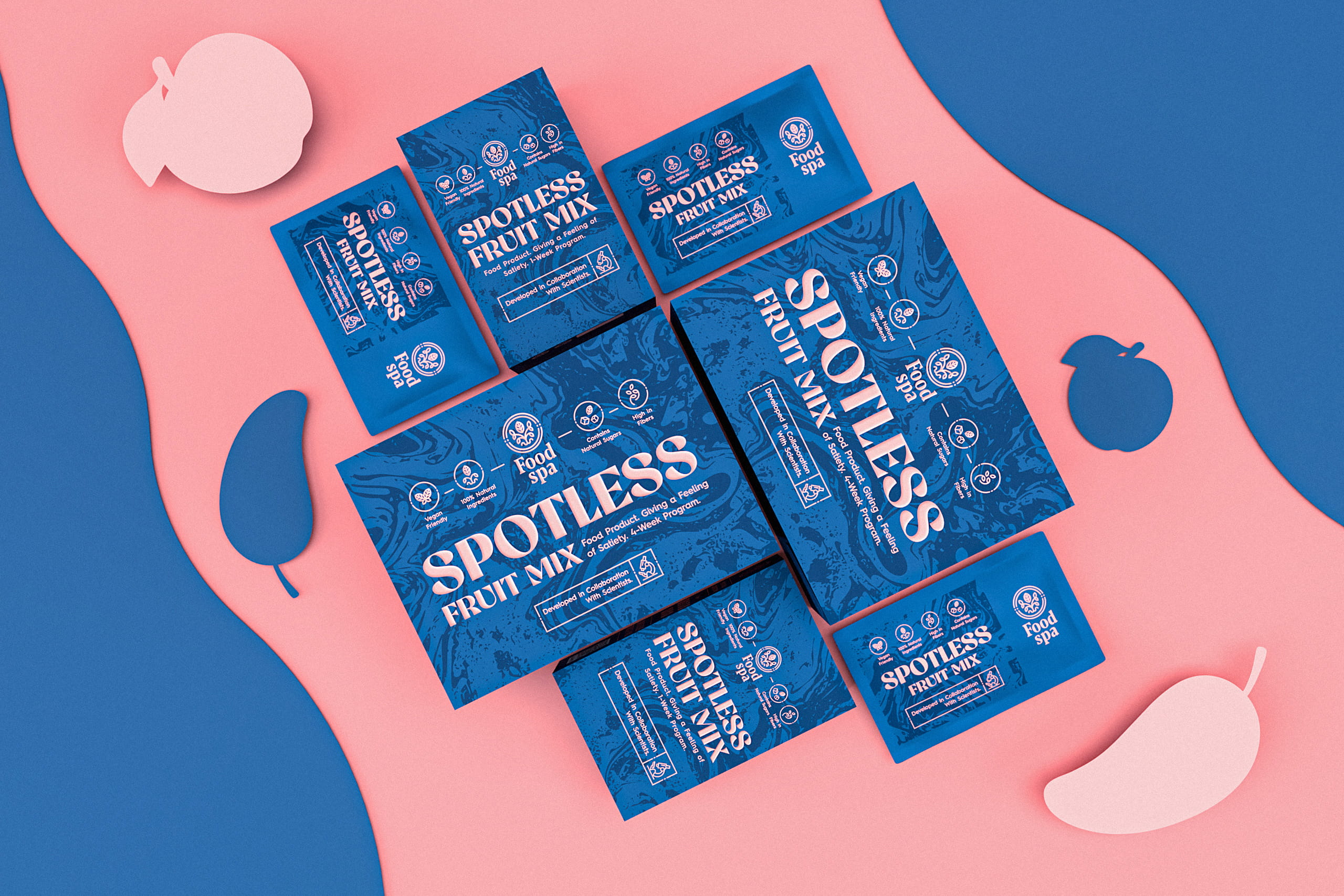
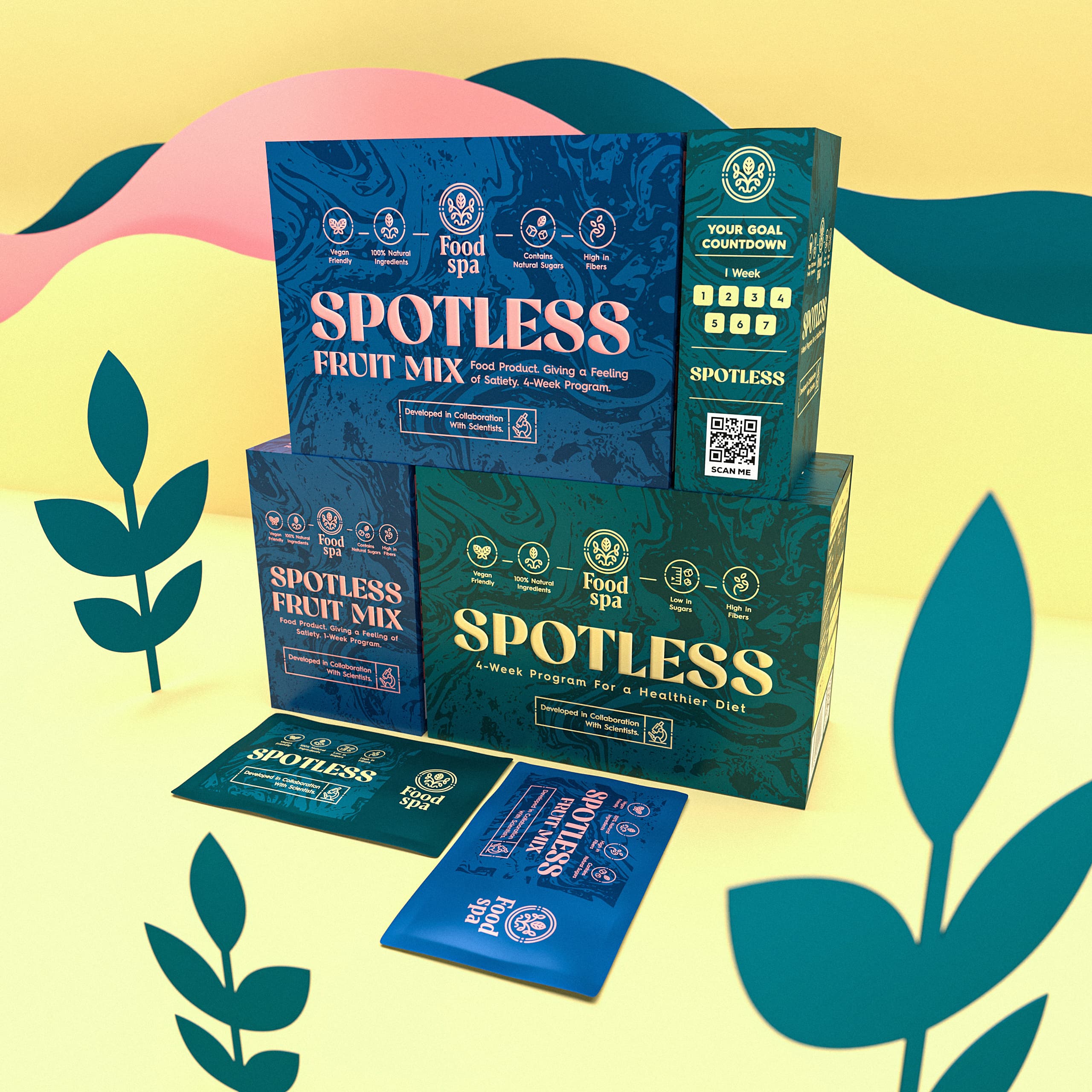
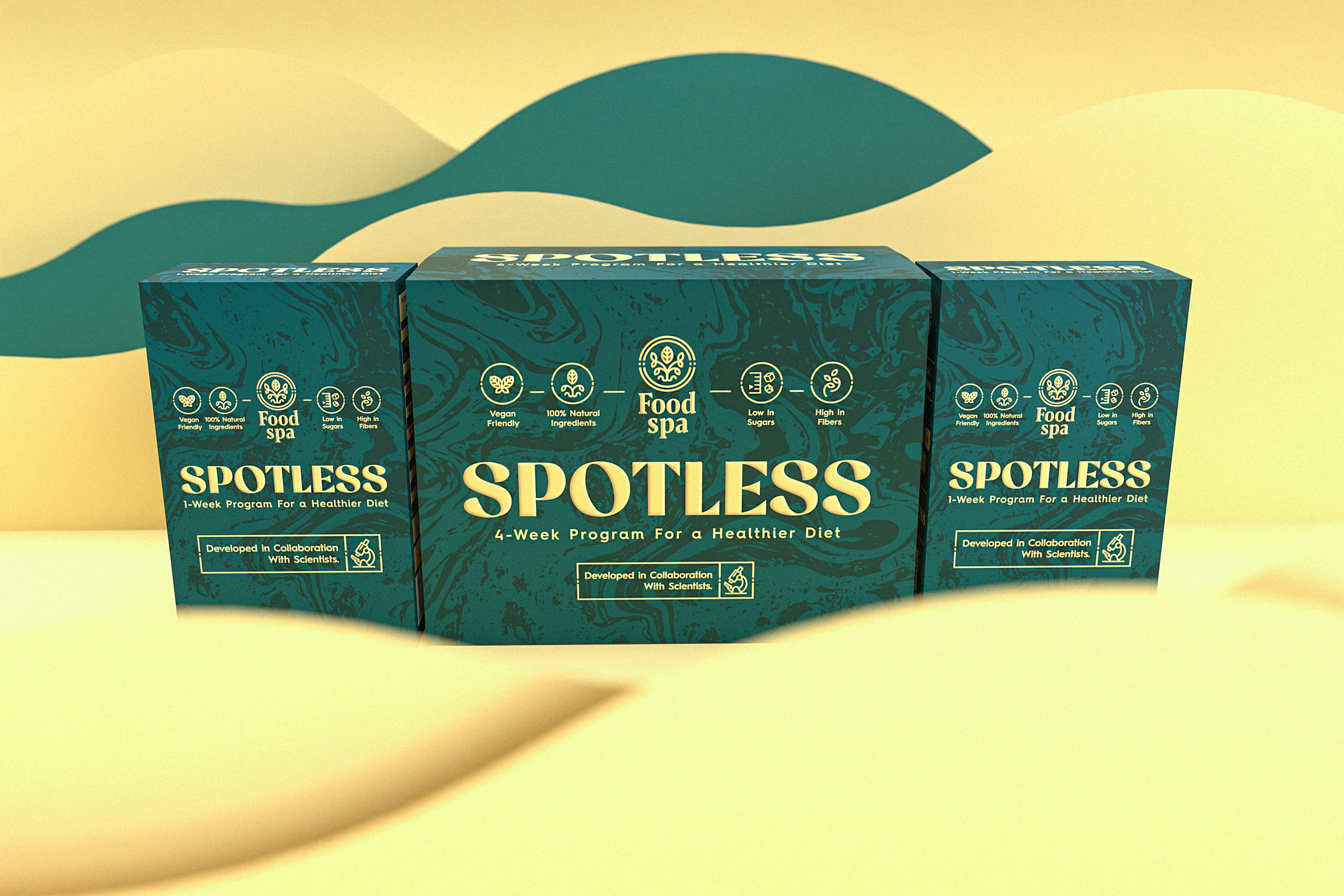
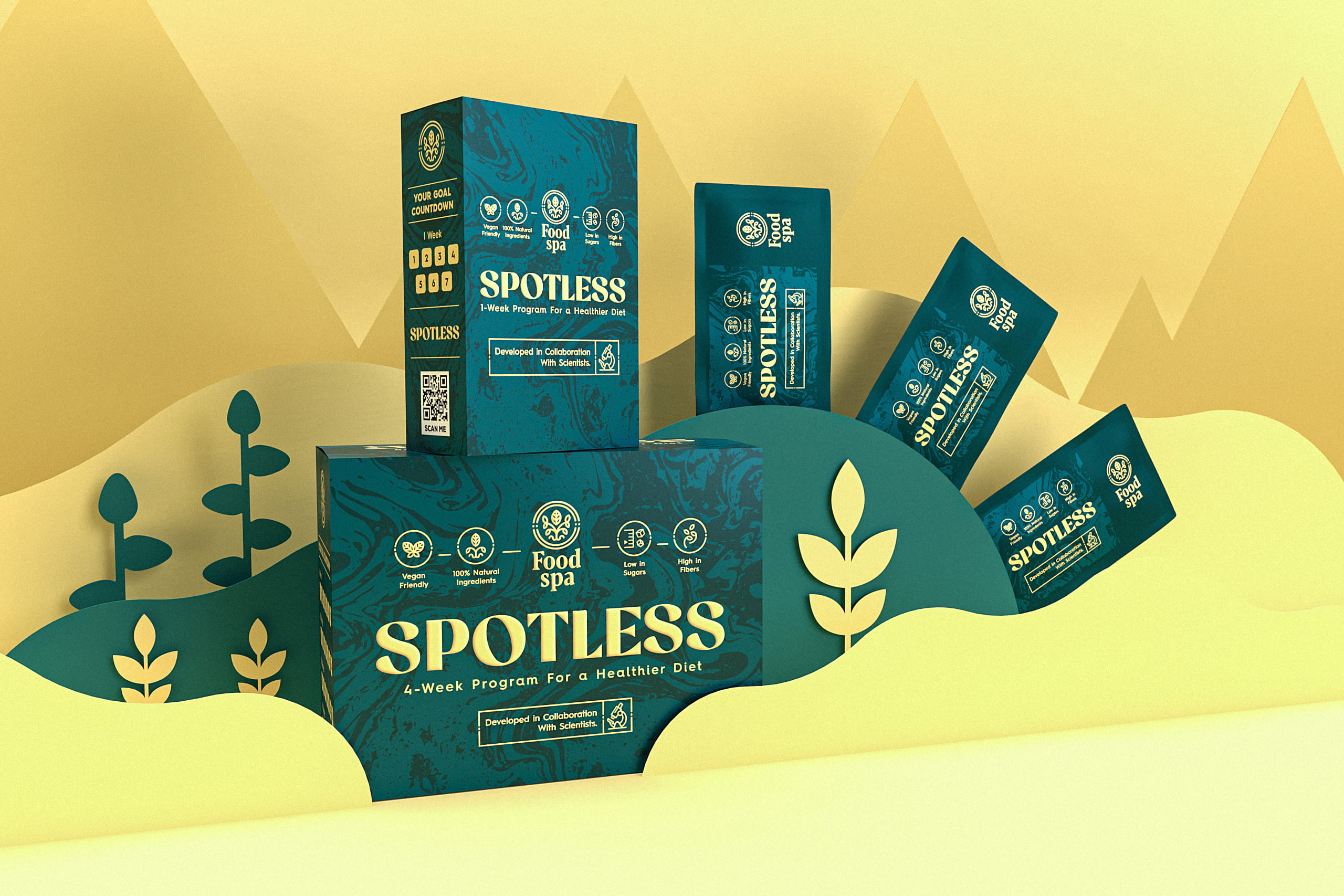
The ‘Spotless’ product line was developed in collaboration with scientists and is aimed at helping achieve personal health and fitness goals. Smaller and larger boxes of the products are available for one or four-week programs. Each box contains 7 or 28 individual packets of the product for the utmost consumption convenience. In addition, the products contain only natural ingredients for the highest nutritional benefits.

Spotless Food Spa Branding And Packaging Design

The packaging

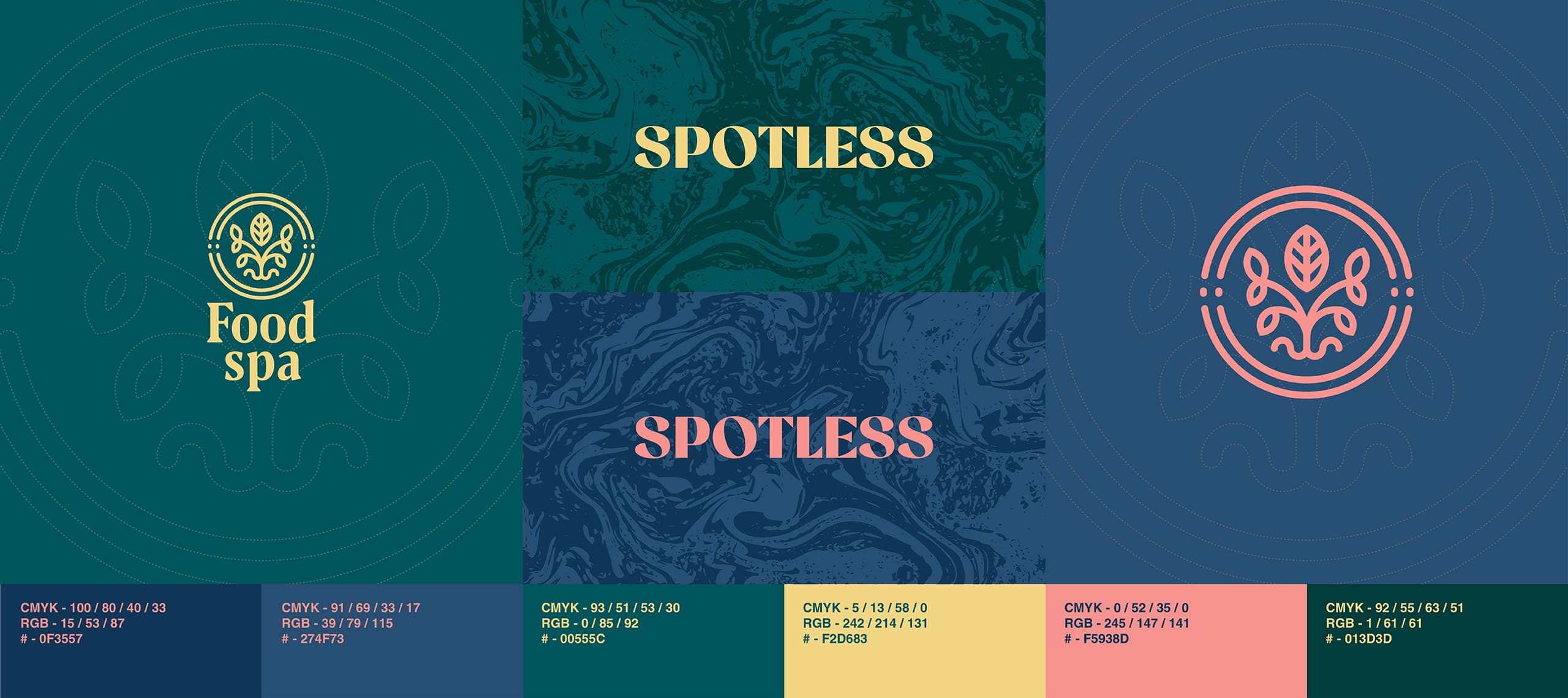
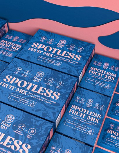
Craft Mark Studio, the Kaunas-based design agency, was responsible for creating the packaging design of Spotless. The rich color palette highlights the new line of products’ natural health-boosting qualities. The typography enhances the overall look of the packaging and is “one of the main accents of the design.”

“We started by creating a premium-style brand logo incorporating natural symbols and representing a high-class product origin. We went for symmetrical shapes and rounded composition. Then, we proceeded with the packaging design for the entire “Spotless” product line… Various interactive elements, such as a goal countdown checklist placed on the side of the product packaging, add some extra oomph to the overall design and make the product more fun to consume.”

Get the latest packaging design inspiration in your inbox:

Popular designs

Pure Persian Honey

When we look closely at honey packaging, they are almost all in the usual format, and the ultimate in creativity is that

Over the wave

This Kombucha originates in Lombok, Indonesia, where its paradise beaches attract hundreds of surfers eager to ride the waves. When you surf,

Designed by: PepsiCo Design & Innovation
Country: United States

Spotless Food Spa Branding And Packaging Design

9-Spotless

Designed by: Craft Mark Studio | Country: Lithuania

Food Spa offers its customers products with excellent nutritional value and a “pleasurable consumption experience.” The company’s Spotless brand is a class of specially-designed food that has natural health-enhancing qualities. The branding and packaging reveal “the premium nature of these products,” which allows them to stand out from competitors.

The ‘Spotless’ product line was developed in collaboration with scientists and is aimed at helping achieve personal health and fitness goals. Smaller and larger boxes of the products are available for one or four-week programs. Each box contains 7 or 28 individual packets of the product for the utmost consumption convenience. In addition, the products contain only natural ingredients for the highest nutritional benefits.

Spotless Food Spa Branding And Packaging Design

The packaging

Craft Mark Studio, the Kaunas-based design agency, was responsible for creating the packaging design of Spotless. The rich color palette highlights the new line of products’ natural health-boosting qualities. The typography enhances the overall look of the packaging and is “one of the main accents of the design.”

“We started by creating a premium-style brand logo incorporating natural symbols and representing a high-class product origin. We went for symmetrical shapes and rounded composition. Then, we proceeded with the packaging design for the entire “Spotless” product line… Various interactive elements, such as a goal countdown checklist placed on the side of the product packaging, add some extra oomph to the overall design and make the product more fun to consume.”

Previous slide
Next slide

Explore more great package design

Get the latest on packaging design in your inbox: