Designed by mousegraphics | Country: Greece
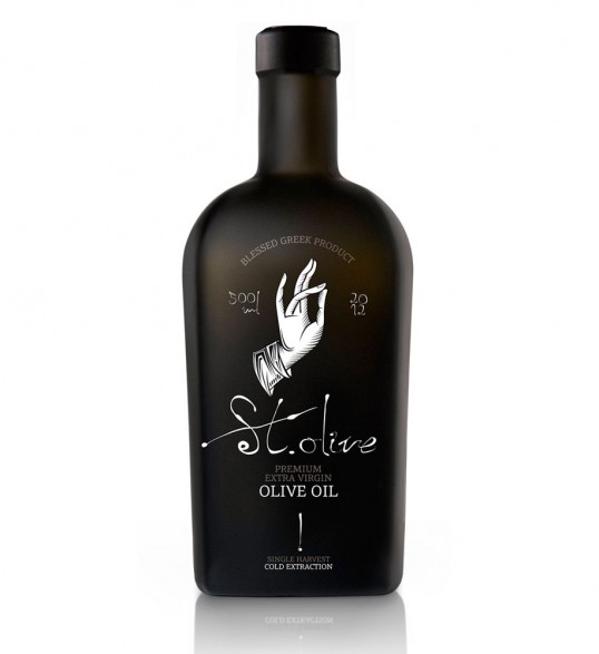
“Brief: we are targeting a selective and well informed clientele, abroad. We want to stress the special qualities of our product.
Design: since our client wanted to avoid having a ‘provenance-oriented’ identity, we turned to the area of basic human aspirations. Creating the product’s identity, we resorted to a singular combination of metaphysics and humor. We used the term “St. Olive”, not in a religious context, but as an attempt to bring forward the chthonic, primary, life-giving character of the oil fruit. Design helped us make this approach more concrete and acute: it placed a hand – the very representation of the spiritual and the divine- within the area of the ritual, the human and the feasible. In this way humor allowed for process to emerge as the care needed to make things great. We even collaborated with a painter specializing in byzantine iconography, in order to be faithful to the codes of the symbolic language we chose. It was our way to confirm once more what we believe is on the basis of every communication: everything, from the simple to the complicated, is “a leap of faith’ and one there is no reason to take without being well prepared.”