Designed by: PepsiCo Design & Innovation
Country: United States

Student Work – Aileen Barrameda

buzzy1

Designed by Aileen Barrameda | Country: United States

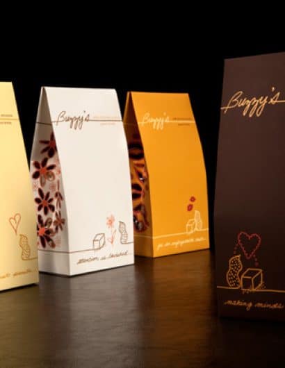
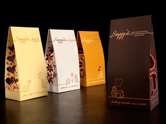
“The packaging is for Buzzy’s, a boutique gourmet candy shop that targets women. They wanted a feminine approach in selling their best selling line of peanut brittle, which includes original, white chocolate dipped, milk chocolate dipped, and dark chocolate dipped.  Buzzy’s uses 7 ingredients to make their original peanut brittle recipe.

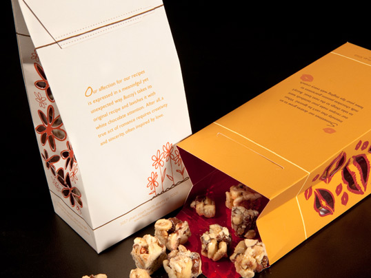
I approached the design with the idea of “simple ingredients made with love,” using romance to woo women. The line of packaging tells a story of peanut meeting sugar and how their relationship develops into the 4 stages of love: attraction (original), romance (white chocolate), passion (milk chocolate), and intimacy (dark chocolate). Since the packaging is about a story unfolding, the packaging has a preforrated tab to reveal the bright red lining–a color associated with love, passion, and romance. The die cuts give a glimps of the product and are associated with the line graphics per assortment.”
buzzy2

Get the latest packaging design inspiration in your inbox:

Popular designs

Designed by: PepsiCo Design & Innovation
Country: United States

Student Work – Aileen Barrameda

buzzy1

buzzy1

Designed by Aileen Barrameda | Country: United States

“The packaging is for Buzzy’s, a boutique gourmet candy shop that targets women. They wanted a feminine approach in selling their best selling line of peanut brittle, which includes original, white chocolate dipped, milk chocolate dipped, and dark chocolate dipped.  Buzzy’s uses 7 ingredients to make their original peanut brittle recipe.

I approached the design with the idea of “simple ingredients made with love,” using romance to woo women. The line of packaging tells a story of peanut meeting sugar and how their relationship develops into the 4 stages of love: attraction (original), romance (white chocolate), passion (milk chocolate), and intimacy (dark chocolate). Since the packaging is about a story unfolding, the packaging has a preforrated tab to reveal the bright red lining–a color associated with love, passion, and romance. The die cuts give a glimps of the product and are associated with the line graphics per assortment.”

buzzy2

Previous slide
Next slide
Get the latest on packaging design in your inbox: