Designed by: PepsiCo Design & Innovation
Country: United States

Student Work – Ben Osborn-Macpherson

Student Work - Ben Osborn-Macpherson

Designed by Ben Osborn-Macpherson | Country: Australia | Fonts used: Geometric 415, Gotham,

3rd year Communication Design student Ben Osborn-Macpherson from RMIT University in Melbourne sends us some of his work.

Student Work - Ben Osborn-Macpherson

Student Work - Ben Osborn-Macpherson

Student Work - Ben Osborn-Macpherson

Student Work - Ben Osborn-Macpherson

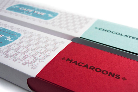
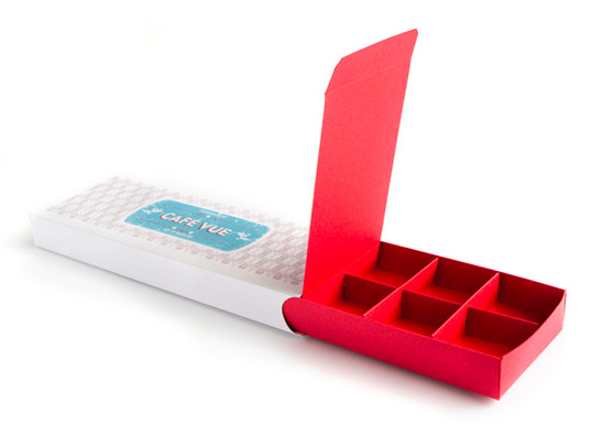
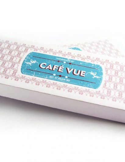
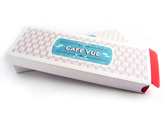
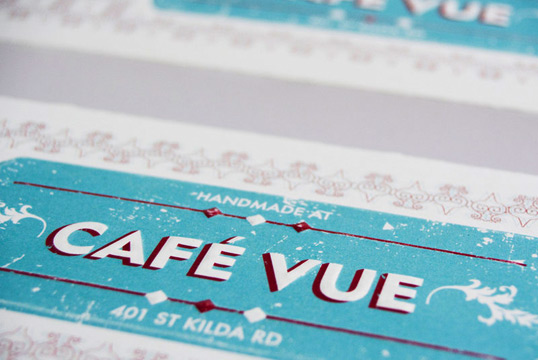
“This brief required a packaging solution for chocolates and macaroons produced on-site at Cafe Vue. It needed to be able to hold 6-12 items without looking too empty with 6. It also needed to be glueless so that it could be assembled by staff on-site. The box that I developed is held together by interlocking slots on the dividers/base and tabs on the sleeve.”

Student Work - Ben Osborn-Macpherson

Student Work - Ben Osborn-Macpherson

Student Work - Ben Osborn-Macpherson

Student Work - Ben Osborn-Macpherson

Student Work - Ben Osborn-Macpherson

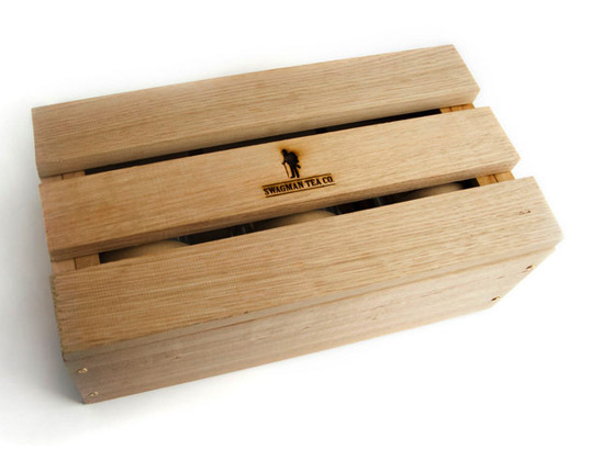
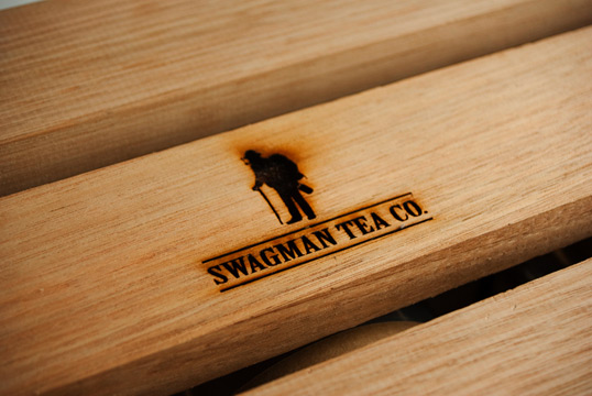
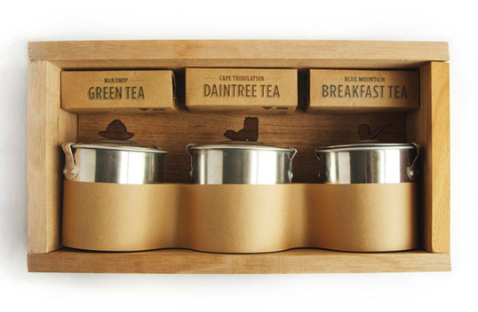
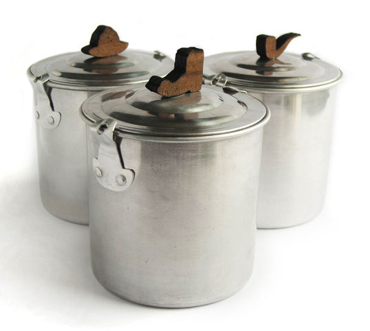
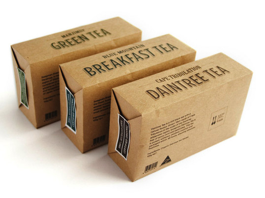
“Packaging for a line of unique Australian leaf teas and reusable tins. The branded wooden box is used to present all the items as a gift set/collection, but can also be turned on its side and used as a small shelf for the tins. The tins are based traditional camping billies with wooden shapes linking to the logo as handles. This creates a link to the brand without invading the customers kitchen with branding. I used a combination of raw materials and recycled brown paper, resulting in a solution that is highly sustainable with a distinctly Australian-outback aesthetic.”

Get the latest packaging design inspiration in your inbox:

Popular designs

Pure Persian Honey

When we look closely at honey packaging, they are almost all in the usual format, and the ultimate in creativity is that

Burma Love Rebrand

Love at First BiteAs an extension of the Burma Superstar restaurant in San Francisco, Burma Love Foods gives diners an opportunity to

Over the wave

This Kombucha originates in Lombok, Indonesia, where its paradise beaches attract hundreds of surfers eager to ride the waves. When you surf,

Designed by: PepsiCo Design & Innovation
Country: United States

Student Work – Ben Osborn-Macpherson

cafe1

Student Work - Ben Osborn-Macpherson

Designed by Ben Osborn-Macpherson | Country: Australia | Fonts used: Geometric 415, Gotham,

3rd year Communication Design student Ben Osborn-Macpherson from RMIT University in Melbourne sends us some of his work.

Student Work - Ben Osborn-Macpherson

Student Work - Ben Osborn-Macpherson

Student Work - Ben Osborn-Macpherson

Student Work - Ben Osborn-Macpherson

“This brief required a packaging solution for chocolates and macaroons produced on-site at Cafe Vue. It needed to be able to hold 6-12 items without looking too empty with 6. It also needed to be glueless so that it could be assembled by staff on-site. The box that I developed is held together by interlocking slots on the dividers/base and tabs on the sleeve.”

Student Work - Ben Osborn-Macpherson

Student Work - Ben Osborn-Macpherson

Student Work - Ben Osborn-Macpherson

Student Work - Ben Osborn-Macpherson

Student Work - Ben Osborn-Macpherson

“Packaging for a line of unique Australian leaf teas and reusable tins. The branded wooden box is used to present all the items as a gift set/collection, but can also be turned on its side and used as a small shelf for the tins. The tins are based traditional camping billies with wooden shapes linking to the logo as handles. This creates a link to the brand without invading the customers kitchen with branding. I used a combination of raw materials and recycled brown paper, resulting in a solution that is highly sustainable with a distinctly Australian-outback aesthetic.”
Previous slide
Next slide

Explore more great package design

Get the latest on packaging design in your inbox: