Designed by: PepsiCo Design & Innovation
Country: United States

Student Work – Collin Cummings

Student Work - Collin Cummings

Designed by Collin Cummings | Country: United States

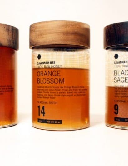
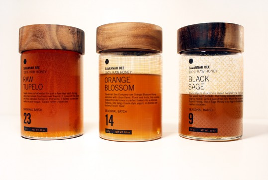
“I fell in love with the idea of repackaging honey because of the timelessness of honey production. The process employed by honey bees hasn’t changed. To reference this highly industrial procedure, I chose a typographic direction that felt sterile. To counterbalance the type, I designed a few complicated and emergent patterns that hide behind the color of the honey when the bottle is full. As you use the product, the elegant patterns are revealed in a second layer as a homage to the beauty and timelessness of such a refined and perfected practice such as honey production.”

Get the latest packaging design inspiration in your inbox:

Popular designs

The Port Vodka Lemon Water

Overview: In response to my client’s vision for a Cape Cod themed beverage brand, I embarked on the journey to create The Port

Far Out Bar

Description: Far Out Bar is a cutting-edge packaging design project created for High Life Farms’ macrodose THC chocolate bars. This project involved

Over the wave

This Kombucha originates in Lombok, Indonesia, where its paradise beaches attract hundreds of surfers eager to ride the waves. When you surf,

Burma Love Rebrand

Love at First BiteAs an extension of the Burma Superstar restaurant in San Francisco, Burma Love Foods gives diners an opportunity to

The Bra Guru

Most women are wearing the wrong size bra and that is a fact. The Bra Guru® is the first and only professional

Designed by: PepsiCo Design & Innovation
Country: United States

Student Work – Collin Cummings

lovley-package-collin-cummings

Student Work - Collin Cummings

Designed by Collin Cummings | Country: United States

“I fell in love with the idea of repackaging honey because of the timelessness of honey production. The process employed by honey bees hasn’t changed. To reference this highly industrial procedure, I chose a typographic direction that felt sterile. To counterbalance the type, I designed a few complicated and emergent patterns that hide behind the color of the honey when the bottle is full. As you use the product, the elegant patterns are revealed in a second layer as a homage to the beauty and timelessness of such a refined and perfected practice such as honey production.”

Explore more great package design

Get the latest on packaging design in your inbox: