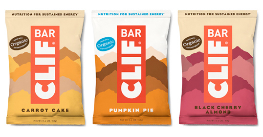
Designed by Eric Ellis | Country: United States
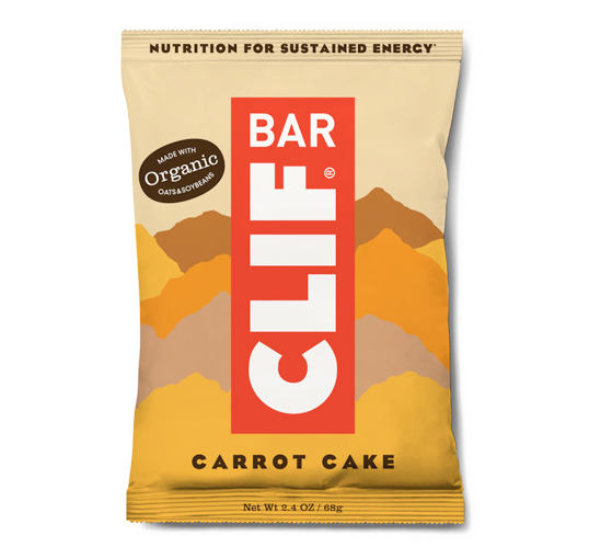
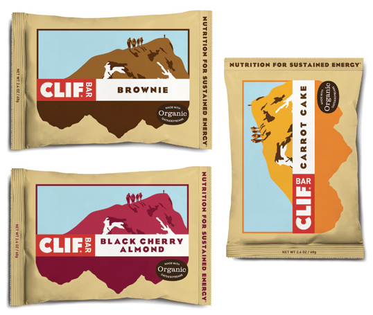
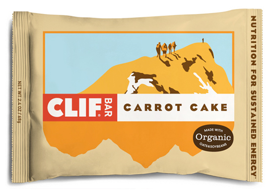
A student packaging redesign project where two different concepts were explored.
“While I didn’t think the existing CLIF Bar’s packaging was all that bad, I did have a few ideas for improvements. I wanted to pull the brand into more of an organic/healthy direction and not have as much emphasis put on the sporty aspect, with the idea that CLIF can be enjoyed even if you aren’t planning on scaling a rock wall anytime soon.”
