Designed by Espen Hansen | Country: Norway
“The essence of this exclusive alcoholic product is the long history of the brand and the storage time of the products.
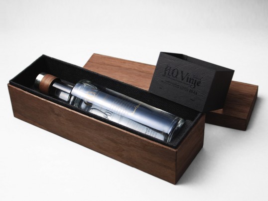
Since Gin does not have a particularly the long storage time (2 – 5 years) I chose to create a concept that is based on real history, to give the product added value. I have decided to use materials that existed at the time AO Vinje lived which gave me a color palette that I am very happy with.
The box is covered with veneer that has the same color as the juniper bushes. The inside of the box is covered in dark gray wool, which was a very common matrialet in regions where AO Vinje grew up in. The bottle has a modern shape with a cap made of wood and silver.
The design of the label is engraved, then the added bronze and gold to lift the text from the clear, transparent background. Typography of the main logo is a modern remake of old Norwegian typography dating back to the Viking age.”