Designed by: PepsiCo Design & Innovation
Country: United States

Student Work – Gustavo Bife Fernandes

Student Work - Gustavo Bife Fernandes

Designed by Gustavo Bife Fernandes | Country: Brazil

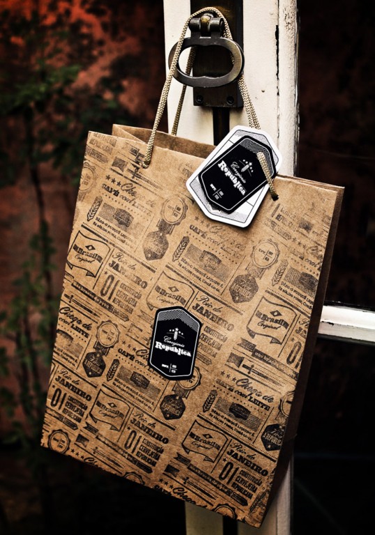
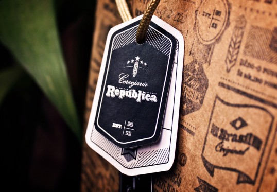
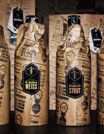
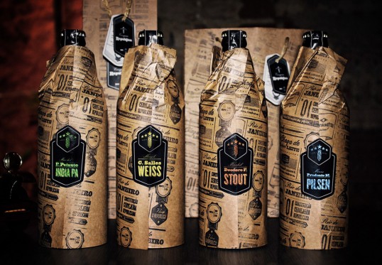
“Over the course of six months I defined the brand positioning, and developed the visual identity system for a fictitious beer brand based on the current scenario of the Brazil’s beer market. It’s the dawning of the “Cervejaria República”.

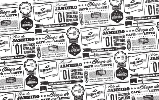
This project defines various aspects that concern those elements of communication, through its naming, voice and visual communication throughout. Within this are the brand’s signature (symbols, logo, typography), institutional colors, palettes and patterns, labels, and packaging among others.

It’s inspired by three main elements that, combined, serves the brand’s guidelines:
– The Wheat, representing beer.
– The Republic, representing Brazil’s old republic period.
– Brazilian Style, representing the needs of defining and discussing the dawn of a legitimate brazilian brewing school.”

Student Work - Gustavo Bife Fernandes

Student Work - Gustavo Bife Fernandes

Student Work - Gustavo Bife Fernandes

Student Work - Gustavo Bife Fernandes

Get the latest packaging design inspiration in your inbox:

Popular designs

Over the wave

This Kombucha originates in Lombok, Indonesia, where its paradise beaches attract hundreds of surfers eager to ride the waves. When you surf,

Pure Persian Honey

When we look closely at honey packaging, they are almost all in the usual format, and the ultimate in creativity is that

The Bra Guru

Most women are wearing the wrong size bra and that is a fact. The Bra Guru® is the first and only professional

Far Out Bar

Description: Far Out Bar is a cutting-edge packaging design project created for High Life Farms’ macrodose THC chocolate bars. This project involved

Designed by: PepsiCo Design & Innovation
Country: United States

Student Work – Gustavo Bife Fernandes

lovely-package-gustavo-bife-fernandes-1

Student Work - Gustavo Bife Fernandes

Designed by Gustavo Bife Fernandes | Country: Brazil

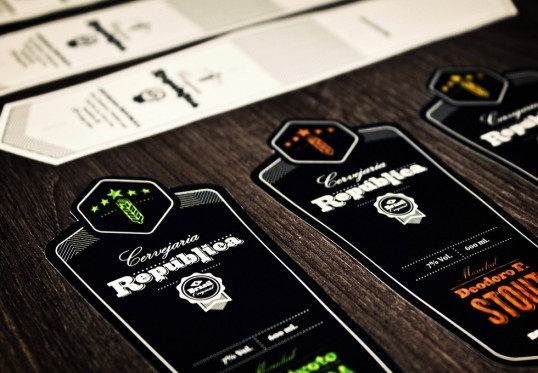
“Over the course of six months I defined the brand positioning, and developed the visual identity system for a fictitious beer brand based on the current scenario of the Brazil’s beer market. It’s the dawning of the “Cervejaria República”.

This project defines various aspects that concern those elements of communication, through its naming, voice and visual communication throughout. Within this are the brand’s signature (symbols, logo, typography), institutional colors, palettes and patterns, labels, and packaging among others.

It’s inspired by three main elements that, combined, serves the brand’s guidelines:
– The Wheat, representing beer.
– The Republic, representing Brazil’s old republic period.
– Brazilian Style, representing the needs of defining and discussing the dawn of a legitimate brazilian brewing school.”
Student Work - Gustavo Bife Fernandes

Student Work - Gustavo Bife Fernandes

Student Work - Gustavo Bife Fernandes

Student Work - Gustavo Bife Fernandes

Previous slide
Next slide

Explore more great package design

Get the latest on packaging design in your inbox: