Designed by: PepsiCo Design & Innovation
Country: United States

Student Work – Heesun Kim

Student Work - Heesun Kim

Designed by Heesun Kim | Country: United States

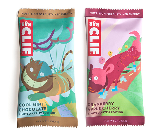
Artist Edition Clif Bar: The goal was to create a limited artist edition Clif Bars for two of the flavors. As seen by “Cool Mint Chocolate” and “Cranberry Apple Cherry” flavors, the color palette reflects on the flavors. The concept was to show ordinary animals doing extraordinary things with the help of Clif Bars.”

Student Work - Heesun Kim

Student Work - Heesun Kim

Student Work - Heesun Kim

Student Work - Heesun Kim

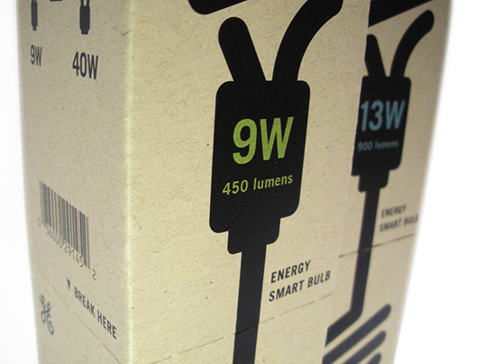
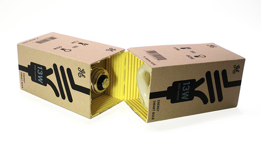
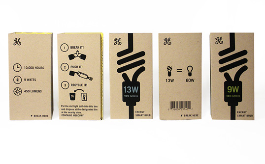
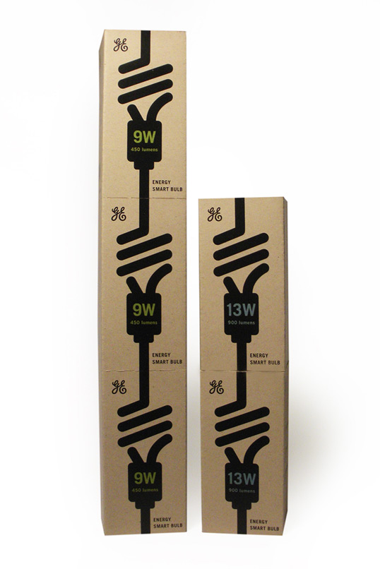
GE Light Bulb: The main objective was to look at light bulb packaging in a completely new way with the green objectives still in mind. The light bulb stacks would be standing tall in a bin at the store and the consumers will be able to “break off” any numbers of light bulb they actually need. The choice of displaying the light bulb as tall stacks or broken off to fit into small shelves makes the new GE light bulb packaging extremely versatile. The new packaging features recycled specialty corrugated board with bright yellow inside, alluding to the idea of being “illuminated.”

Student Work - Heesun Kim

Student Work - Heesun Kim

Student Work - Heesun Kim

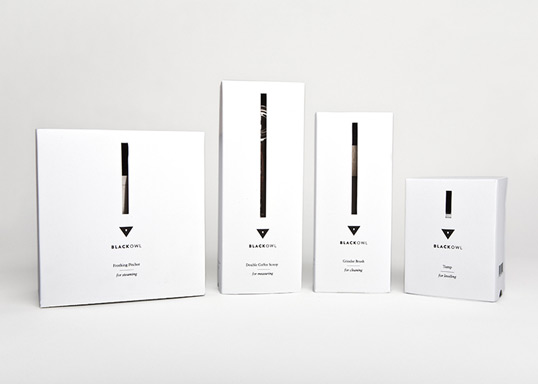
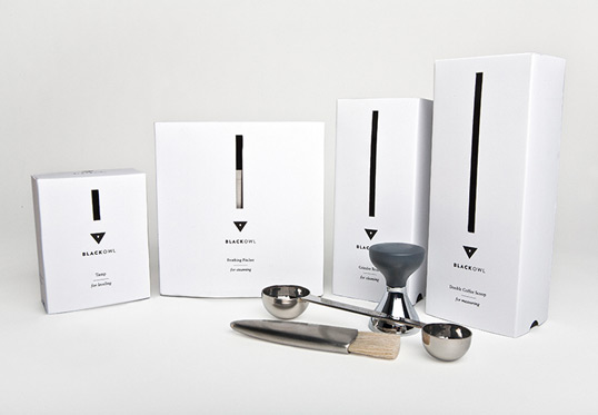
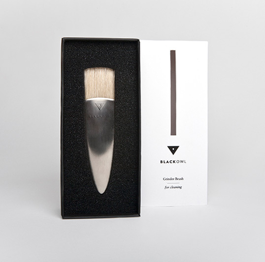
Black Owl: Black Owl represents all the tools that are required in the process of making a cup of espresso. What makes it stand out is the fact that it’s not Starbuck’s cup of espresso. It acknowledges that drinking an espresso is a ceremony enjoyed by many and it elevates the act of making espresso by introducing a high tier brand.

One of the important sense I wanted to evoke was smell. A huge part of espresso drinking has to do with aroma. When a customer opens the package, the black aroma ink would rub against the white cover, activating the coffee smell.

The name, Black Owl, means something almost attainable but it’s always out of one’s reach. It’s a tease. The name alludes to the exclusivity of the brand and the meaning of Black Owl is reinforced by the slit in the middle of the packaging. The slit itself is a tease to the customers. By using sight, smell, and touch, it engages the consumer with various senses instead of one.”

Get the latest packaging design inspiration in your inbox:

Popular designs

Designed by: PepsiCo Design & Innovation
Country: United States

Student Work – Heesun Kim

heesun1

Student Work - Heesun Kim

Designed by Heesun Kim | Country: United States

Artist Edition Clif Bar: The goal was to create a limited artist edition Clif Bars for two of the flavors. As seen by “Cool Mint Chocolate” and “Cranberry Apple Cherry” flavors, the color palette reflects on the flavors. The concept was to show ordinary animals doing extraordinary things with the help of Clif Bars.”

Student Work - Heesun Kim

Student Work - Heesun Kim

Student Work - Heesun Kim

Student Work - Heesun Kim

GE Light Bulb: The main objective was to look at light bulb packaging in a completely new way with the green objectives still in mind. The light bulb stacks would be standing tall in a bin at the store and the consumers will be able to “break off” any numbers of light bulb they actually need. The choice of displaying the light bulb as tall stacks or broken off to fit into small shelves makes the new GE light bulb packaging extremely versatile. The new packaging features recycled specialty corrugated board with bright yellow inside, alluding to the idea of being “illuminated.”

Student Work - Heesun Kim

Student Work - Heesun Kim

Student Work - Heesun Kim

Black Owl: Black Owl represents all the tools that are required in the process of making a cup of espresso. What makes it stand out is the fact that it’s not Starbuck’s cup of espresso. It acknowledges that drinking an espresso is a ceremony enjoyed by many and it elevates the act of making espresso by introducing a high tier brand.

One of the important sense I wanted to evoke was smell. A huge part of espresso drinking has to do with aroma. When a customer opens the package, the black aroma ink would rub against the white cover, activating the coffee smell.

The name, Black Owl, means something almost attainable but it’s always out of one’s reach. It’s a tease. The name alludes to the exclusivity of the brand and the meaning of Black Owl is reinforced by the slit in the middle of the packaging. The slit itself is a tease to the customers. By using sight, smell, and touch, it engages the consumer with various senses instead of one.”
Explore more great package design

Get the latest on packaging design in your inbox: