Designed by Jamie Prendergast | Country: United States
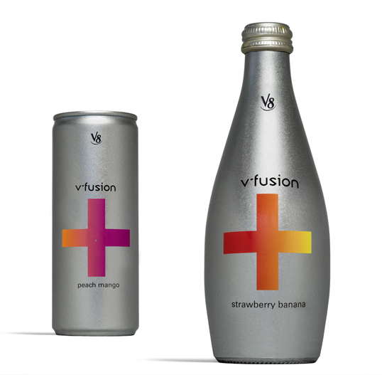
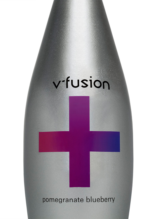
“This redesign of V8’s V-fusion packaging was part of an assignment for an Advanced Packaging class. The name fusion suggests technology and science, so I redesigned the logo and packaging to convey a more high-tech and modern feel. For the packaging, I used a plus sign as the main element to reflect the positive benefits of the product and the wide variety of fruit and vegetable juices that come in the beverages. The colored gradients on the plus signs correspond to the flavors of the product.”


