Designed by: PepsiCo Design & Innovation
Country: United States

Student Work – Jesse Lindhorst

Student Work - Jesse Lindhorst

Designed by Jesse Lindhorst | Country: United States

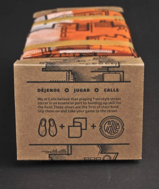
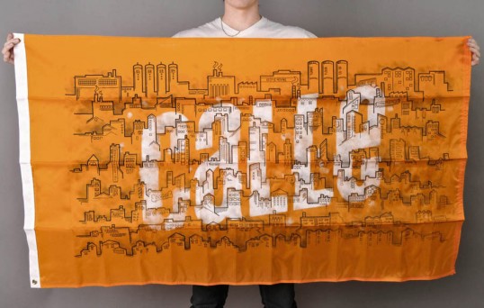
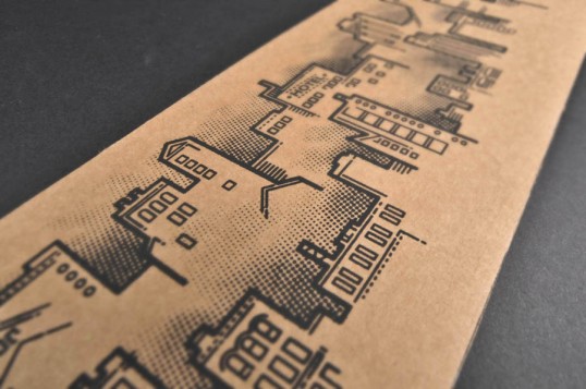
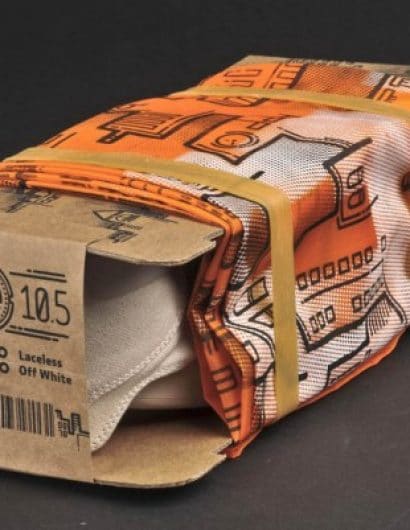
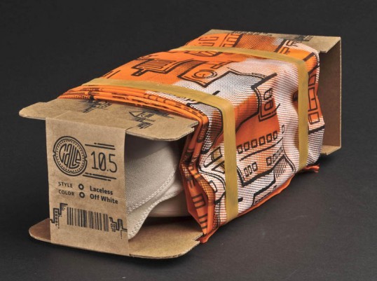
“Calle, in Spanish, means “Street.” This brand of slip-on street soccer shoes is the first of its kind. My goal for the redesign of this brands packaging was to capture its unique feel as a sleek street shoe, while still incorporating the power and precision of soccer. The metropolis illustration that spans across most of the package elements is meant to represent any city, from the feel of the busy downtown skyline to the sprawl of suburbia.

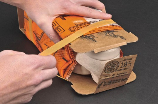
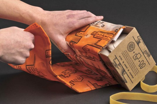
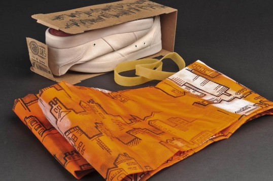
The structure is simple, made of one small piece of cardboard, wrapped in a bright flag for vivid visual appeal, and strapped tight with rubber clamps. The unconventional build of the package makes the experience of opening the box something the customer won’t soon forget, especially once they feast their eyes on monstrous illustration strewn across the flag. This flag can be pinned up in a room or even hung on a fence to make the perfect target for a street soccer goal. The only piece of post-consumer waste that comes from this package is the small cardboard structure, which can simply be recycled.

Refine your skills in the street.”

Student Work - Jesse Lindhorst

Student Work - Jesse Lindhorst

Student Work - Jesse Lindhorst

Student Work - Jesse Lindhorst

Student Work - Jesse Lindhorst

Student Work - Jesse Lindhorst

Student Work - Jesse Lindhorst

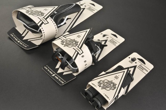
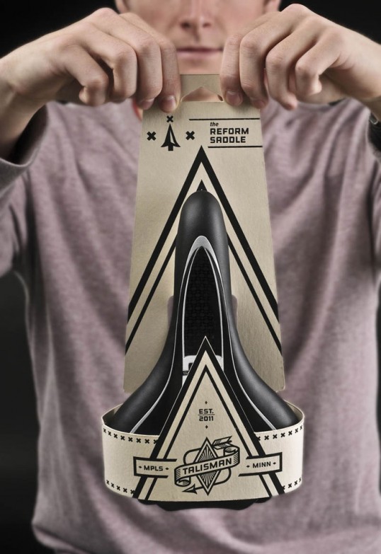
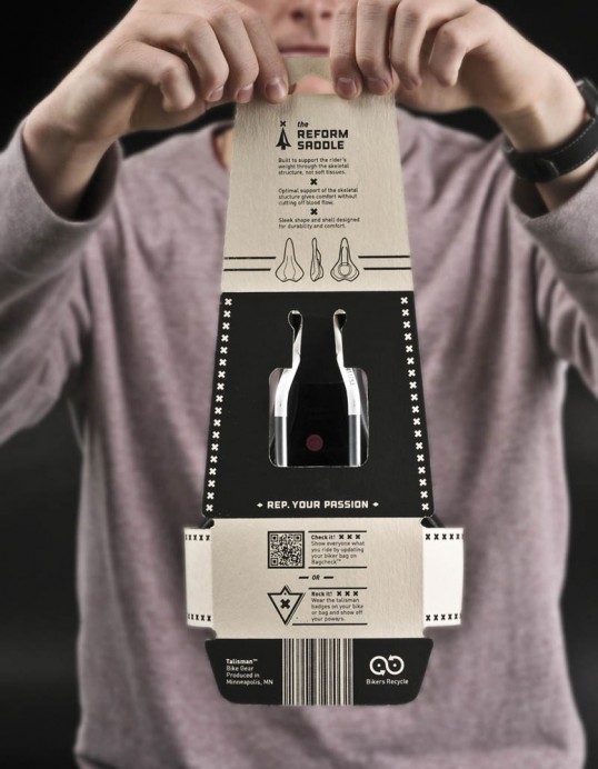
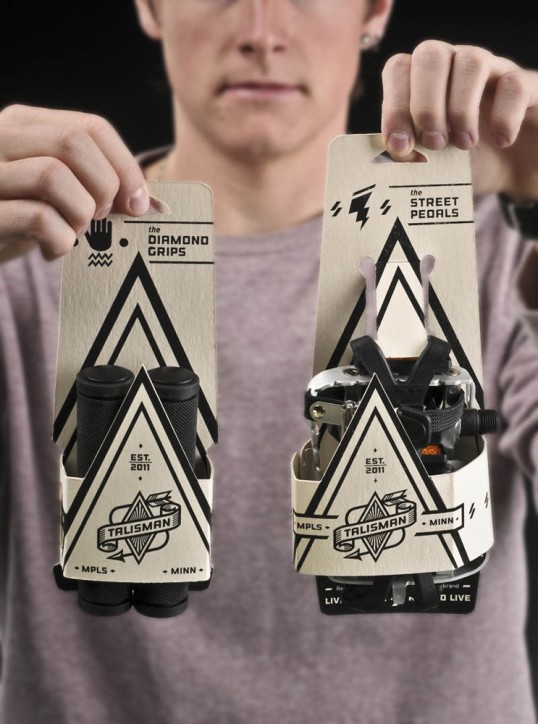
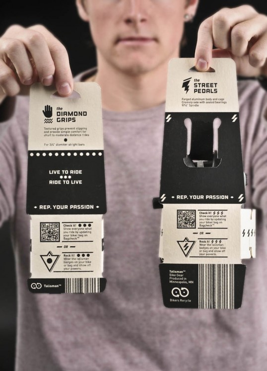
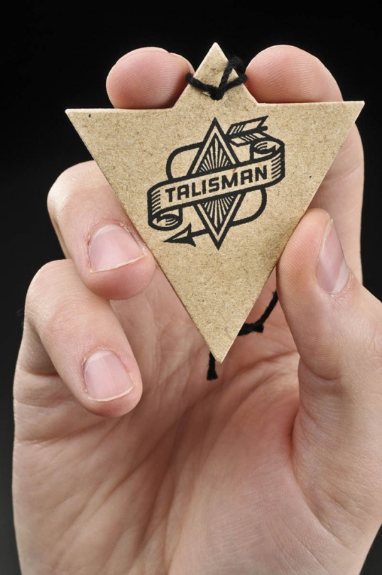
“Talisman bike gear is made for the passionate cyclist looking for precision and clean, minimal style. When diving into the initial branding concepts I knew I wanted to reflect the idea of precision in the logo and through the overall graphics on the packaging. I really wanted to push away from the overly busy graphical styles of other professional bike gear brands so I developed an identity that would revolve completely around the build of simple shapes and one color printing.

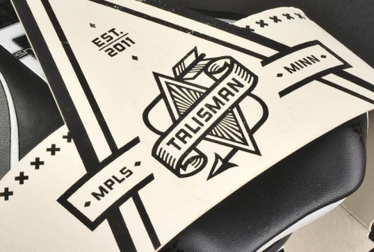
The fluid movement of the arrow wrapping around the classic diamond structure of the logo brings in a variety of elements of every bike: the classic diamond frame, the spokes of the wheels, the fluidity of the arrow compared to the gliding movement of the bike itself.

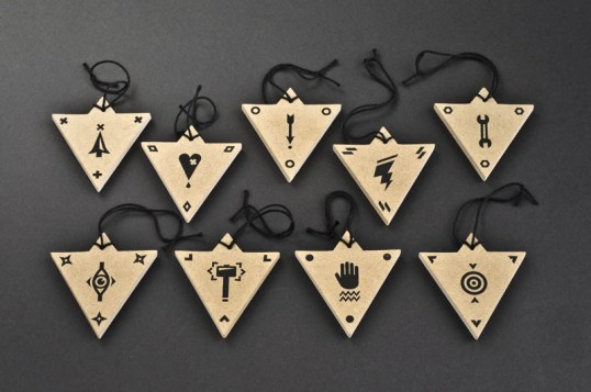
I then wanted to develop a way to expand the brand so that users could represent their new gear with pride. This brought on the concept of badges or talisman, reflecting the meaning of the brand name. These badges would be collectables within the packages of Talisman gear, each with a different power element on it, from the “Passion” the user has for cycling to the “Precision” needed to ride through heavy traffic. Talisman portrays the power and stability that the hardcore cyclist hunts for.”

Student Work - Jesse Lindhorst

Student Work - Jesse Lindhorst

Student Work - Jesse Lindhorst

Student Work - Jesse Lindhorst

Student Work - Jesse Lindhorst

Student Work - Jesse Lindhorst

Student Work - Jesse Lindhorst

Student Work - Jesse Lindhorst

Get the latest packaging design inspiration in your inbox:

Popular designs

Burma Love Rebrand

Love at First BiteAs an extension of the Burma Superstar restaurant in San Francisco, Burma Love Foods gives diners an opportunity to

Pure Persian Honey

When we look closely at honey packaging, they are almost all in the usual format, and the ultimate in creativity is that

The Bra Guru

Most women are wearing the wrong size bra and that is a fact. The Bra Guru® is the first and only professional

Designed by: PepsiCo Design & Innovation
Country: United States

Student Work – Jesse Lindhorst

lovely-package-jesse-lindhorst1

Student Work - Jesse Lindhorst

Designed by Jesse Lindhorst | Country: United States

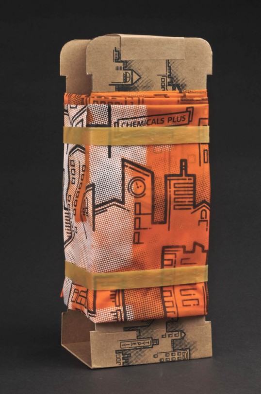
“Calle, in Spanish, means “Street.” This brand of slip-on street soccer shoes is the first of its kind. My goal for the redesign of this brands packaging was to capture its unique feel as a sleek street shoe, while still incorporating the power and precision of soccer. The metropolis illustration that spans across most of the package elements is meant to represent any city, from the feel of the busy downtown skyline to the sprawl of suburbia.

The structure is simple, made of one small piece of cardboard, wrapped in a bright flag for vivid visual appeal, and strapped tight with rubber clamps. The unconventional build of the package makes the experience of opening the box something the customer won’t soon forget, especially once they feast their eyes on monstrous illustration strewn across the flag. This flag can be pinned up in a room or even hung on a fence to make the perfect target for a street soccer goal. The only piece of post-consumer waste that comes from this package is the small cardboard structure, which can simply be recycled.

Refine your skills in the street.”

Student Work - Jesse Lindhorst

Student Work - Jesse Lindhorst

Student Work - Jesse Lindhorst

Student Work - Jesse Lindhorst

Student Work - Jesse Lindhorst

Student Work - Jesse Lindhorst

Student Work - Jesse Lindhorst

“Talisman bike gear is made for the passionate cyclist looking for precision and clean, minimal style. When diving into the initial branding concepts I knew I wanted to reflect the idea of precision in the logo and through the overall graphics on the packaging. I really wanted to push away from the overly busy graphical styles of other professional bike gear brands so I developed an identity that would revolve completely around the build of simple shapes and one color printing.

The fluid movement of the arrow wrapping around the classic diamond structure of the logo brings in a variety of elements of every bike: the classic diamond frame, the spokes of the wheels, the fluidity of the arrow compared to the gliding movement of the bike itself.

I then wanted to develop a way to expand the brand so that users could represent their new gear with pride. This brought on the concept of badges or talisman, reflecting the meaning of the brand name. These badges would be collectables within the packages of Talisman gear, each with a different power element on it, from the “Passion” the user has for cycling to the “Precision” needed to ride through heavy traffic. Talisman portrays the power and stability that the hardcore cyclist hunts for.”
Student Work - Jesse Lindhorst

Student Work - Jesse Lindhorst

Student Work - Jesse Lindhorst

Student Work - Jesse Lindhorst

Student Work - Jesse Lindhorst

Student Work - Jesse Lindhorst

Student Work - Jesse Lindhorst

Student Work - Jesse Lindhorst

Previous slide
Next slide

Explore more great package design

Get the latest on packaging design in your inbox: