Designed by: PepsiCo Design & Innovation
Country: United States

Student Work – José Luis García Eguiguren

ramsay1

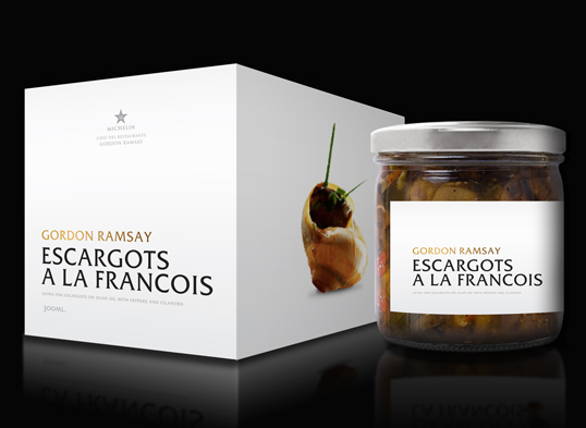
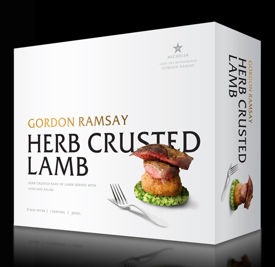
Designed by José Luis García Eguiguren | Country: Spain | Fonts used: ITC Friz Quadrata

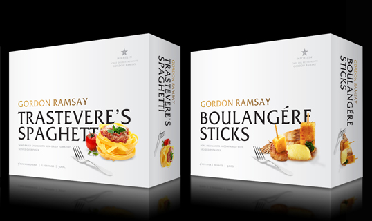
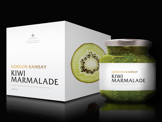
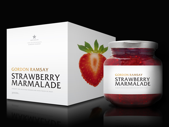
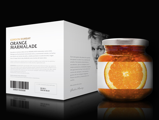
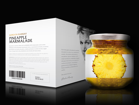
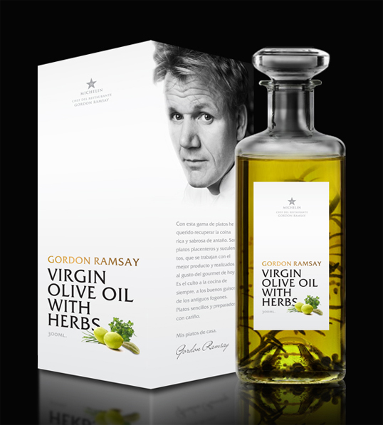
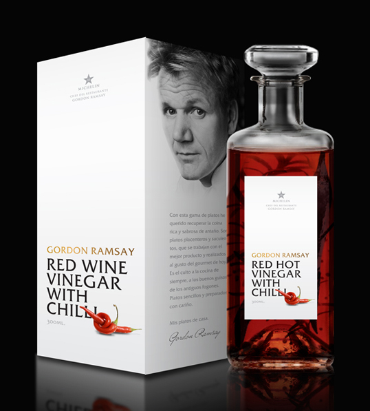
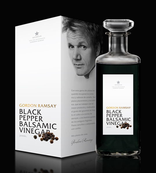
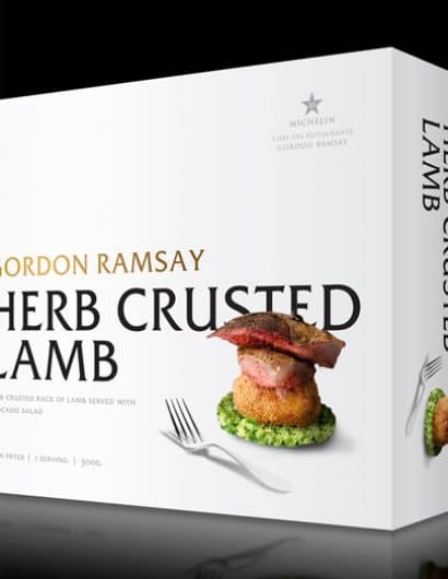
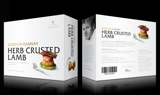
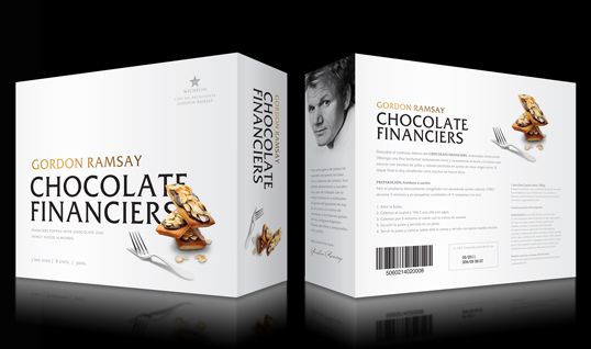
“Our assignment was to create an elegant product-line for a famous chef. I chose Gordon Ramsay, a renowned UK chef who has received 10 Michelin stars. For this, I utilized a clean and simple design that emphasized the typography as a differentiating element to accompany the photography.  Instead of laying out the food as it would appear on a plate, it is placed in a more artistic manner as if it was a sculpture. I used photographs on the  lateral panels of the boxes in order to create a more dynamic brand (example: escargots and marmalades). As you can see, it’s a very clean, elegant and simple way to create a brand that is unified by a typographic style.”
ramsay2

ramsay3

ramsay4

ramsay5

ramsay6

ramsay7

ramsay8

ramsay9

ramsay10

ramsay11

ramsay12

ramsay13

Get the latest packaging design inspiration in your inbox:

Popular designs

Burma Love Rebrand

Love at First BiteAs an extension of the Burma Superstar restaurant in San Francisco, Burma Love Foods gives diners an opportunity to

Far Out Bar

Description: Far Out Bar is a cutting-edge packaging design project created for High Life Farms’ macrodose THC chocolate bars. This project involved

Over the wave

This Kombucha originates in Lombok, Indonesia, where its paradise beaches attract hundreds of surfers eager to ride the waves. When you surf,

Designed by: PepsiCo Design & Innovation
Country: United States

Student Work – José Luis García Eguiguren

ramsay1

ramsay1

Designed by José Luis García Eguiguren | Country: Spain | Fonts used: ITC Friz Quadrata

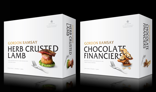
“Our assignment was to create an elegant product-line for a famous chef. I chose Gordon Ramsay, a renowned UK chef who has received 10 Michelin stars. For this, I utilized a clean and simple design that emphasized the typography as a differentiating element to accompany the photography.  Instead of laying out the food as it would appear on a plate, it is placed in a more artistic manner as if it was a sculpture. I used photographs on the  lateral panels of the boxes in order to create a more dynamic brand (example: escargots and marmalades). As you can see, it’s a very clean, elegant and simple way to create a brand that is unified by a typographic style.”
ramsay2

ramsay3

ramsay4

ramsay5

ramsay6

ramsay7

ramsay8

ramsay9

ramsay10

ramsay11

ramsay12

ramsay13

Previous slide
Next slide

Explore more great package design

Get the latest on packaging design in your inbox: