Designed by: PepsiCo Design & Innovation
Country: United States

Student Work – José Luis García Eguiguren

Student Work - José Luis García Eguiguren

Designed by José Luis García Eguiguren | Country: Spain

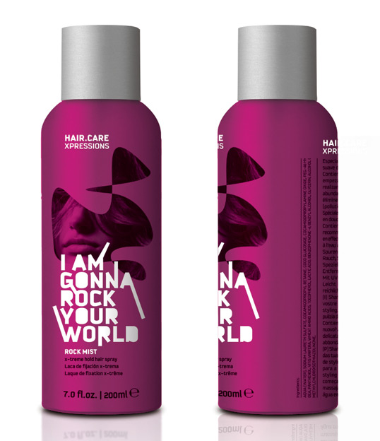
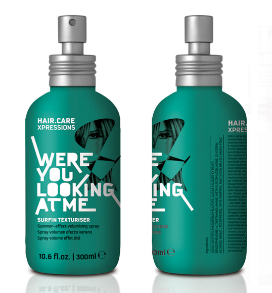
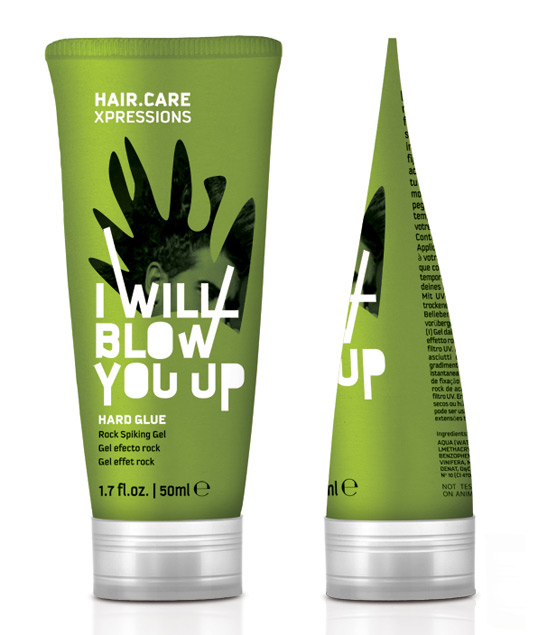
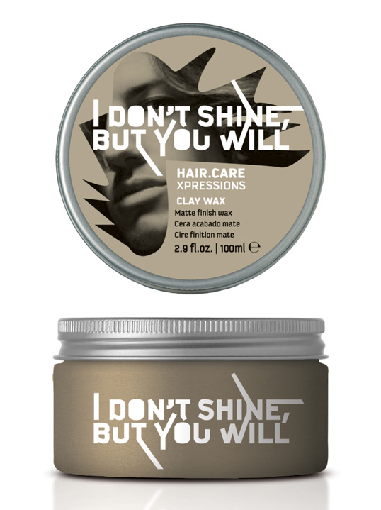
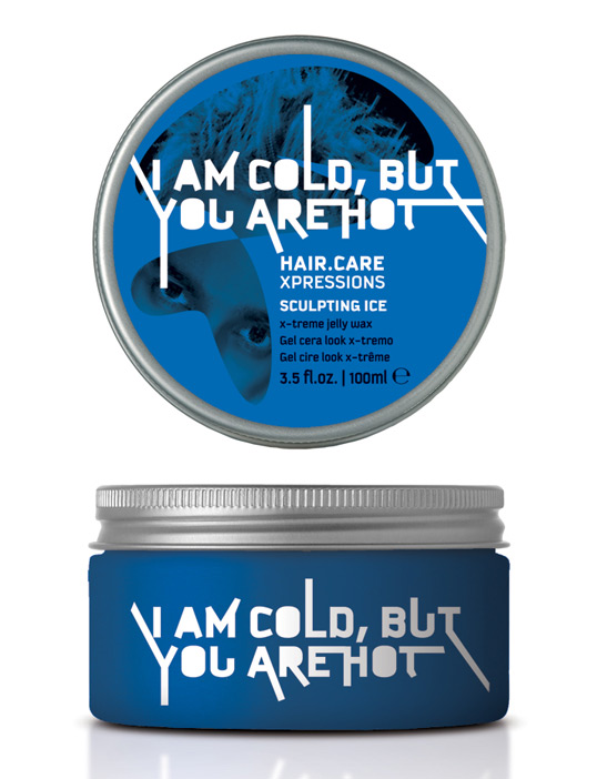
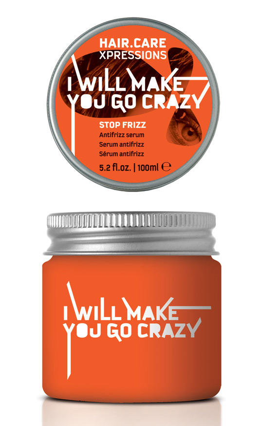
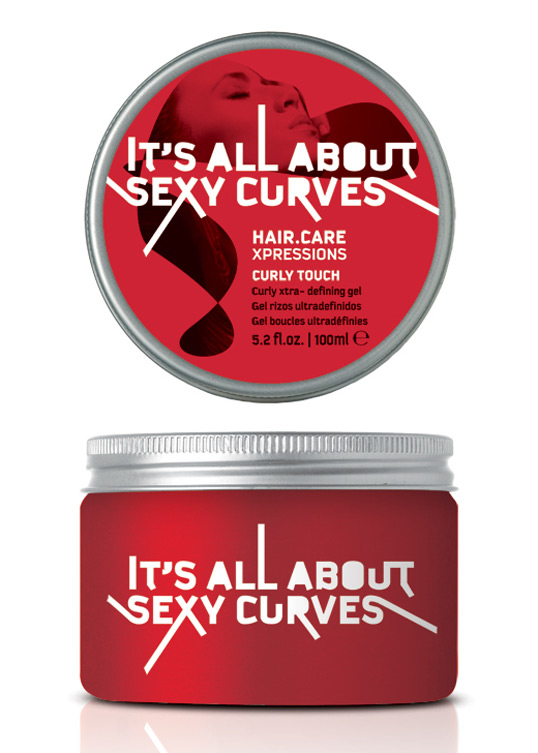
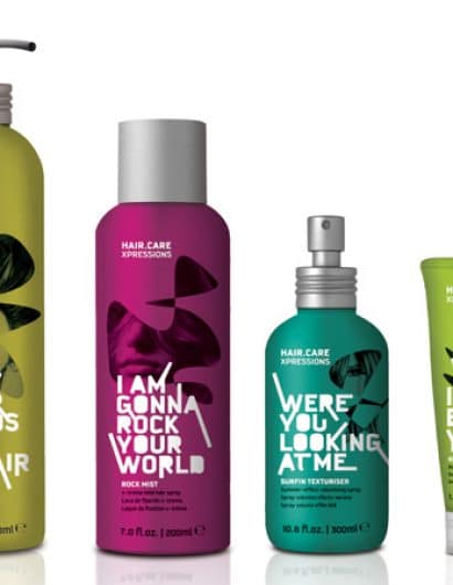
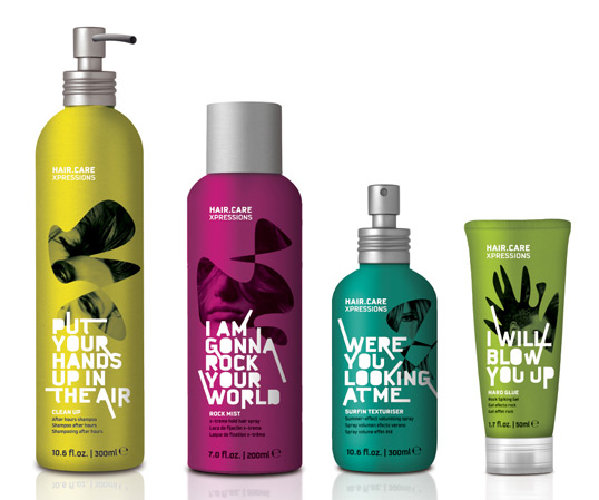
“The main idea of this project was to create a pack that communicates an expression that describes an action or a pick up line. The expressions communicates directly to costumer inviting to experience something new. The lettering its created from the basic typography KAUTIVA and interacts with the pack, giving a modern and unique style. The abstract shapes and images evokes hair style mixed with the facial expression of the person. This product will target young people looking for a different hairstyle. It will will be printed on matte metallic containers. The limitations on this project was not to change the containers and the main name of the Brand (HAIRCARE).”

Student Work - José Luis García Eguiguren

Student Work - José Luis García Eguiguren

Student Work - José Luis García Eguiguren

Student Work - José Luis García Eguiguren

Student Work - José Luis García Eguiguren

Student Work - José Luis García Eguiguren

Student Work - José Luis García Eguiguren

Student Work - José Luis García Eguiguren

Get the latest packaging design inspiration in your inbox:

Popular designs

Burma Love Rebrand

Love at First BiteAs an extension of the Burma Superstar restaurant in San Francisco, Burma Love Foods gives diners an opportunity to

The Port Vodka Lemon Water

Overview: In response to my client’s vision for a Cape Cod themed beverage brand, I embarked on the journey to create The Port

Pure Persian Honey

When we look closely at honey packaging, they are almost all in the usual format, and the ultimate in creativity is that

Designed by: PepsiCo Design & Innovation
Country: United States

Student Work – José Luis García Eguiguren

hair1

Student Work - José Luis García Eguiguren

Designed by José Luis García Eguiguren | Country: Spain

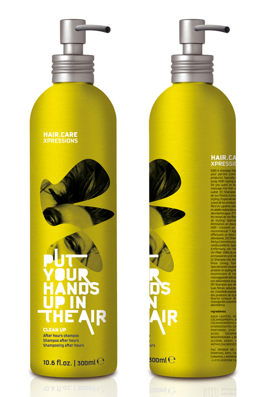
“The main idea of this project was to create a pack that communicates an expression that describes an action or a pick up line. The expressions communicates directly to costumer inviting to experience something new. The lettering its created from the basic typography KAUTIVA and interacts with the pack, giving a modern and unique style. The abstract shapes and images evokes hair style mixed with the facial expression of the person. This product will target young people looking for a different hairstyle. It will will be printed on matte metallic containers. The limitations on this project was not to change the containers and the main name of the Brand (HAIRCARE).”
Student Work - José Luis García Eguiguren

Student Work - José Luis García Eguiguren

Student Work - José Luis García Eguiguren

Student Work - José Luis García Eguiguren

Student Work - José Luis García Eguiguren

Student Work - José Luis García Eguiguren

Student Work - José Luis García Eguiguren

Student Work - José Luis García Eguiguren

Previous slide
Next slide

Explore more great package design

Get the latest on packaging design in your inbox: