Designed by Josh Carter | Country: United States
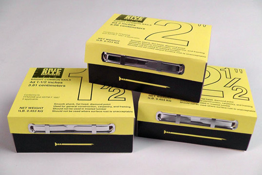
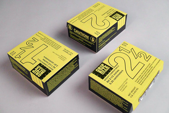
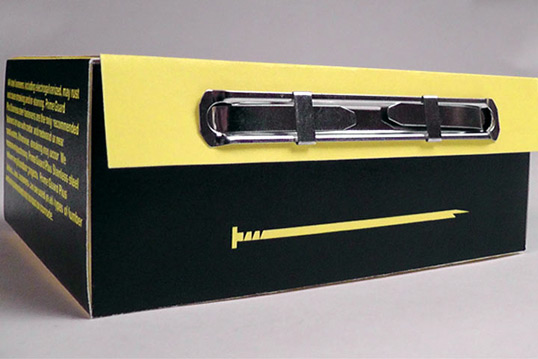
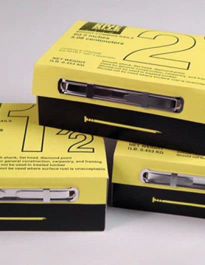
“The concept for the project was to re-design an existing package line that we found consumer unfriendly. I picked Grip Rite Fasteners because I didn’t think the design was as functional as it could have been. The logo also lacked creativity and grammatical correctness. The current Grip Rite Fasteners logo spells fasteners with an apostrophe (Fas’ners). I feel like I improved the functionality of the box by making the dimensions of the nails large and clear on the front. I also added a fastening mechanism on the front that I think looks clean and makes the box able to be closed conveniently.”


