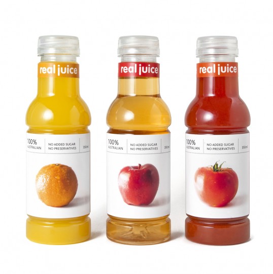
Designed by Julian Yeo | Country: Australia | Font: VAG Rounded
“The brand is named Real Juice with the idea of how the brand should be. That is friendly and subtly quirky. ‘VAG Rounded’ is used for the logotype to suit the characteristics of the brand. Real Juice is aimed at mid market consumers. I wanted to create a sense of familiarity and comfort by borrowing the fundamental aesthetics of real fruits. That is achieved through minimal and careful execution via photography and typography.”