Designed by: PepsiCo Design & Innovation
Country: United States

Student Work – Katelyn Peissig

Student Work - Katelyn Peissig

Designed by Katelyn Peissig | Country: United States

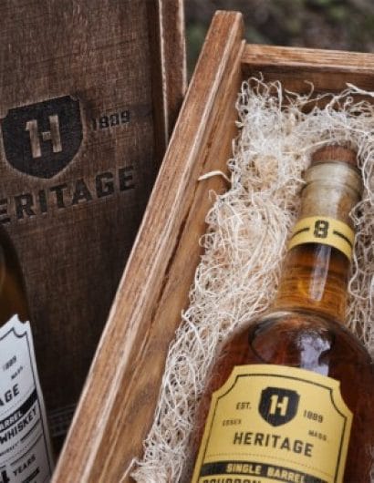
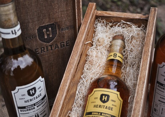
“Heritage is a brand of single barrel bourbon whiskey who’s packaging reflects the age-old process of true whisky making. The creation of Heritage Single Barrel Bourbon Whiskey starts out with natural spring water and American born corn that is placed in a copper still to be distilled. From there its placed in charred oak barrels to age and gain color and flavor from the wood. Once the barrels have aged, the Bourbon whiskey is hand bottled and packaged for the consumer’s drinking pleasure.

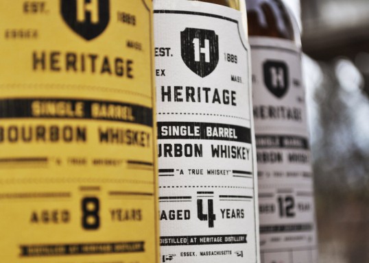
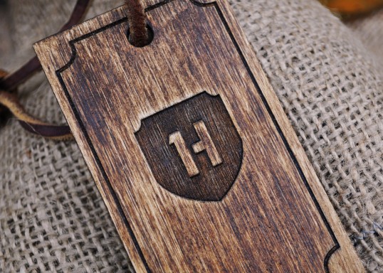
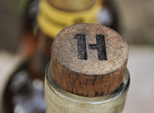
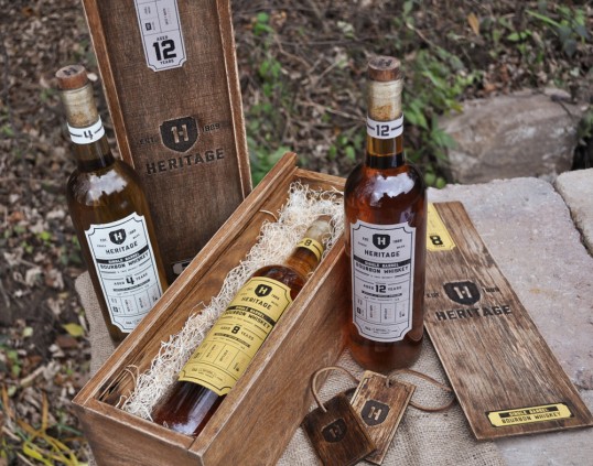
To reflect the history and process of Heritage, I developed a logo that incorporates the number “1,” as well as the letter “H,” to represent the product. I added a shield to further emphasize the history behind the whiskey. When designing the labels my main focus was for them to contain an aged feel, yet contemporary look. The bottles are encased in oak boxes that I have stained and distressed to reflect the oak barrels, in which the whiskey is aged in.”

Student Work - Katelyn Peissig

Student Work - Katelyn Peissig

Student Work - Katelyn Peissig

Student Work - Katelyn Peissig

Student Work - Katelyn Peissig

Get the latest packaging design inspiration in your inbox:

Popular designs

Designed by: PepsiCo Design & Innovation
Country: United States

Student Work – Katelyn Peissig

lovely-package-katelyn-peissig1

Student Work - Katelyn Peissig

Designed by Katelyn Peissig | Country: United States

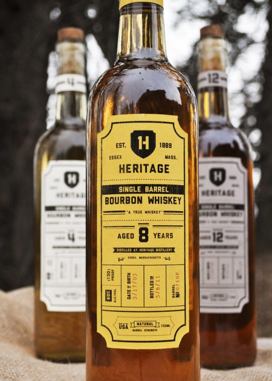
“Heritage is a brand of single barrel bourbon whiskey who’s packaging reflects the age-old process of true whisky making. The creation of Heritage Single Barrel Bourbon Whiskey starts out with natural spring water and American born corn that is placed in a copper still to be distilled. From there its placed in charred oak barrels to age and gain color and flavor from the wood. Once the barrels have aged, the Bourbon whiskey is hand bottled and packaged for the consumer’s drinking pleasure.

To reflect the history and process of Heritage, I developed a logo that incorporates the number “1,” as well as the letter “H,” to represent the product. I added a shield to further emphasize the history behind the whiskey. When designing the labels my main focus was for them to contain an aged feel, yet contemporary look. The bottles are encased in oak boxes that I have stained and distressed to reflect the oak barrels, in which the whiskey is aged in.”
Student Work - Katelyn Peissig

Student Work - Katelyn Peissig

Student Work - Katelyn Peissig

Student Work - Katelyn Peissig

Student Work - Katelyn Peissig

Explore more great package design

Get the latest on packaging design in your inbox: