Designed by: PepsiCo Design & Innovation
Country: United States

Student Work – Marcel Messner

lovely-package-marcel-messner-1

Designed by Marcel Messner | Country: Germany

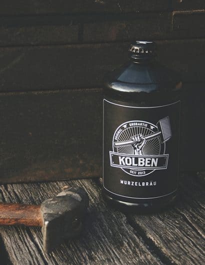
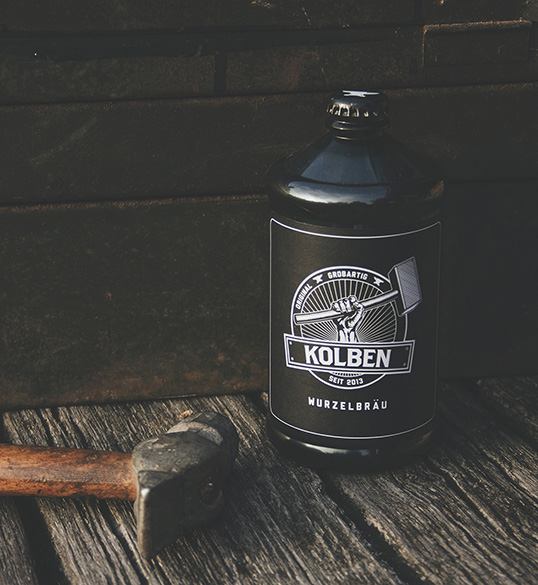
“Honest, authentic, strong – that’s KOLBEN, a real beer for real men. It’s the perfect refreshment after you spent a whole day in the forest chopping wood for your fireplace.

In this student project of the masters-program Packaging, Design & Marketing at Stuttgart Media University in Germany the task was to create a unique beverage brand including marketing, packaging and graphic design. From the earliest concepts to the production of the bottles and secondary packaging, we produced everything in-house at the University.”
lovely-package-marcel-messner-2

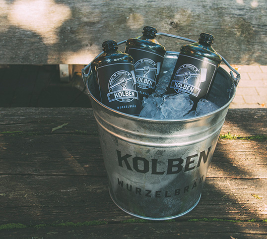
“KOLBEN Wurzelbräu is a brand targeting men between 25 and 60 years. It sets itself apart from the competition by being very down to earth – it’s a beer and nothing else, without designer editions or mixed beer variations. It’s the perfect drink after a long day, at a barbeque in your backyard or for watching a game with your buddies.”
lovely-package-marcel-messner-3 lovely-package-marcel-messner-4

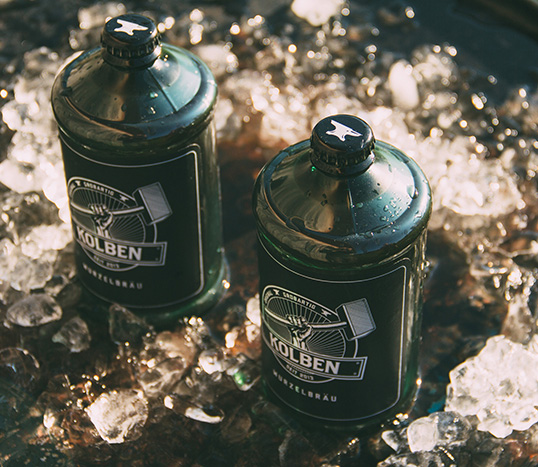
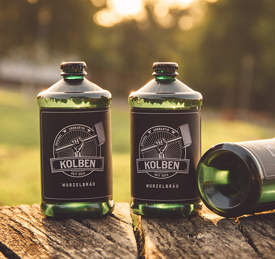
“The shape of the bottle is reminiscent of the first beer cans made in the 1930s. It has a massive diameter and is meant to be held by big manly hands. As an extra feature the bottles can be stacked for storage. Additionally the bottom of each bottle can be used to open the crown cap of another bottle. In that way the bottle is kind of a tool itself that should feel familiar to hard-working men.”
lovely-package-marcel-messner-5 lovely-package-marcel-messner-6 lovely-package-marcel-messner-7

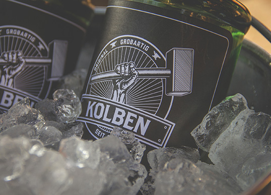
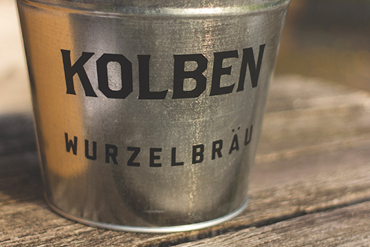
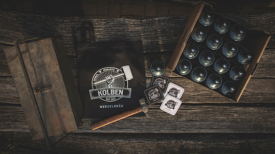
“The graphic design sticks to the brand values visualized by the strong hand wielding the forge hammer – as seen in the logo. The color palette consists of only black and white and the typography is strong and bold in order to further emphasize the plain, gritty and simple in-your-face approach.

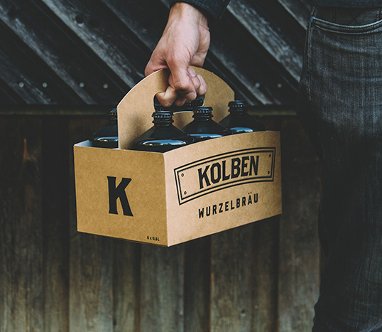
KOLBEN Wurzelbräu is sold as single bottles, sixpacks and in sustainable crates made of corrugated cardboard. The beer is distributed in supermarkets but also in gas stations and hardware stores.”

lovely-package-marcel-messner-8 lovely-package-marcel-messner-9

Get the latest packaging design inspiration in your inbox:

Popular designs

The Port Vodka Lemon Water

Overview: In response to my client’s vision for a Cape Cod themed beverage brand, I embarked on the journey to create The Port

Burma Love Rebrand

Love at First BiteAs an extension of the Burma Superstar restaurant in San Francisco, Burma Love Foods gives diners an opportunity to

Over the wave

This Kombucha originates in Lombok, Indonesia, where its paradise beaches attract hundreds of surfers eager to ride the waves. When you surf,

Designed by: PepsiCo Design & Innovation
Country: United States

Student Work – Marcel Messner

lovely-package-marcel-messner-1

lovely-package-marcel-messner-1

Designed by Marcel Messner | Country: Germany

“Honest, authentic, strong – that’s KOLBEN, a real beer for real men. It’s the perfect refreshment after you spent a whole day in the forest chopping wood for your fireplace.

In this student project of the masters-program Packaging, Design & Marketing at Stuttgart Media University in Germany the task was to create a unique beverage brand including marketing, packaging and graphic design. From the earliest concepts to the production of the bottles and secondary packaging, we produced everything in-house at the University.”

lovely-package-marcel-messner-2

“KOLBEN Wurzelbräu is a brand targeting men between 25 and 60 years. It sets itself apart from the competition by being very down to earth – it’s a beer and nothing else, without designer editions or mixed beer variations. It’s the perfect drink after a long day, at a barbeque in your backyard or for watching a game with your buddies.”

lovely-package-marcel-messner-3 lovely-package-marcel-messner-4

“The shape of the bottle is reminiscent of the first beer cans made in the 1930s. It has a massive diameter and is meant to be held by big manly hands. As an extra feature the bottles can be stacked for storage. Additionally the bottom of each bottle can be used to open the crown cap of another bottle. In that way the bottle is kind of a tool itself that should feel familiar to hard-working men.”
lovely-package-marcel-messner-5 lovely-package-marcel-messner-6 lovely-package-marcel-messner-7

“The graphic design sticks to the brand values visualized by the strong hand wielding the forge hammer – as seen in the logo. The color palette consists of only black and white and the typography is strong and bold in order to further emphasize the plain, gritty and simple in-your-face approach.

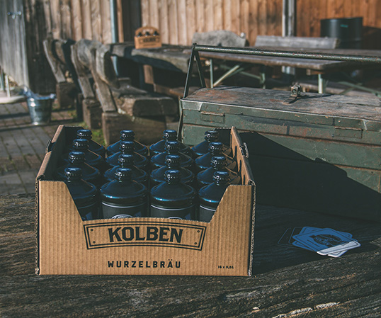
KOLBEN Wurzelbräu is sold as single bottles, sixpacks and in sustainable crates made of corrugated cardboard. The beer is distributed in supermarkets but also in gas stations and hardware stores.”
lovely-package-marcel-messner-8 lovely-package-marcel-messner-9

Previous slide
Next slide

Explore more great package design

Get the latest on packaging design in your inbox: