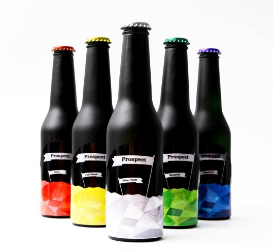
Designed by Matthew Melling | Country: United Kingdom
“In the 1840’s thousands of people flocked to America in search of gold. My rebrand is based on the idea of discovering rare and valuable minerals, hence “Prospect Brewery”. The box appears to be a wooden crate full of rocks or coal. 6 small holes give the viewer a glimpse of the product inside. The bottles are painted in matte black to represent the rocks in which the minerals would have been found. The labels have a glossy finish and the design represents the crystal form of rare raw materials. The customer will discover 6 new beers for the first time with a sense of curiosity, and the award winning beer inside will not disappoint.”