Designed by: PepsiCo Design & Innovation
Country: United States

Student Work – Morgan Sterns

Student Work - Morgan Sterns

Designed by Morgan Sterns | Country: United States

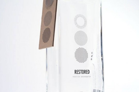
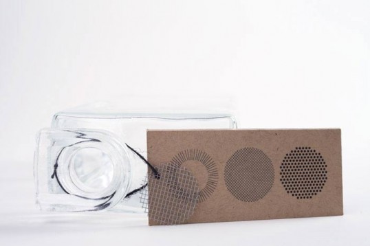
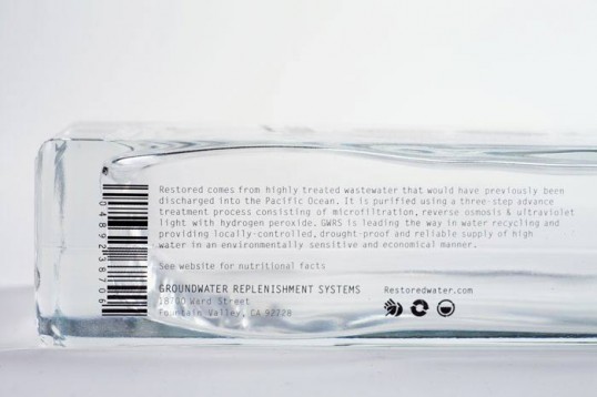
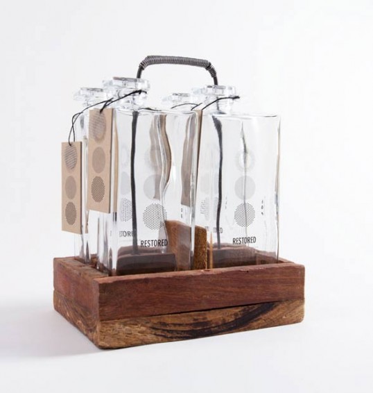
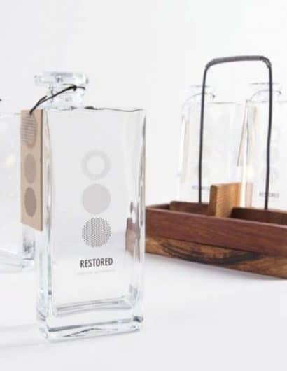
“The Restored water identity and packaging concept was strongly influenced by the process of taking highly treated wastewater that would have previously been discharged into the Pacific Ocean and purifying it using a three-step advanced treatment process. My main objective was to create a brand that would be a blueprint for water agencies throughout the world in order to help solve local water supply issues.

The logo and identity concept was inspired by patterns found in groundwater filtration systems while the packaging concept inspiration came from mixing clean lines with stainless steel, glass, and recycled wood materials. The final system resulted in the creation of a line of reusable water canteens that convey a modern and minimalistic approach to design while still functioning as a piece of art in the household.”

Student Work - Morgan Sterns

Student Work - Morgan Sterns

Student Work - Morgan Sterns

Student Work - Morgan Sterns

Get the latest packaging design inspiration in your inbox:

Popular designs

Burma Love Rebrand

Love at First BiteAs an extension of the Burma Superstar restaurant in San Francisco, Burma Love Foods gives diners an opportunity to

Over the wave

This Kombucha originates in Lombok, Indonesia, where its paradise beaches attract hundreds of surfers eager to ride the waves. When you surf,

Designed by: PepsiCo Design & Innovation
Country: United States

Student Work – Morgan Sterns

lovely-package-morgan-sterns-1

Student Work - Morgan Sterns

Designed by Morgan Sterns | Country: United States

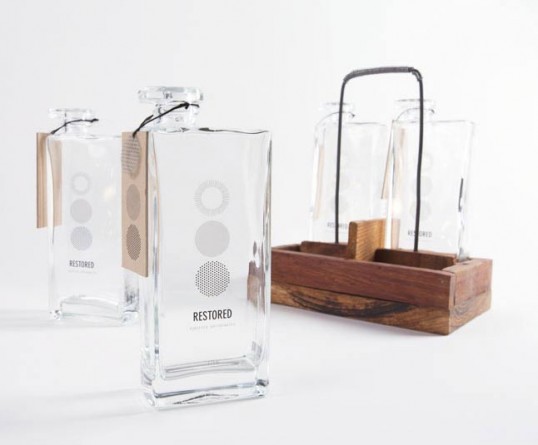
“The Restored water identity and packaging concept was strongly influenced by the process of taking highly treated wastewater that would have previously been discharged into the Pacific Ocean and purifying it using a three-step advanced treatment process. My main objective was to create a brand that would be a blueprint for water agencies throughout the world in order to help solve local water supply issues.

The logo and identity concept was inspired by patterns found in groundwater filtration systems while the packaging concept inspiration came from mixing clean lines with stainless steel, glass, and recycled wood materials. The final system resulted in the creation of a line of reusable water canteens that convey a modern and minimalistic approach to design while still functioning as a piece of art in the household.”
Student Work - Morgan Sterns

Student Work - Morgan Sterns

Student Work - Morgan Sterns

Student Work - Morgan Sterns

Previous slide
Next slide

Explore more great package design

Get the latest on packaging design in your inbox: