Designed by: PepsiCo Design & Innovation
Country: United States

Student Work – Oliver Lan

Student Work - Oliver Lan

Designed by Oliver Lan | Country: United States

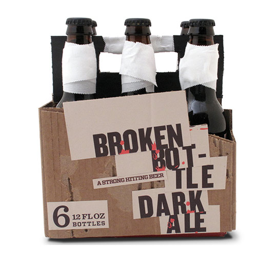
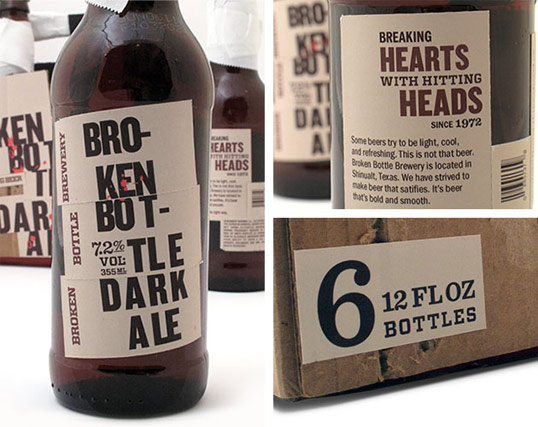
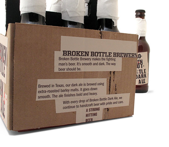
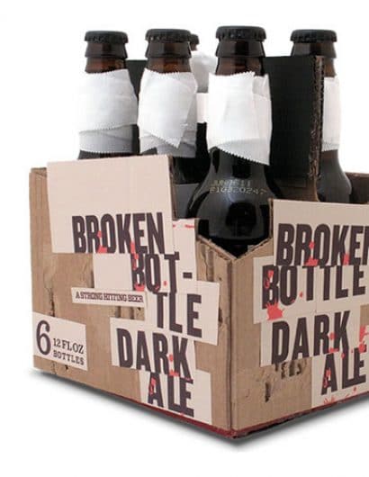
“Broken Bottle asked us to develop a brand that packages their beer with a lot of bite. We centered the brand around their name and as ‘a strong hitting beer.’ The brand harkens to a time where beer is centered around craftsmanship. However, the packaging reflects the broken name and the beer’s hard-hitting flavor. The various elements of the package are cut into different sections and applied over stripped and worn cardboard. The typography is a mess. The bottles are bandaged. The handle is taped together. It’s a broken beer with broken packaging.”

Student Work - Oliver Lan

Student Work - Oliver Lan

Student Work - Oliver Lan


Get the latest packaging design inspiration in your inbox:

Popular designs

The Port Vodka Lemon Water

Overview: In response to my client’s vision for a Cape Cod themed beverage brand, I embarked on the journey to create The Port

Burma Love Rebrand

Love at First BiteAs an extension of the Burma Superstar restaurant in San Francisco, Burma Love Foods gives diners an opportunity to

Pure Persian Honey

When we look closely at honey packaging, they are almost all in the usual format, and the ultimate in creativity is that

Over the wave

This Kombucha originates in Lombok, Indonesia, where its paradise beaches attract hundreds of surfers eager to ride the waves. When you surf,

Designed by: PepsiCo Design & Innovation
Country: United States

Student Work – Oliver Lan

lovely-package-oliver-lan1

Student Work - Oliver Lan

Designed by Oliver Lan | Country: United States

“Broken Bottle asked us to develop a brand that packages their beer with a lot of bite. We centered the brand around their name and as ‘a strong hitting beer.’ The brand harkens to a time where beer is centered around craftsmanship. However, the packaging reflects the broken name and the beer’s hard-hitting flavor. The various elements of the package are cut into different sections and applied over stripped and worn cardboard. The typography is a mess. The bottles are bandaged. The handle is taped together. It’s a broken beer with broken packaging.”
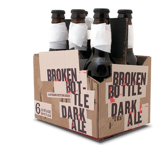
Student Work - Oliver Lan

Student Work - Oliver Lan

Student Work - Oliver Lan


Previous slide
Next slide

Explore more great package design

Get the latest on packaging design in your inbox: