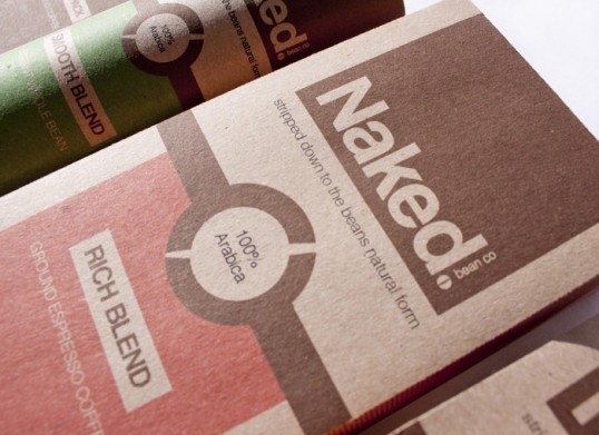
Designed by Samantha Hartill | Country: United Kingdom
“Coffee beans go through a rigorous process to be ‘stripped down to their natural form.’ Therefore, by the end stage of the process – the bean is ‘Naked.’ This is the rationale behind the name, theme and strap line of this coffee brand.
Coffee is a drink favoured by an adult audience. Therefore, the theme and copyright behind this brand will appeal and be understood by the intended audience.”


“There are plenty of references relating to being naked in a descriptive and an instructive way in how the audience interact with the packages. Although, on the front this appears to be fun and cheeky with references to skinny dipping and going commando, but on the back there is a deeper meaning – The Naked Truth. The brand has a strong connection with Fairtrade. Therefore, Naked Bean Co, have revealed their brand values and the reason why the audience is needed to keep the range alive and also the makers behind the beans – Fairtrade, upholding an ethical brand value with Fairtrade and the Naked truth.”


“The package design is to be natural and neutral, with a playful outlook intended for adults. Each package is to be a different shape, but the visual language needs to be consistent to keep them a ‘Naked family.”


“There is a Naked scale, depending on the strength of the coffee, one bean being smooth to three beans being strong.”