Designed by: PepsiCo Design & Innovation
Country: United States

Student Work | Sanyukta Kothari

Student Work | Sanyukta Kothari

Designed by Sanyukta Kothari | Country: United States

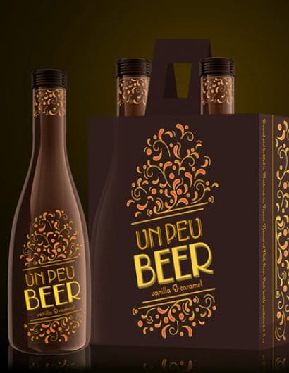
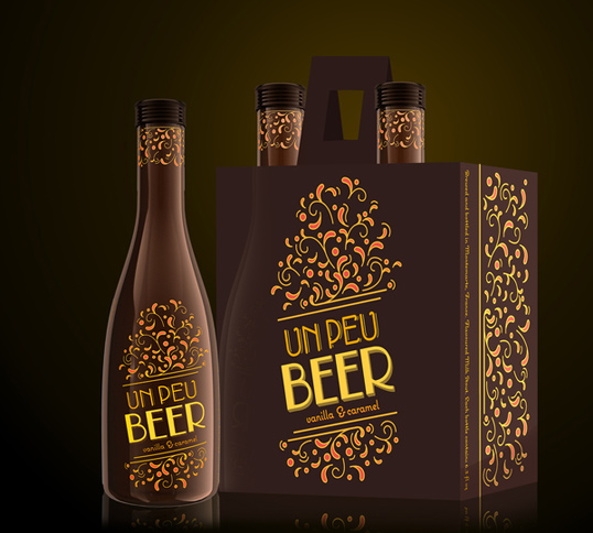
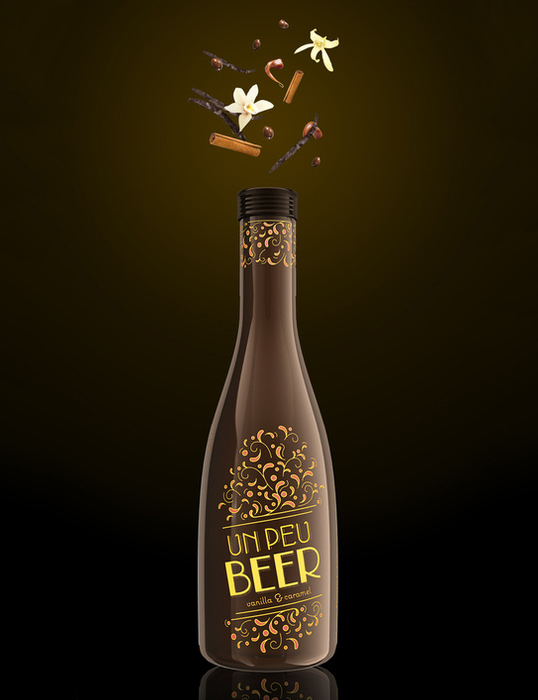
“The dessert beer is called Un Peu, French for ‘a little’, which is exactly how an indulgence like this should be. It is bottled in small and slender 180 ml (6.3 fl. oz.) bottles, rather than the standard stubby 12 fl. oz. bottles, a size carefully chosen based on the unusual product category. It is also packaged in 2-packs, rather than 6-packs, as it is not boisterous frat-party beer meant to be consumed in giant quantities, but dessert beer, that calls for a more sophisticated and intimate drinking experience. Like a special date, with a close friend, or over fine conversation late into the night.

Drawing from the rich, warm colour palette of the Moulin Rouge and the ostentation, the label graphics depict the heady crescendo of flavours in the beer. The type is inspired by the French Art Nouveau typography of the late nineteenth century, and has been re-drawn and embellished to fit the modern context. The 2-pack has been designed to resemble a bag (similar to wine gift bags), perfect for gifting.”

Student Work | Sanyukta Kothari

Get the latest packaging design inspiration in your inbox:

Popular designs

Designed by: PepsiCo Design & Innovation
Country: United States

Student Work | Sanyukta Kothari

peu1

Student Work | Sanyukta Kothari

Designed by Sanyukta Kothari | Country: United States

“The dessert beer is called Un Peu, French for ‘a little’, which is exactly how an indulgence like this should be. It is bottled in small and slender 180 ml (6.3 fl. oz.) bottles, rather than the standard stubby 12 fl. oz. bottles, a size carefully chosen based on the unusual product category. It is also packaged in 2-packs, rather than 6-packs, as it is not boisterous frat-party beer meant to be consumed in giant quantities, but dessert beer, that calls for a more sophisticated and intimate drinking experience. Like a special date, with a close friend, or over fine conversation late into the night.

Drawing from the rich, warm colour palette of the Moulin Rouge and the ostentation, the label graphics depict the heady crescendo of flavours in the beer. The type is inspired by the French Art Nouveau typography of the late nineteenth century, and has been re-drawn and embellished to fit the modern context. The 2-pack has been designed to resemble a bag (similar to wine gift bags), perfect for gifting.”
Student Work | Sanyukta Kothari

Explore more great package design

Get the latest on packaging design in your inbox: