Designed by: PepsiCo Design & Innovation
Country: United States

Student Work – Sarah Cespedes

Student Work - Sarah Cespedes

Designed by Sarah Cespedes | Country: United States

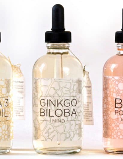
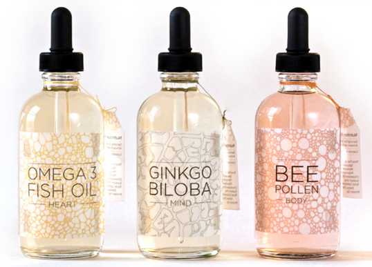
“Heart, mind, & body vitamins are geared towards people who are interested in natural supplements. The packaging is slightly transparent in order to highlight the beauty of the natural products. The products are in liquid form for people who don’t want to spend their days taking a lot of pills. The patterns on the labels abstractly reflect the different systems of the body that the particular vitamin benefits. The color palette is soothing and pleasant which gives the user a feeling of ease and assurance that the supplements they’re taking are pure and natural.”

Get the latest packaging design inspiration in your inbox:

Popular designs

Art Meets Craftsmanship in BrewBeak Beer Series Packaging Design

“BrewBeak Beer Series Packaging Design artfully fuses craftsmanship and art, reflecting the brand’s philosophy and the beauty of nature. Through minimalist design and bird-themed illustrations, each package uniquely represents different beer varieties, creating a memorable and sophisticated brand identity.”

Pepsi Introduces Limited Edition Peach and Lime Flavors

Pepsi launches its summer BBQ campaign with new limited-edition flavors, Pepsi Lime and Pepsi Peach, designed to complement the festive, smoky essence of outdoor grilling. These vibrant, fruit-inspired designs not only promise a refreshing taste but also stand out with their visually appealing packaging, capturing the essence of summer.

Designed by: PepsiCo Design & Innovation
Country: United States

Student Work – Sarah Cespedes

oils

Student Work - Sarah Cespedes

Designed by Sarah Cespedes | Country: United States

“Heart, mind, & body vitamins are geared towards people who are interested in natural supplements. The packaging is slightly transparent in order to highlight the beauty of the natural products. The products are in liquid form for people who don’t want to spend their days taking a lot of pills. The patterns on the labels abstractly reflect the different systems of the body that the particular vitamin benefits. The color palette is soothing and pleasant which gives the user a feeling of ease and assurance that the supplements they’re taking are pure and natural.”

Previous slide
Next slide
Get the latest on packaging design in your inbox: