Designed by: PepsiCo Design & Innovation
Country: United States

Student Work – Spencer Bigum

Student Work - Spencer Bigum

Designed by Spencer Bigum | Country: United States

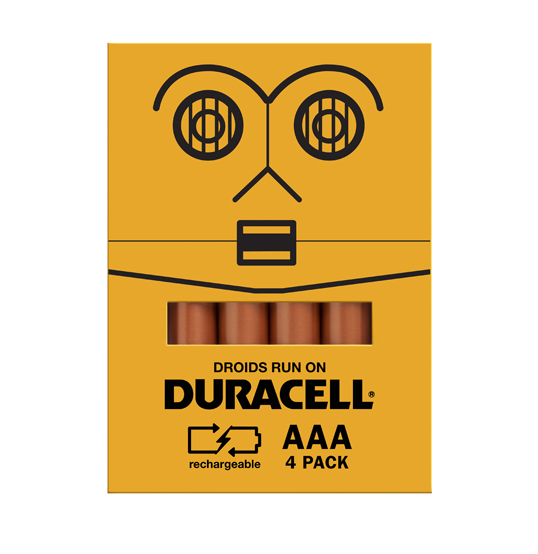
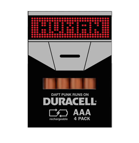
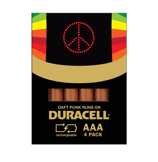
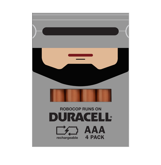
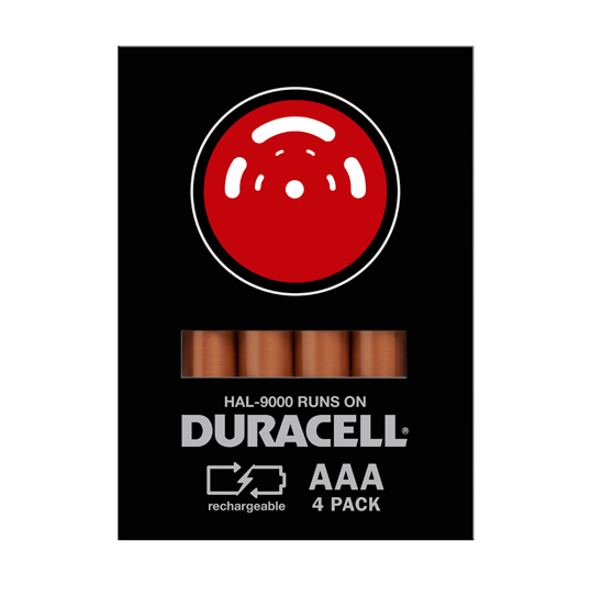
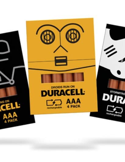
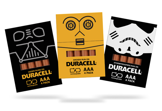
“The design of the package was created to be simple, bold, and iconic. To make buying a battery, like buying a toy! The traditional package of the battery was reversed to first optimize the amount of space to design on and second, the removal of all plastic needed to be used on the package. A die-cut is made to show the “copper top” and the size of the battery for a visual reference as to what type – AA, AAA, D etc… in addition to the call out on the front of the package. Simple clean typography supports the idea of simple but bold and a new symbol for rechargeable was created to help promote and sell this smarter type of battery.”

Student Work - Spencer Bigum

Student Work - Spencer Bigum

Student Work - Spencer Bigum

Student Work - Spencer Bigum

Student Work - Spencer Bigum

Student Work - Spencer Bigum

Student Work - Spencer Bigum

Get the latest packaging design inspiration in your inbox:

Popular designs

Far Out Bar

Description: Far Out Bar is a cutting-edge packaging design project created for High Life Farms’ macrodose THC chocolate bars. This project involved

Over the wave

This Kombucha originates in Lombok, Indonesia, where its paradise beaches attract hundreds of surfers eager to ride the waves. When you surf,

Burma Love Rebrand

Love at First BiteAs an extension of the Burma Superstar restaurant in San Francisco, Burma Love Foods gives diners an opportunity to

Designed by: PepsiCo Design & Innovation
Country: United States

Student Work – Spencer Bigum

lovely-package-duracell1

Student Work - Spencer Bigum

Designed by Spencer Bigum | Country: United States

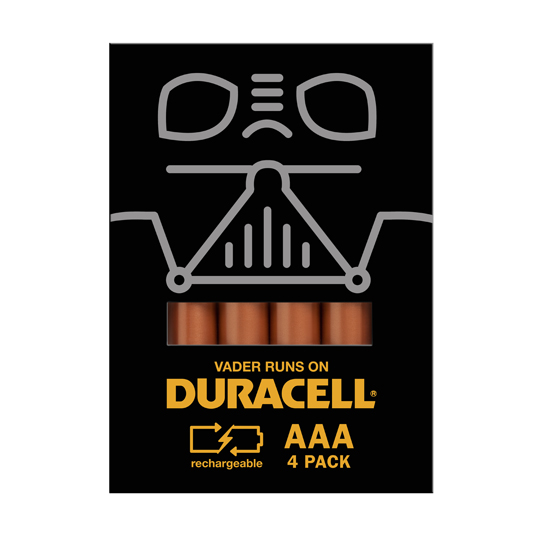
“The design of the package was created to be simple, bold, and iconic. To make buying a battery, like buying a toy! The traditional package of the battery was reversed to first optimize the amount of space to design on and second, the removal of all plastic needed to be used on the package. A die-cut is made to show the “copper top” and the size of the battery for a visual reference as to what type – AA, AAA, D etc… in addition to the call out on the front of the package. Simple clean typography supports the idea of simple but bold and a new symbol for rechargeable was created to help promote and sell this smarter type of battery.”
Student Work - Spencer Bigum

Student Work - Spencer Bigum

Student Work - Spencer Bigum

Student Work - Spencer Bigum

Student Work - Spencer Bigum

Student Work - Spencer Bigum

Student Work - Spencer Bigum

Explore more great package design

Get the latest on packaging design in your inbox: