Designed by: PepsiCo Design & Innovation
Country: United States

Student Work – Westerdals School of Communication

Student Work - Westerdals School of Communication

Designed by Eivind Reibo Jentoft, June Saglie Holte & Rebecca Egebjerg | Country: Norway

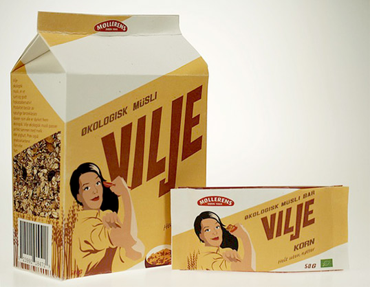
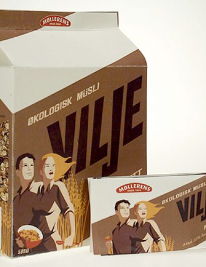
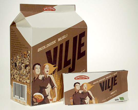
“The brief was to make a package for Møllerens new (fictional) ecological muesli cereal series. The different flavours are Corn, Nut, and Blueberry/Black Crowberry.

The main target-group are strong, well-educated, urban women in the age 25-40, Who care about making an ecological choice for both their health and the planet’s. We named the product “Vilje”, it means WILL in Norwegian and is also a womans name.

We wanted to make something that was a clear alternative to the boring and simular competition. We focused on making a package that was easy to use and didn’t make a lot of mess for a quick breakfast. It is printed on 100% recycled paper. The design is inspired by the 1940’s propaganda posters directed towards woman and radiates energy, health and happiness.”

Student Work - Westerdals School of Communication

Student Work - Westerdals School of Communication

Get the latest packaging design inspiration in your inbox:

Popular designs

Over the wave

This Kombucha originates in Lombok, Indonesia, where its paradise beaches attract hundreds of surfers eager to ride the waves. When you surf,

The Bra Guru

Most women are wearing the wrong size bra and that is a fact. The Bra Guru® is the first and only professional

Pure Persian Honey

When we look closely at honey packaging, they are almost all in the usual format, and the ultimate in creativity is that

Designed by: PepsiCo Design & Innovation
Country: United States

Student Work – Westerdals School of Communication

vilje1

Student Work - Westerdals School of Communication

Designed by Eivind Reibo Jentoft, June Saglie Holte & Rebecca Egebjerg | Country: Norway

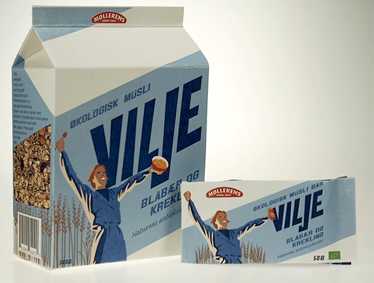
“The brief was to make a package for Møllerens new (fictional) ecological muesli cereal series. The different flavours are Corn, Nut, and Blueberry/Black Crowberry.

The main target-group are strong, well-educated, urban women in the age 25-40, Who care about making an ecological choice for both their health and the planet’s. We named the product “Vilje”, it means WILL in Norwegian and is also a womans name.

We wanted to make something that was a clear alternative to the boring and simular competition. We focused on making a package that was easy to use and didn’t make a lot of mess for a quick breakfast. It is printed on 100% recycled paper. The design is inspired by the 1940’s propaganda posters directed towards woman and radiates energy, health and happiness.”
Student Work - Westerdals School of Communication

Student Work - Westerdals School of Communication

Previous slide
Next slide

Explore more great package design

Get the latest on packaging design in your inbox: