Designed by: PepsiCo Design & Innovation
Country: United States

Student Work – Yunyeen Yong

Student Work - Yunyeen Yong

Designed by Yunyeen Yong | Country: Australia

“Jooze is a fictional company that manufactures fresh fruit juices, catered especially to kindergarten and primary school students. It is a company that believes that healthy eating habits should begin at a very young age.

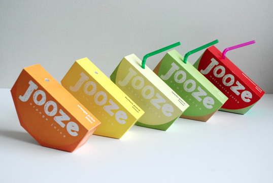
The shape of the logo is inspired by the shape of a sliced fruit, and the handwritten typeface used is to portray a sense of fun, hands-on personality and characteristic that appeals to kids and toddlers. The logo also consists of singular bright colours, which may vary depending on the flavour of the juice. This would hopefully be a recognisable icon whereby children can relate and connect to the brand.

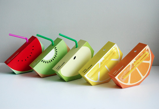
A simplified illustration of the fruits are to further clarify the flavours, to add visual aesthetics, and to appeal and connect to the target audience.

The juice box is shaped in an unconventional way to incorporate the essence of the logo, to gain instant recognition from the audience, and to capture their attention, especially if this product is placed alongside other juices on the supermarket shelves.”

Student Work - Yunyeen Yong

Get the latest packaging design inspiration in your inbox:

Popular designs

Far Out Bar

Description: Far Out Bar is a cutting-edge packaging design project created for High Life Farms’ macrodose THC chocolate bars. This project involved

Pure Persian Honey

When we look closely at honey packaging, they are almost all in the usual format, and the ultimate in creativity is that

Burma Love Rebrand

Love at First BiteAs an extension of the Burma Superstar restaurant in San Francisco, Burma Love Foods gives diners an opportunity to

Designed by: PepsiCo Design & Innovation
Country: United States

Student Work – Yunyeen Yong

jooze1

Student Work - Yunyeen Yong

Designed by Yunyeen Yong | Country: Australia

“Jooze is a fictional company that manufactures fresh fruit juices, catered especially to kindergarten and primary school students. It is a company that believes that healthy eating habits should begin at a very young age.

The shape of the logo is inspired by the shape of a sliced fruit, and the handwritten typeface used is to portray a sense of fun, hands-on personality and characteristic that appeals to kids and toddlers. The logo also consists of singular bright colours, which may vary depending on the flavour of the juice. This would hopefully be a recognisable icon whereby children can relate and connect to the brand.

A simplified illustration of the fruits are to further clarify the flavours, to add visual aesthetics, and to appeal and connect to the target audience.

The juice box is shaped in an unconventional way to incorporate the essence of the logo, to gain instant recognition from the audience, and to capture their attention, especially if this product is placed alongside other juices on the supermarket shelves.”
Student Work - Yunyeen Yong

Previous slide
Next slide

Explore more great package design

Get the latest on packaging design in your inbox: