Designed by mousegraphics | Country: Greece
“The briefing (in brief): We produce a good organic wine that we want to place in a highly competitive market via a strong packaging design idea.
The target consumer: Design conscious consumers ready to try a cared-for product.
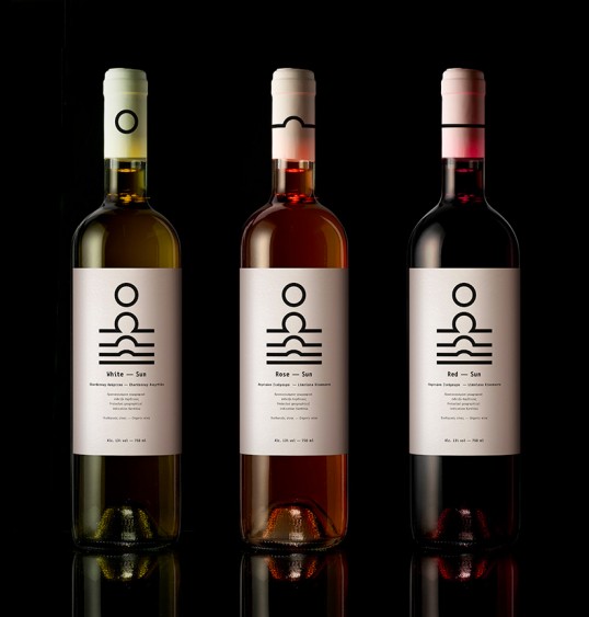
The design: One of the most creative and difficult areas of packaging design is probably this of wine. In the case of Sun wines, we focused on the wine color and the ways it corresponds to particular solar phases: the deep red of a setting sun, the gold white of its mid day radiance, the pinkish rose of the early rising star. We designed the abstract time sequence of these phases on each bottle, with a sign created specifically for each variety and placed near the rim of the bottle carrying this variety. The sun, solar light is one of the most elemental, eternal ingredients of wine alchemy. Its role cannot possibly be measured or even described, but its value can be commemorated and appreciated.”