Designed by: PepsiCo Design & Innovation
Country: United States

Superdrug Hair Removal

superdrug-fd

Designed by Burst | Country: United Kingdom

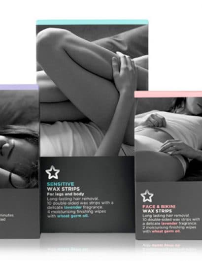
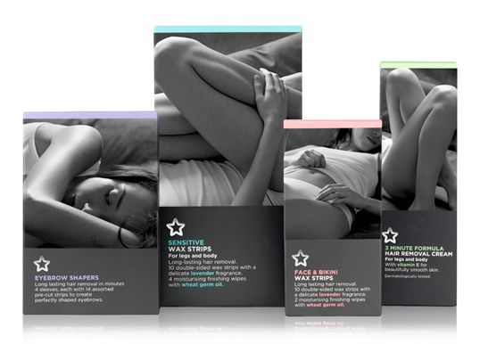
“We wanted to take away the embarrassment factor of the whole depils sector, which seems to be generally treated the same as SanPro in its styling. We have focused on the beautiful natural body, using high contrast black and white photography that has a sheen effect, emphasising the smooth skin and evoking the emotion of someone being at one and relaxed with the whole situation. The close up black and white editorial photographic style to empower and inspire the purchaser, not make her feel like a ‘bloke’ that needs a shave or a ‘hairy old witch’. The high contrast images use relevant parts of the body to help communicate which product to use and the coloured band at the top helps differentiate further.”

Get the latest packaging design inspiration in your inbox:

Popular designs

Harry Brompton’s Iced Tea Unveils New Packaging Design by Gency

Discover the vibrant new look of Harry Brompton’s Iced Tea, masterfully redesigned by Gency, and taste the summer with the introduction of their refreshing new Summer Berries flavour. Dive into a world where design meets deliciousness and experience the finest RTD tea.

Designed by: PepsiCo Design & Innovation
Country: United States

Superdrug Hair Removal

superdrug-fd

superdrug-fd

Designed by Burst | Country: United Kingdom

“We wanted to take away the embarrassment factor of the whole depils sector, which seems to be generally treated the same as SanPro in its styling. We have focused on the beautiful natural body, using high contrast black and white photography that has a sheen effect, emphasising the smooth skin and evoking the emotion of someone being at one and relaxed with the whole situation. The close up black and white editorial photographic style to empower and inspire the purchaser, not make her feel like a ‘bloke’ that needs a shave or a ‘hairy old witch’. The high contrast images use relevant parts of the body to help communicate which product to use and the coloured band at the top helps differentiate further.”

Previous slide
Next slide
Get the latest on packaging design in your inbox: