Designed by: PepsiCo Design & Innovation
Country: United States

Superdrug Nappies

super1

Designed by Burst | Country: United Kingdom

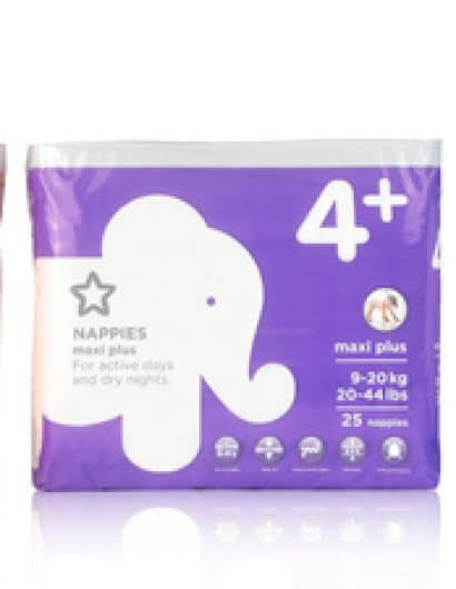
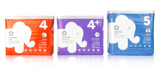
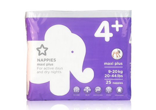
“The Superdrug Nappies range is a part of the overall baby range, design update that burst did this year. It is carried across nappies, toiletries, wipes and accessories. We chose a bold iconic graphic animal theme to work across the range, reminiscent of children’s board books to engage both mother and child. The simplified iconic animals images help identify the products on shelf and aid partners and family when purchasing i.e. “The red elephant pack”. And the large bold use of type for the age also helps identify which product to select. The packs simplicity is far removed from the chaotic graphic mess that dominates the nappy sector.”
super2

Get the latest packaging design inspiration in your inbox:

Popular designs

Luxurious Packaging Design for Saudi Chocolatier Fahda by TOLD

Discover how TOLD transformed the packaging of Saudi chocolate brand Fahda, creating an opulent unboxing experience with liquid gold lettering, cheetah iconography, and intricately embossed jungle landscapes. A luxury experience even before tasting the chocolate.

Dama Blanca: Packaging Design for Salt of Cádiz

Discover the artisanal salt packaging design for Dama Blanca, a family project from Salinas of Cádiz. The design reflects the brand’s 3000-year history, authenticity and love for the sea, using natural materials and a sea-inspired palette.

Designed by: PepsiCo Design & Innovation
Country: United States

Superdrug Nappies

super1

super1

Designed by Burst | Country: United Kingdom

“The Superdrug Nappies range is a part of the overall baby range, design update that burst did this year. It is carried across nappies, toiletries, wipes and accessories. We chose a bold iconic graphic animal theme to work across the range, reminiscent of children’s board books to engage both mother and child. The simplified iconic animals images help identify the products on shelf and aid partners and family when purchasing i.e. “The red elephant pack”. And the large bold use of type for the age also helps identify which product to select. The packs simplicity is far removed from the chaotic graphic mess that dominates the nappy sector.”

super2

Previous slide
Next slide
Get the latest on packaging design in your inbox: