Designed by: PepsiCo Design & Innovation
Country: United States

Talbot Forest Cheese Packaging Design

Designed by: Onfire | Country: New Zealand

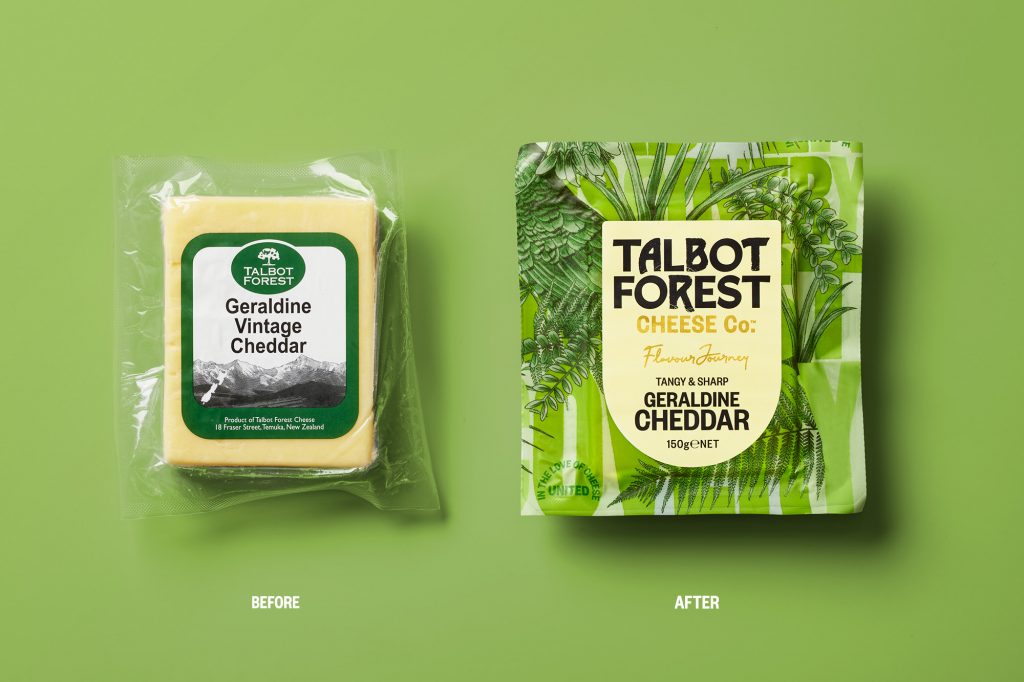
Established in 2000, Talbot Forest Cheese has now become a household name for “high-quality specialty cheese.” Named after Talbot Forest on the South Island of New Zealand, the brand was destined to disrupt the cheese market; however, lack of attention did not allow the company to go past its current status.

“…a lack of attention to the brand and packaging has resulted in a ‘manufacturer’ brand rather than the disruptive iconic Kiwi brand it should be. We were tasked with its recreation and challenged to bring to life its story, quirky personality and unique perspective in cheese making.”
Talbot Forest Cheese Packaging Design

The packaging

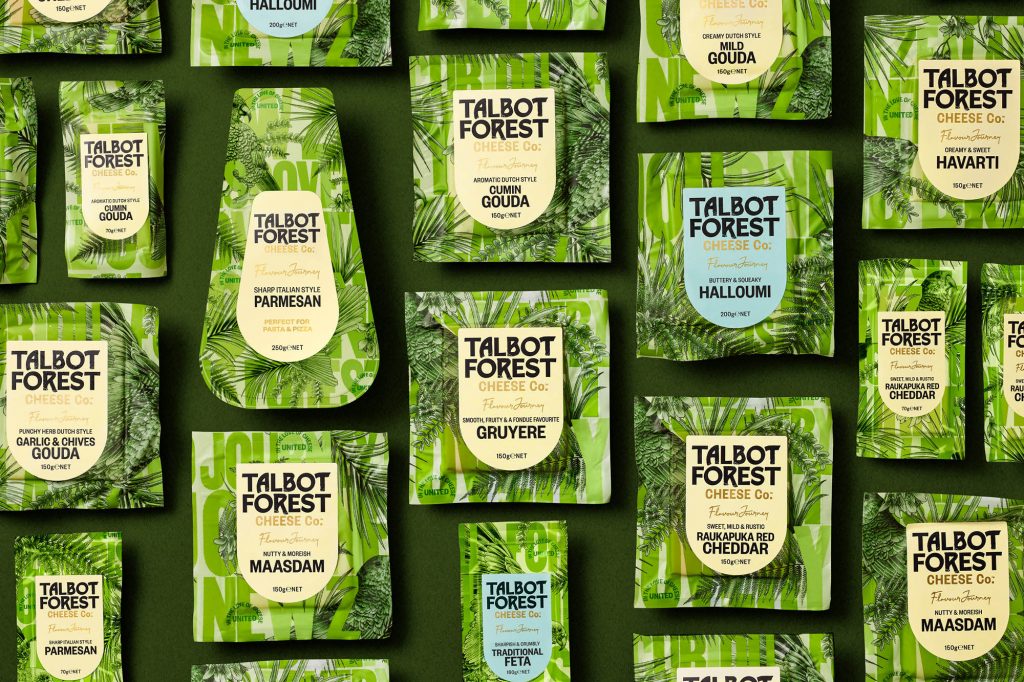
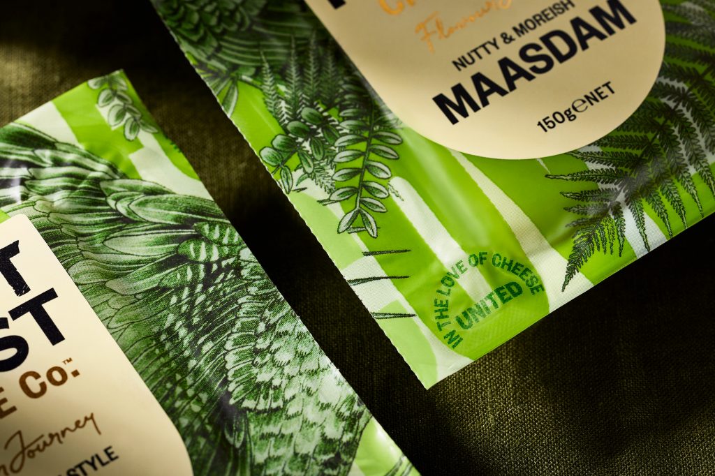
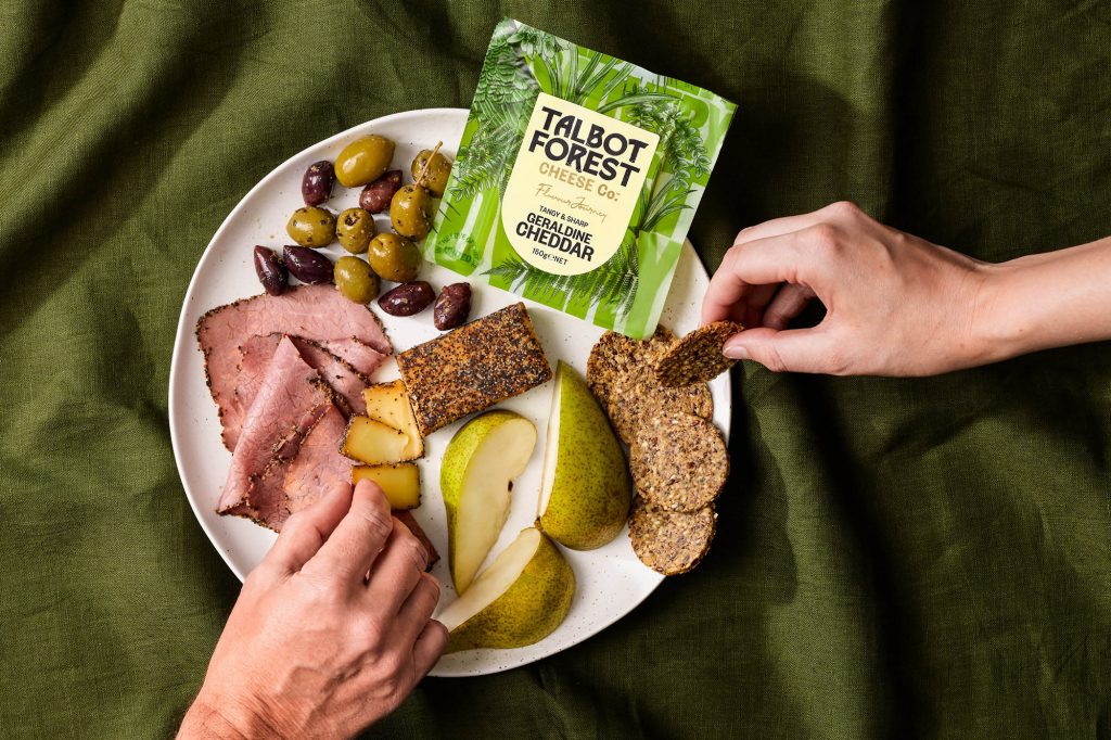
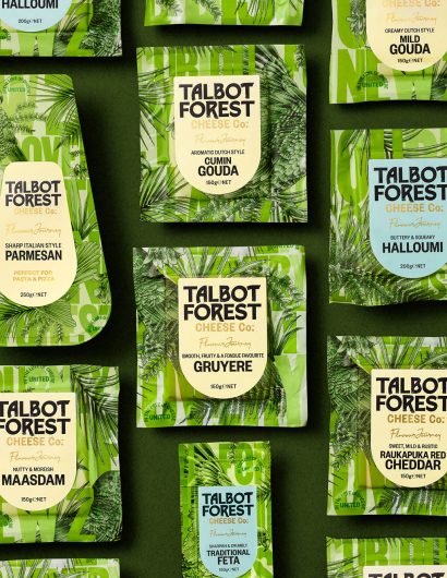
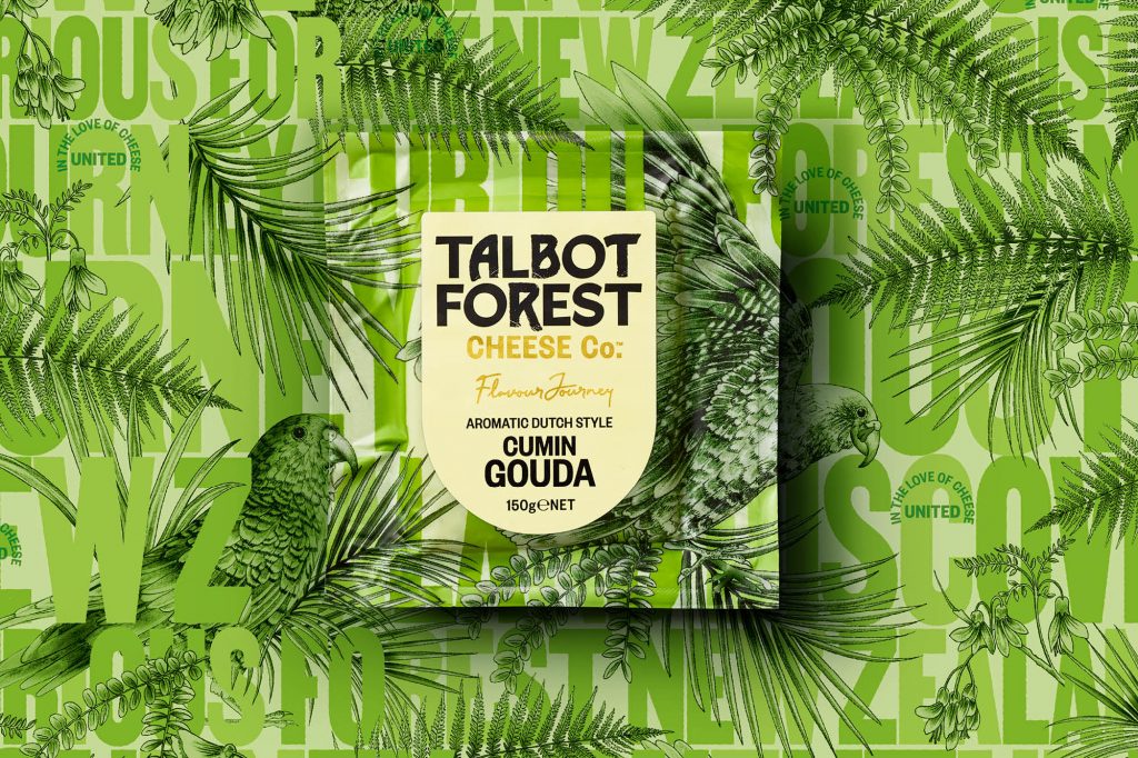
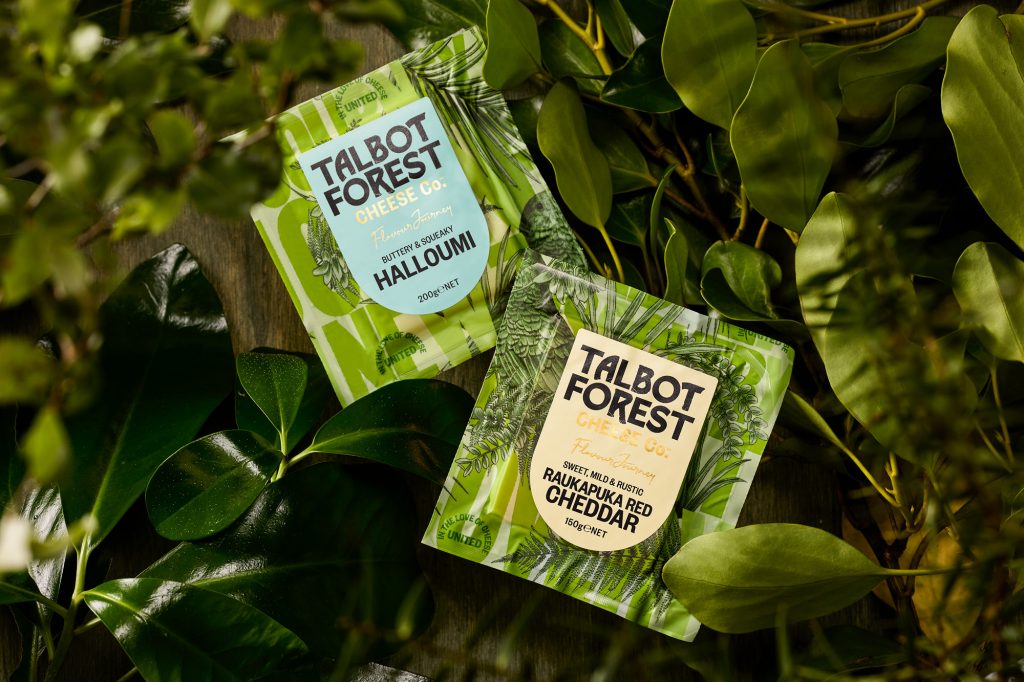
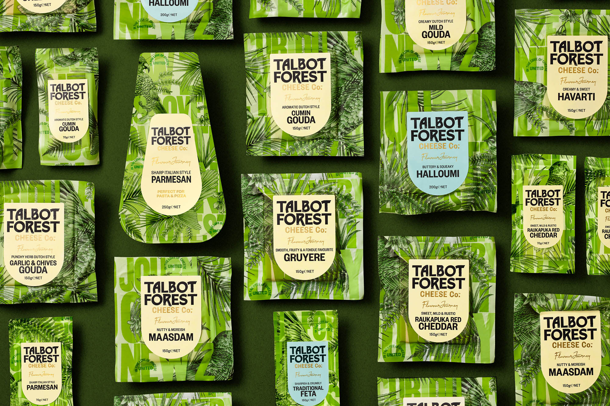
Onfire took the challenge of creating designs that would communicate the unique personality of the brand. The design agency took inspiration from the brand’s forest origins, which allowed them to create designs that depicted the “botanical style local flora, fauna and birdlife illustrations.”

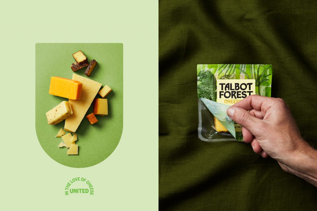
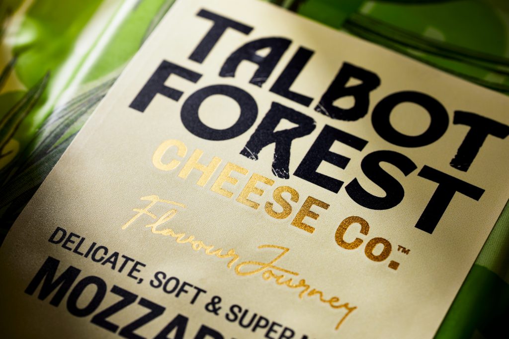
“Inspired by its new motto, ‘United in the love of cheese’, a shield-shaped label is applied with refreshed taste descriptions with a pale color palette to aid product navigation. The result is a brand that sparks curiosity with a distinctive opinion and personality in a category awash with various iterations of the now commoditised craft story.”

Maja, Marketing Manager, Talbot Forest Cheese, mentions:

“Having worked with Onfire Design on several successful packaging design projects I knew the team was well placed to deliver on the challenging brief.  The outcome is a fresh, bold design that embraces the brand’s roots and story but does so with a contemporary vibrant look that sparks curiosity and attention – a real game changer for the brand and for the category!”

Get the latest packaging design inspiration in your inbox:

Popular designs

Creating a Strong Brand Identity: The Journey of Living Things Packaging Design

“Developing Living Things packaging involved multiple design stages, feedback, and refinement. With extensive market research, collaboration with brand strategist Jose Debate and design agency Studio Nari, we created a strong, recognizable brand identity appealing to health-conscious, trend-setting millennials and Gen Z.”

Designed by: PepsiCo Design & Innovation
Country: United States

Talbot Forest Cheese Packaging Design

onfire-design-talbot-forest-cheese-packaging-design-5

Designed by: Onfire | Country: New Zealand

Established in 2000, Talbot Forest Cheese has now become a household name for “high-quality specialty cheese.” Named after Talbot Forest on the South Island of New Zealand, the brand was destined to disrupt the cheese market; however, lack of attention did not allow the company to go past its current status.

“…a lack of attention to the brand and packaging has resulted in a ‘manufacturer’ brand rather than the disruptive iconic Kiwi brand it should be. We were tasked with its recreation and challenged to bring to life its story, quirky personality and unique perspective in cheese making.”
Talbot Forest Cheese Packaging Design

The packaging

Onfire took the challenge of creating designs that would communicate the unique personality of the brand. The design agency took inspiration from the brand’s forest origins, which allowed them to create designs that depicted the “botanical style local flora, fauna and birdlife illustrations.”

“Inspired by its new motto, ‘United in the love of cheese’, a shield-shaped label is applied with refreshed taste descriptions with a pale color palette to aid product navigation. The result is a brand that sparks curiosity with a distinctive opinion and personality in a category awash with various iterations of the now commoditised craft story.”

Maja, Marketing Manager, Talbot Forest Cheese, mentions:

“Having worked with Onfire Design on several successful packaging design projects I knew the team was well placed to deliver on the challenging brief.  The outcome is a fresh, bold design that embraces the brand’s roots and story but does so with a contemporary vibrant look that sparks curiosity and attention – a real game changer for the brand and for the category!”

Previous slide
Next slide
Get the latest on packaging design in your inbox: