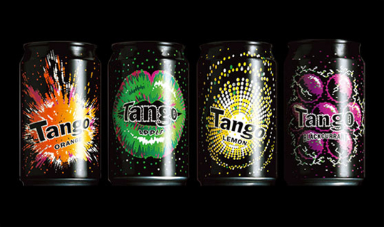
Designed by Brandhouse | Country: United Kingdom | Font used: a modified Franklin Gothic.
“Transforming a chip-shop brand into a hero brand – and making 14 year-old boys feel like 18-year olds – by telling a story about ‘rebellion’.”


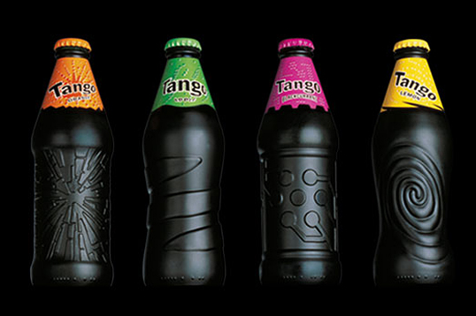
Designed by Brandhouse | Country: United Kingdom | Font used: a modified Franklin Gothic.
“Transforming a chip-shop brand into a hero brand – and making 14 year-old boys feel like 18-year olds – by telling a story about ‘rebellion’.”


Get the latest packaging design inspiration in your inbox:
Designed by: PepsiCo Design & Innovation
Country: United States
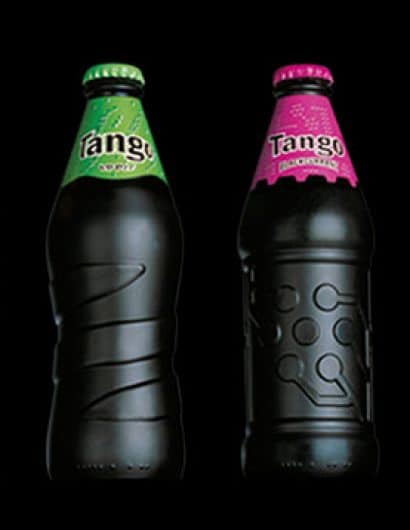

Designed by Brandhouse | Country: United Kingdom | Font used: a modified Franklin Gothic.
“Transforming a chip-shop brand into a hero brand – and making 14 year-old boys feel like 18-year olds – by telling a story about ‘rebellion’.”
