Designed by: PepsiCo Design & Innovation
Country: United States

Tatratea

1

Tatratea

Designed by Pergamen | Country: Slovakia

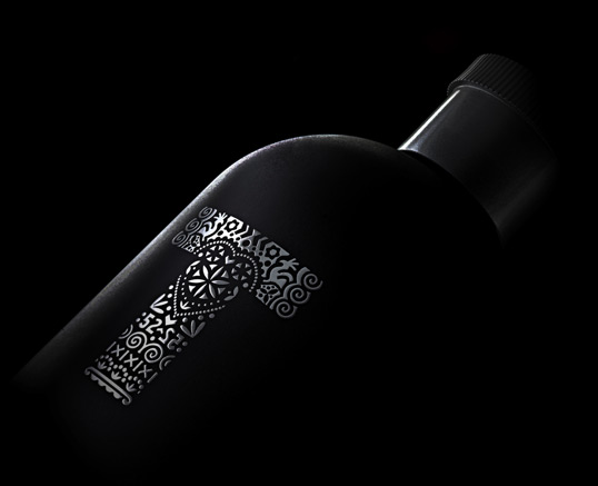
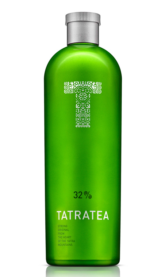
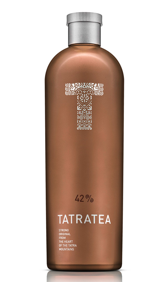
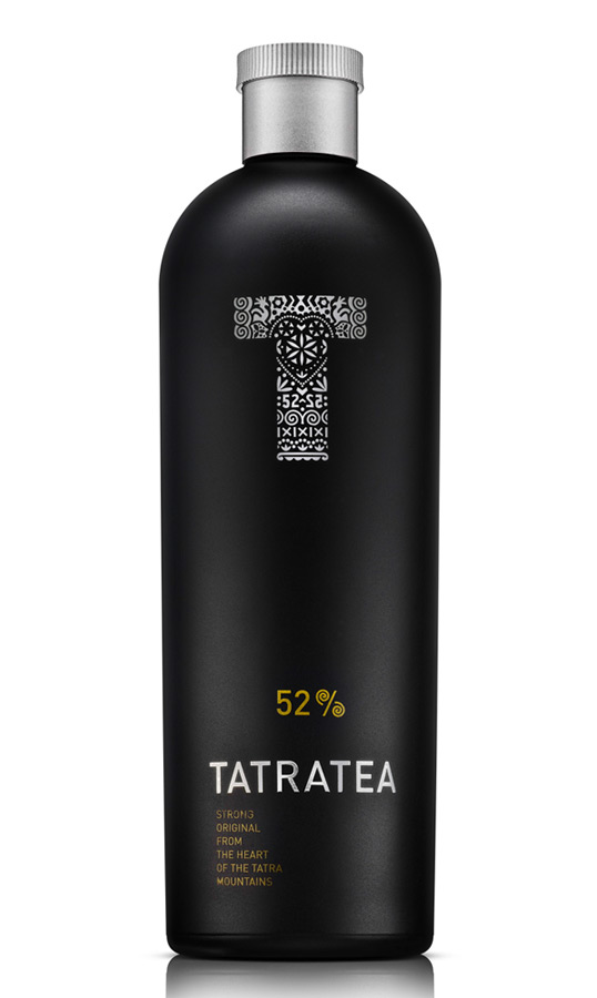
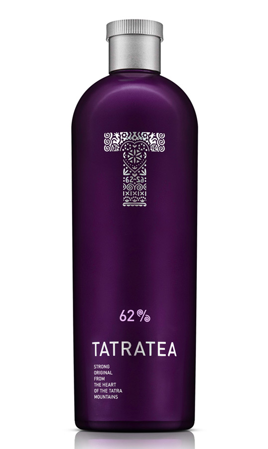
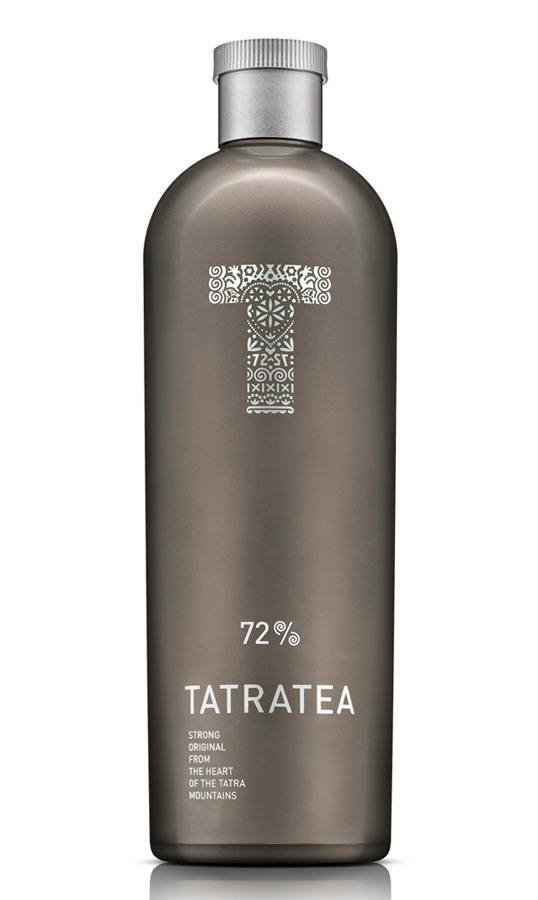
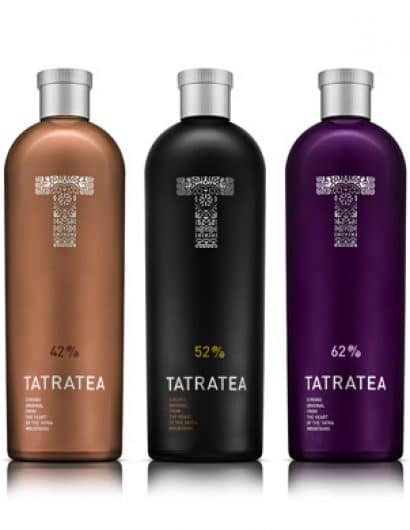
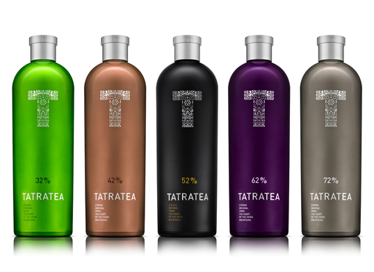
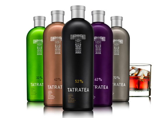
“In 2009 Karloff, a premium Slovak producer and distributor of spirits and wines decided to change the design of a popular Tatratea. Design studio Pergamen created a new bottle, symbol and design for this strong Slovak spirit. Inspiration for the shape of the bottle was a therm flask used in Tatra Mountains resorts. Easily identified silhouette with no bottle neck is accompanied by a symbol “T” that is inspired by traditional wood-carving and jewel-making. The initial contains solar symbols for the circle of life, symbols of love, happiness, fertility etc. Simple (but distinct) colour scale helps to identify particular kinds of Tatratea according to the volume of alcohol. A limet-green glass of Tatratea 32 underlines its citrus flavour. A gentle peach tint of Tatratea 42 respects the presence of a white tea. The legendary 52 with extracts of black tea occupies the black bottle. Forest fruits in Tatratea 62 are softened by a glass with forest fruits colour. The strongest Tatratea 72 has a titan metallic look. The aim of re-design of Tatratea was to accent the brand essence: “Strong original from the heart of Tatra Mountains”.

Tatratea

Tatratea

Tatratea

Tatratea

Tatratea

Tatratea

Tatratea

1

Get the latest packaging design inspiration in your inbox:

Popular designs

Far Out Bar

Description: Far Out Bar is a cutting-edge packaging design project created for High Life Farms’ macrodose THC chocolate bars. This project involved

Pure Persian Honey

When we look closely at honey packaging, they are almost all in the usual format, and the ultimate in creativity is that

The Port Vodka Lemon Water

Overview: In response to my client’s vision for a Cape Cod themed beverage brand, I embarked on the journey to create The Port

Over the wave

This Kombucha originates in Lombok, Indonesia, where its paradise beaches attract hundreds of surfers eager to ride the waves. When you surf,

Designed by: PepsiCo Design & Innovation
Country: United States

Tatratea

1
tatratea1

Tatratea

Designed by Pergamen | Country: Slovakia

“In 2009 Karloff, a premium Slovak producer and distributor of spirits and wines decided to change the design of a popular Tatratea. Design studio Pergamen created a new bottle, symbol and design for this strong Slovak spirit. Inspiration for the shape of the bottle was a therm flask used in Tatra Mountains resorts. Easily identified silhouette with no bottle neck is accompanied by a symbol “T” that is inspired by traditional wood-carving and jewel-making. The initial contains solar symbols for the circle of life, symbols of love, happiness, fertility etc. Simple (but distinct) colour scale helps to identify particular kinds of Tatratea according to the volume of alcohol. A limet-green glass of Tatratea 32 underlines its citrus flavour. A gentle peach tint of Tatratea 42 respects the presence of a white tea. The legendary 52 with extracts of black tea occupies the black bottle. Forest fruits in Tatratea 62 are softened by a glass with forest fruits colour. The strongest Tatratea 72 has a titan metallic look. The aim of re-design of Tatratea was to accent the brand essence: “Strong original from the heart of Tatra Mountains”.
Tatratea

Tatratea

Tatratea

Tatratea

Tatratea

Tatratea

Tatratea

1
Previous slide
Next slide

Explore more great package design

Get the latest on packaging design in your inbox: