Designed by: PepsiCo Design & Innovation
Country: United States

TCHO SeriousMilk & Purenotes

TCHO SeriousMilk & Purenotes

Designed by Edenspikermann | Country: Germany

“How do you attract the attention of milk chocolate lovers without abandoning your dark chocolate roots? By relying on the design values practiced for four years and injecting them with a bold visual direction.

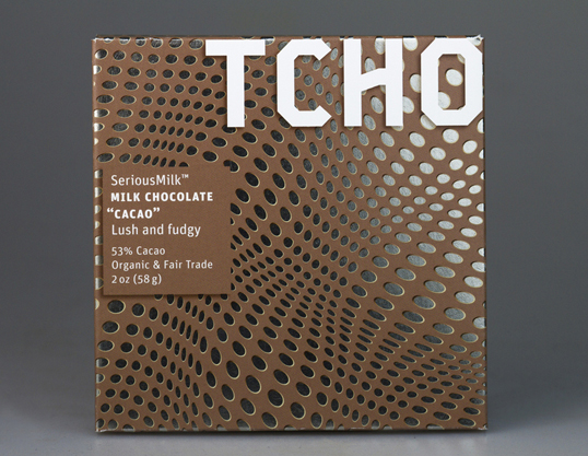
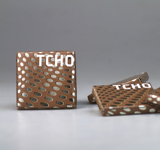
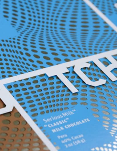
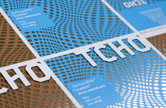
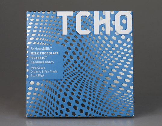
Our design for SeriousMilk is hypnotic, drawing one into the rolling optics that say creamy, smooth, you have to try me, I’m different. The illusion appears to move and flow because of the precise mathematically based composition. These “tessellations” fill the visual plane leaving the viewer wanting to move around the box edges looking for more.”

TCHO SeriousMilk & Purenotes

TCHO SeriousMilk & Purenotes

TCHO SeriousMilk & Purenotes

TCHO SeriousMilk & Purenotes

TCHO SeriousMilk & Purenotes

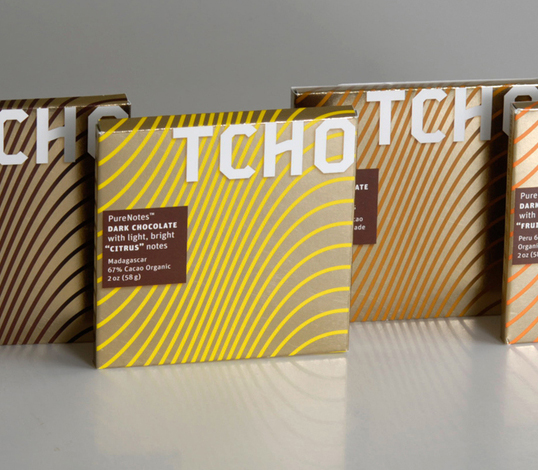
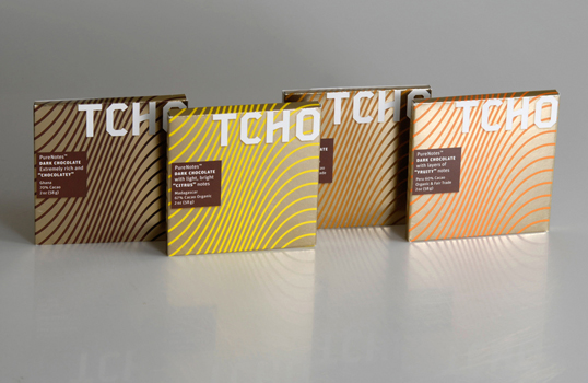
“The design for PureNotes takes the guilloche patterns of our original dark bars and enlarges and simplifies them to create a stronger line look and helps to clarify the dark chocolate flavor story along with a stronger connection to the newly introduced milk line.”

Get the latest packaging design inspiration in your inbox:

Popular designs

Inverey: A Unique Barrel-Aged Scottish Gin Packaging Design

Inverey stands out with its image that captures the essence of the rugged Highland countryside. Breaking away from the norm, the label design does not feature the traditional tartan. Instead, it presents an organised structure of intertwining circles, rhombuses, four-pointed stars and dots born out of their intersection.

Designed by: PepsiCo Design & Innovation
Country: United States

TCHO SeriousMilk & Purenotes

lovely-package-tcho1

TCHO SeriousMilk & Purenotes

Designed by Edenspikermann | Country: Germany

“How do you attract the attention of milk chocolate lovers without abandoning your dark chocolate roots? By relying on the design values practiced for four years and injecting them with a bold visual direction.

Our design for SeriousMilk is hypnotic, drawing one into the rolling optics that say creamy, smooth, you have to try me, I’m different. The illusion appears to move and flow because of the precise mathematically based composition. These “tessellations” fill the visual plane leaving the viewer wanting to move around the box edges looking for more.”

TCHO SeriousMilk & Purenotes

TCHO SeriousMilk & Purenotes

TCHO SeriousMilk & Purenotes

TCHO SeriousMilk & Purenotes

TCHO SeriousMilk & Purenotes

“The design for PureNotes takes the guilloche patterns of our original dark bars and enlarges and simplifies them to create a stronger line look and helps to clarify the dark chocolate flavor story along with a stronger connection to the newly introduced milk line.”
Previous slide
Next slide
Get the latest on packaging design in your inbox: