Designed by: PepsiCo Design & Innovation
Country: United States

Tesco Cream

Tesco Cream

Designed by R Design | Country: United Kingdom

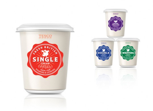
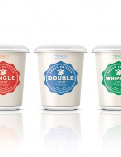
“The brief was to redesign Tesco’s range of fresh cream that covered over 30 lines. The existing design focused on serving suggestions. Whilst inspirational, this made the range very difficult to shop the specific cream type. 

The idea behind the new design was to create a quality seal that takes cues from old fashioned dairy cream pots. Bold typography is used to highlight the cream type, this is supported by strong colour coding of the seal that follows sector language. This strong simple idea was able to adapt across the various pot sizes and lids. The design also worked well when applied across range extensions such as Soured Cream and Crème Fraiche. The new design achieves a consistent look across the range, a strong shelf presence and succeeds in making the range much easier to shop.”

Tesco Cream

Get the latest packaging design inspiration in your inbox:

Popular designs

Unique Whisky Packaging Design Celebrates 40-Year Legacy

Stckmn crafted ‘The Only Drop,’ a unique whisky packaging celebrating liquid and cask unity. Featuring handcrafted paper pulp sculptures and transparent bottle designs, the project fetched £18,750 at auction, aiding Scottish youth.

Designed by: PepsiCo Design & Innovation
Country: United States

Tesco Cream

lovely-package-tesco-cream1

Tesco Cream

Designed by R Design | Country: United Kingdom

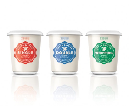
“The brief was to redesign Tesco’s range of fresh cream that covered over 30 lines. The existing design focused on serving suggestions. Whilst inspirational, this made the range very difficult to shop the specific cream type. 

The idea behind the new design was to create a quality seal that takes cues from old fashioned dairy cream pots. Bold typography is used to highlight the cream type, this is supported by strong colour coding of the seal that follows sector language. This strong simple idea was able to adapt across the various pot sizes and lids. The design also worked well when applied across range extensions such as Soured Cream and Crème Fraiche. The new design achieves a consistent look across the range, a strong shelf presence and succeeds in making the range much easier to shop.”
Tesco Cream

Previous slide
Next slide
Get the latest on packaging design in your inbox: