Designed by P&W | Country: United Kingdom
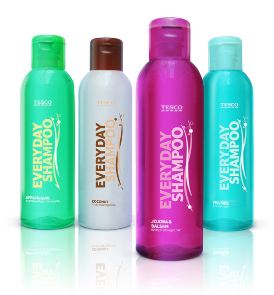
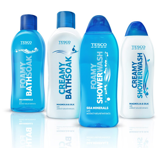
“International Design Consultancy P&W has redesigned the packaging for Tesco’s health and beauty essentials range. The range, comprising of items such as shampoo, bath soak, shower wash is entry price point but needed to convey added value and quality. The design solution had to be unisex in some areas and have the potential to extend beyond heath and beauty.
Bold use of typography and benefit tone of voice with simple graphics make for a strong identifiable range. The result is a distinctive solution that has plenty of brand stretch for future categories.
Working within commercial restrictions we challenged the physical shapes where possible and specified finishes for componentry, for example color coded actuators or detailing grips on the shower gel. Clear bottles and crystal clear labels also help elevate the whole tier for more added value,
Men’s has a technical linear feel and strong masculine blue which unites the range with vibrant accent colors for easy decoding. For women soft ribbons give a reassuring caring feel, a feminine palette with silver keylines and icons subtly link the overall range.
“The design treatment required for this range needed to be bold and identifiable yet remain flexible as it spans many products in different categories. The design conveys each product’s function with a simple yet stylish execution. We turned a disparate range into an elegant solution and we maintained the design integrity and consistency all the way through to the production stage.”


