Designed R Design | Country: United Kingdom
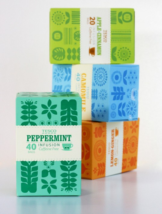
“R Design was briefed to redesign and realign Tesco’s standard fruit and herbal tea range.
In a growing and evolving market, messages and product benefits were often being confused and overlooked by busy consumers.
Our creative direction was to strip back all the graphic confusion and clearly and simply to communicate the product, variety and benefits.”

“We decided to do this by creating a unique contemporary illustrative approach and colours that convey the product flavour. Because it is a very graphically busy fixture it was also important to achieve a strong on shelve standout in a strong and confidant manner.
The new design creates a modern and contempory theme that is more intune with both the market and the consumer.”