Designed by Studio Lost & Found | Country: Australia
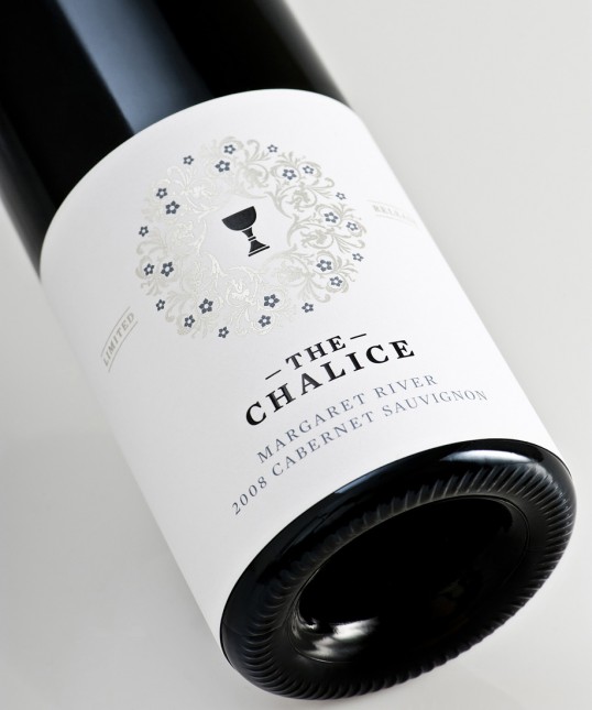
“The Chalice wine labels were designed for Margaret River producer Chalice Bridge Estate.
The Chalice is an icon range of prestige and perfection. These limited release wines represent the Holy Grail of winemaking, and incorporate select parcels of the finest fruit from the Chalice Bridge single vineyard estate in Southern Margaret River. The wine is barrel-fermented and left for fourteen months in new French oak barriques to develop its superior flavours.
The elegance and simplicity of the design reflects the premium positioning of this product.
Printed 4x PMS on Fasson Antarctic White uncoated vellum paper, with matt gold and silver foil, sequential bottle numbering, and a high-build clear silkscreen varnish.
The label printers Supa Stik won Gold in the Offset Roll Fed Label – Wine & Beverage Category at the 2011 Print Industry Craftsmanship Awards WA.”