Designed by: PepsiCo Design & Innovation
Country: United States

The Empanada Kitchen

The Empanada Kitchen

Designed by BARDO | Country: Australia

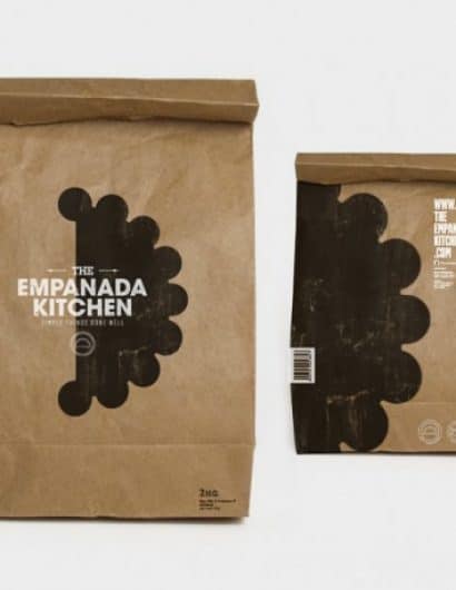
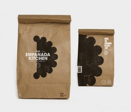
“The Empanada Kitchen is a young gastronomic company dedicated to make empanadas in New Zealand. It recipes combine unique flavors created especially by his owner with a spirit that characterizes it: “Simple things done well”. The identity design reflects the traditional combined with the contemporary, giving the brand values such as honesty, strength and quality, generating a commitment to the product and the customer.

The main objective was to use simple shapes and noble typographies to maintain perdurability over time. At the same time it was thought the inclusion of miscellaneous that helps to symbolize his fresh and young spirit, differentiating itself from the competition”

Get the latest packaging design inspiration in your inbox:

Popular designs

The Port Vodka Lemon Water

Overview: In response to my client’s vision for a Cape Cod themed beverage brand, I embarked on the journey to create The Port

Pure Persian Honey

When we look closely at honey packaging, they are almost all in the usual format, and the ultimate in creativity is that

Far Out Bar

Description: Far Out Bar is a cutting-edge packaging design project created for High Life Farms’ macrodose THC chocolate bars. This project involved

Designed by: PepsiCo Design & Innovation
Country: United States

The Empanada Kitchen

lovely-package-the-empanada-kitchen-1

The Empanada Kitchen

Designed by BARDO | Country: Australia

“The Empanada Kitchen is a young gastronomic company dedicated to make empanadas in New Zealand. It recipes combine unique flavors created especially by his owner with a spirit that characterizes it: “Simple things done well”. The identity design reflects the traditional combined with the contemporary, giving the brand values such as honesty, strength and quality, generating a commitment to the product and the customer.

The main objective was to use simple shapes and noble typographies to maintain perdurability over time. At the same time it was thought the inclusion of miscellaneous that helps to symbolize his fresh and young spirit, differentiating itself from the competition”

Previous slide
Next slide

Explore more great package design

Get the latest on packaging design in your inbox: