Designed by: PepsiCo Design & Innovation
Country: United States

The Gorgeous Spice Company Packaging Design

Designed by: Studio Otherness | Country: Netherlands

The Gorgeous Spice Company is a Canada-based brand that offers “highly versatile spice blends.” The founder saw a serious problem with the business when labeling spices was concerned. He realized that the products were either too arcane or too prescriptive.

The problem with the spice business, as the Gorgeous’ founder saw it, is that its products are either too prescriptive—“this is for chicken”—or too arcane, requiring technical ability that promotes elitism. The ‘Gorgeous’ blends were created to subvert those extremes, combining fresh spices into coherent ‘can’t fail’ flavor profiles all their own. The results are products so versatile that they can literally be used on popcorn, and an accessibility that encourages both experimentation and liberal consumption.

The Gorgeous Spice Company Packaging Design

The packaging

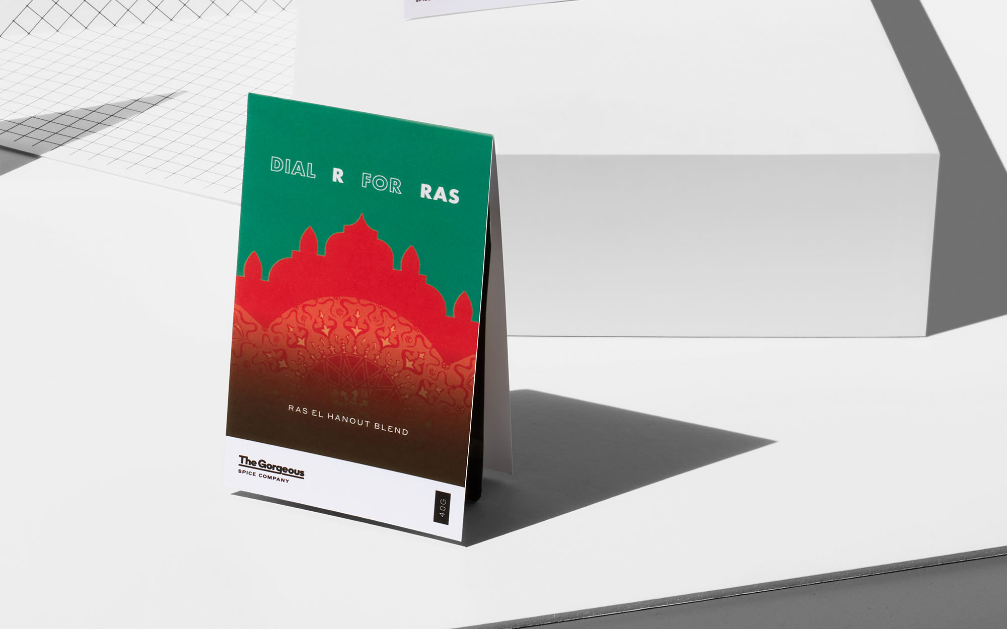
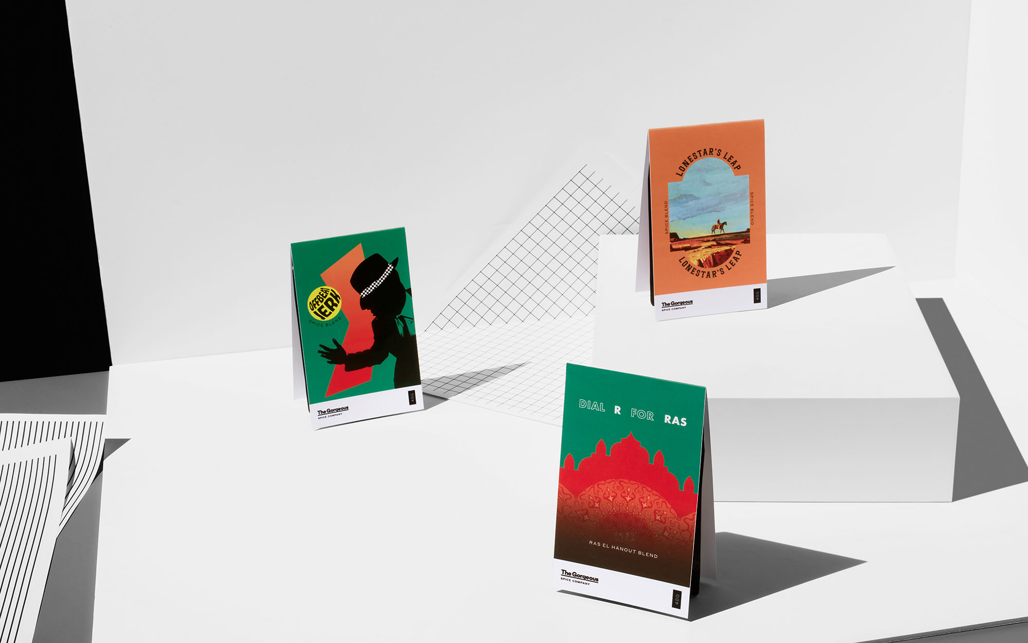
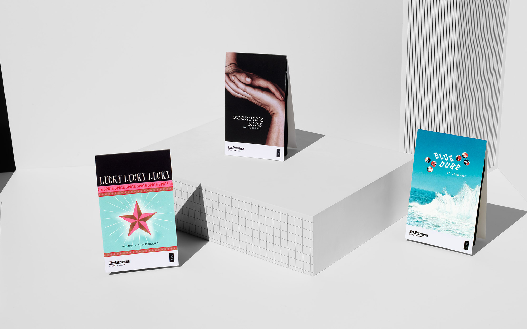
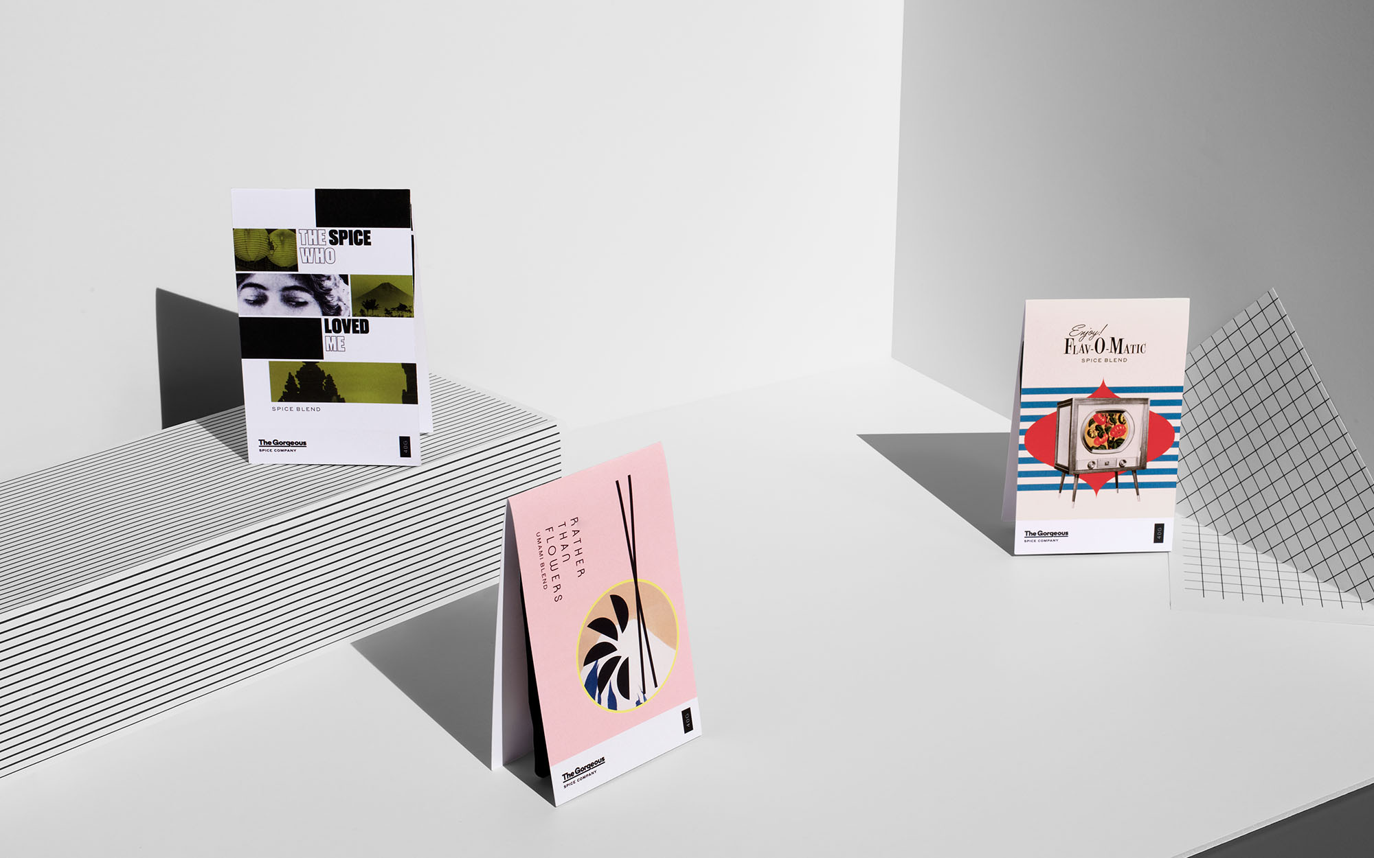
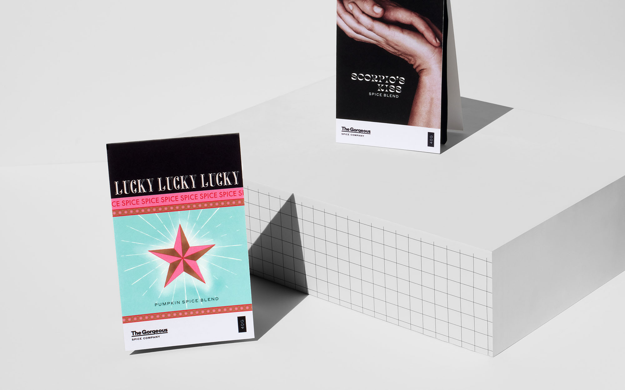
The Gorgeous Spice Company combined its forces with Studio Otherness, a Rotterdam-based design agency, to create packaging illustrations that would provide a solution to this problem. The packaging designs created by the agency focused on dimensionalizing the products.

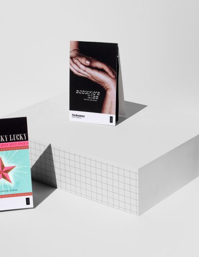
Though sporting completely individualized typography and layouts, subtle design systems across the 12 packages emerge: A focus on leading with typography in the hierarchy, and repetition of core colors such as pink, red, orange and yellow start to show that each spice blend from The Gorgeous comes from the same creator. Finally, inspired by long-standing design and architecture magazines, a consistent masthead (in this case, footer) sports The Gorgeous’ logo and legal information.

The simple “album cover” approach, wrapping the spices and stapling to the black Ziplock pouch, allowed the blends to be shipped in the mail and delivered through mail slots across North America.

Get the latest packaging design inspiration in your inbox:

Popular designs

Pepsi Introduces Limited Edition Peach and Lime Flavors

Pepsi launches its summer BBQ campaign with new limited-edition flavors, Pepsi Lime and Pepsi Peach, designed to complement the festive, smoky essence of outdoor grilling. These vibrant, fruit-inspired designs not only promise a refreshing taste but also stand out with their visually appealing packaging, capturing the essence of summer.

Designed by: PepsiCo Design & Innovation
Country: United States

The Gorgeous Spice Company Packaging Design

Gorgeous 3

Designed by: Studio Otherness | Country: Netherlands

The Gorgeous Spice Company is a Canada-based brand that offers “highly versatile spice blends.” The founder saw a serious problem with the business when labeling spices was concerned. He realized that the products were either too arcane or too prescriptive.

The problem with the spice business, as the Gorgeous’ founder saw it, is that its products are either too prescriptive—“this is for chicken”—or too arcane, requiring technical ability that promotes elitism. The ‘Gorgeous’ blends were created to subvert those extremes, combining fresh spices into coherent ‘can’t fail’ flavor profiles all their own. The results are products so versatile that they can literally be used on popcorn, and an accessibility that encourages both experimentation and liberal consumption.

The Gorgeous Spice Company Packaging Design

The packaging

The Gorgeous Spice Company combined its forces with Studio Otherness, a Rotterdam-based design agency, to create packaging illustrations that would provide a solution to this problem. The packaging designs created by the agency focused on dimensionalizing the products.

Though sporting completely individualized typography and layouts, subtle design systems across the 12 packages emerge: A focus on leading with typography in the hierarchy, and repetition of core colors such as pink, red, orange and yellow start to show that each spice blend from The Gorgeous comes from the same creator. Finally, inspired by long-standing design and architecture magazines, a consistent masthead (in this case, footer) sports The Gorgeous’ logo and legal information.

The simple “album cover” approach, wrapping the spices and stapling to the black Ziplock pouch, allowed the blends to be shipped in the mail and delivered through mail slots across North America.

Previous slide
Next slide
Get the latest on packaging design in your inbox: