Designed by Glasfurd & Walker | Country: Canada
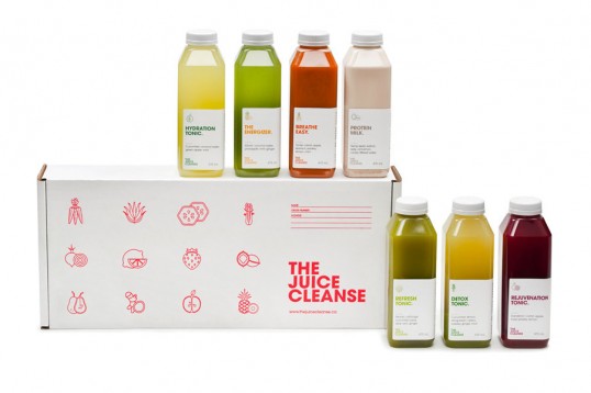
“The Juice Cleanse is The Juice Truck’s latest product to launch in Vancouver BC. The Juice Truck engaged Glasfurd & Walker to work on positioning, naming, identity, packaging, and art direction as an extension of their already successful brand.
The cleanses come in 3, 5 and 7 day durations with a total of 12 packaged juices. Each Juice Cleanse is designed to promote overall health, energy and happiness. The brand is not focussed around a diet or starvation cleanse and were carefully formulated with their nutritionist to achieve maximum results, with flavour and taste being of primary importance. A health conscious and ethical approach to cleansing needed to be communicated in an educational, yet light hearted and friendly way.The brand language is a development and extension of the Juice Truck identity that uses light humour and direct, no-fuss language and iconography to communicate their products offer.
As with many cleanses, there are juices that focus on nutritional benefits over aesthetic appeal, therefore brand imagery was created that highlighted the core ingredients and freshness of the juices with distinct style and colour for promotional and brand material.”