


Designed by: Jacomy Mayne Studio | Country: Russia
Country: Russia
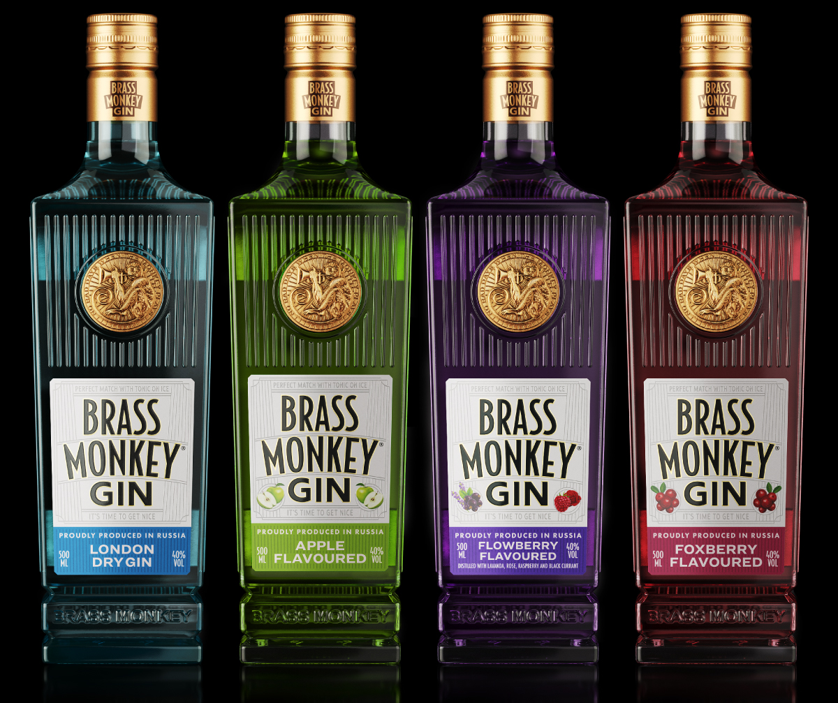
Graphic designers and art students know all about Art Deco. The 1920s and the ‘30s were all about the popular art form. This much sought-after design arrangement is characterized by stylized or geometric forms. Another specialty of these two decades is jazz music. The packaging design of Brass Monkey, a Gin brand from Russia, combines the nostalgia of Art Deco and Jazz.
Jacomy Mayne Studio, a Mendoza-based multiple award-winning branding and packaging boutique studio, created the classy packaging which recreates the nostalgia of the bygone era.
The design studio mentions:
“This special gin made in Russia comes in a custom tailor-made bottle and it honors the art deco of the 20s and 30s. It tells an unfinished story, a story of overcoming and changing attitudes, just like in jazz. It’s all about seeing the glass half-full and putting on some music too. This gin is jazz and believe us, we know about jazz.”


The motivation for the bottle design comes from old containers used in the 20s, and the packaging label is influenced by the fruit-inspired flavors of the Gin.
“In general terms, the label design of all product lines is consistent with the same style, based on art deco and realistic illustrations of the fruits with which the corresponding distillate is made. The design of the bottle was a completely personalized process, where the inspiration came from the old containers of the 20s that used all kinds of textures to give volume to the bottles.”


