Designed by: PepsiCo Design & Innovation
Country: United States

The Pop Shoppe

popshoppe1

Designed by AmoebaCorp | Country: Canada

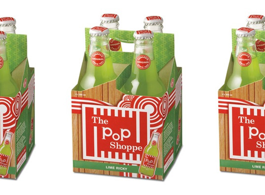
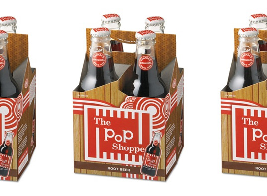
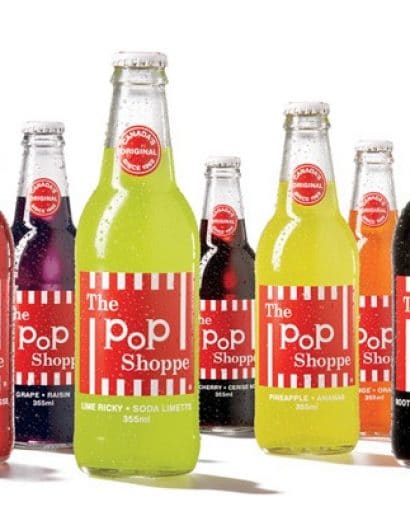
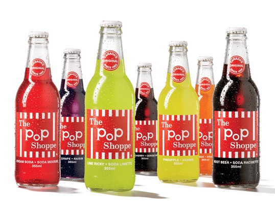
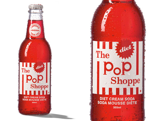
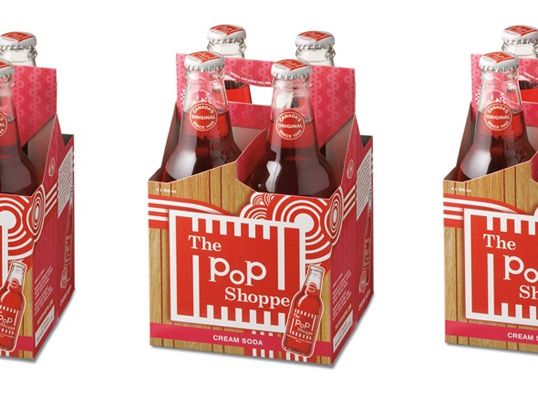
“Imagine you have a new client who wants to relaunch a 1970’s Canadian icon. And not just any Canadian icon: The Pop Shoppe. Who doesn’t remember that bottle? That label? Those crazy colours and flavours.

So what do you do?

We decided to not just rely on our memories so we went into research to see what consumers remembered. And then we leveraged what we learned across the repackaging, the in-store collateral, website and all the other consumer toughpoints we could think of.”
popshoppe2

popshoppe3

popshoppe4

popshoppe5

popshoppe6

Get the latest packaging design inspiration in your inbox:

Popular designs

Inverey: A Unique Barrel-Aged Scottish Gin Packaging Design

Inverey stands out with its image that captures the essence of the rugged Highland countryside. Breaking away from the norm, the label design does not feature the traditional tartan. Instead, it presents an organised structure of intertwining circles, rhombuses, four-pointed stars and dots born out of their intersection.

Designed by: PepsiCo Design & Innovation
Country: United States

The Pop Shoppe

popshoppe1

popshoppe1

Designed by AmoebaCorp | Country: Canada

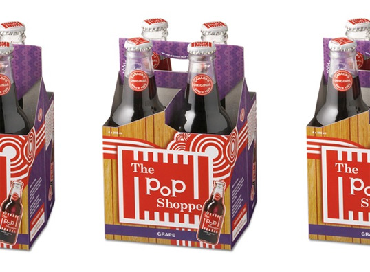
“Imagine you have a new client who wants to relaunch a 1970’s Canadian icon. And not just any Canadian icon: The Pop Shoppe. Who doesn’t remember that bottle? That label? Those crazy colours and flavours.

So what do you do?

We decided to not just rely on our memories so we went into research to see what consumers remembered. And then we leveraged what we learned across the repackaging, the in-store collateral, website and all the other consumer toughpoints we could think of.”
popshoppe2

popshoppe3

popshoppe4

popshoppe5

popshoppe6

Previous slide
Next slide
Get the latest on packaging design in your inbox: