Designed by Be Friendly | Country: Australia
‘This branding and packaging is for a monthly curated wine club The Tasting Bench.
Our goal was to avoid the old wine clichés while expressing clearly what The Tasting Bench is about, to an aesthetically savvy key market.
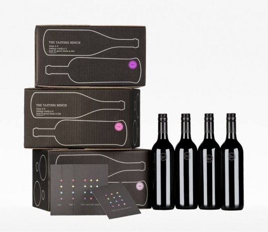
The twelve sequential multicoloured dots represents the monthly wine deliveries and also evoke an image of a dozen boxed wines. The slab serif type creates a visual base, or bench, which forms the basis of the branding and the business.
The packaging utilises a simple outline of a wine bottle to immediately communicate the contents of the box, re-enforcing the ethos that the wine is always most important at The Tasting Bench; not the price and not the amount of gold foil on the label. The ingredients; wine x4, tasting cards x4, love x lots, further communicate the simplicity and honesty of The Tasting Bench philosophy.
The box ingeniously ships four bottles of wine securely, allowing for the fact the each month the four bottles will most likely be completely different shapes.”