Designed by: PepsiCo Design & Innovation
Country: United States

Three Cedars Vodka Packaging Pays Tribute To The Colonial Heritage Of The Hudson Valley

Designed by: Pavement Design | Country: US

Big brands, design agencies, branding gurus, and creative professionals will tell you that we are in the golden age of minimalistic designs. From logos to fashion to interior designs, minimalist designs are here to stay. With that said, you should avoid being influenced by trends. While current fads may look great, your designs will only remain relevant as long as they are trending. The best designs do not follow trends, but focus on communicating their brand personality in the best possible way. The Three Cedars Vodka is a prime example of packaging done right.

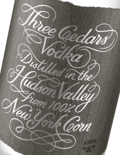
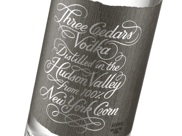
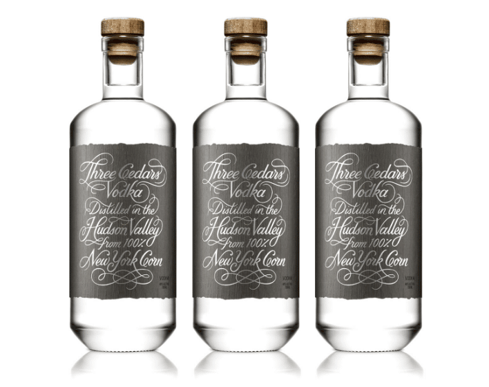
Designed by Pavement, a San Francisco Bay Area-based award-winning design and branding studio, the typography is the centerpiece of the packaging design. The elegant cursive script sits handsomely over a rustic label, making the packaging design alluring. While the design is simple, it is not minimalistic. The packaging design is a fitting tribute to the colonial history of the Hudson Valley.
Three Cedars Vodka Packaging Pays Tribute To The Colonial Heritage Of The Hudson Valley

Pavement mentions the following:

“…Their Three Cedars Vodka is distilled from 100% New York corn sourced from local organic farmers and hand-distilled using only three natural ingredients. To capture this promise, a hand-lettered preamble adorns the package, boldly announcing the quality of the ingredients and region of the distillery’s namesake. The lettering style is influenced by and pays homage to the Colonial history of the Hudson Valley, creating an uncomplicated and sleek look sure to attract today’s discerning craft spirits consumers.”

Get the latest packaging design inspiration in your inbox:

Popular designs

Burma Love Rebrand

Love at First BiteAs an extension of the Burma Superstar restaurant in San Francisco, Burma Love Foods gives diners an opportunity to

Pure Persian Honey

When we look closely at honey packaging, they are almost all in the usual format, and the ultimate in creativity is that

The Bra Guru

Most women are wearing the wrong size bra and that is a fact. The Bra Guru® is the first and only professional

Designed by: PepsiCo Design & Innovation
Country: United States

Three Cedars Vodka Packaging Pays Tribute To The Colonial Heritage Of The Hudson Valley

3 Cedars 3

Designed by: Pavement Design | Country: US

Big brands, design agencies, branding gurus, and creative professionals will tell you that we are in the golden age of minimalistic designs. From logos to fashion to interior designs, minimalist designs are here to stay. With that said, you should avoid being influenced by trends. While current fads may look great, your designs will only remain relevant as long as they are trending. The best designs do not follow trends, but focus on communicating their brand personality in the best possible way. The Three Cedars Vodka is a prime example of packaging done right.

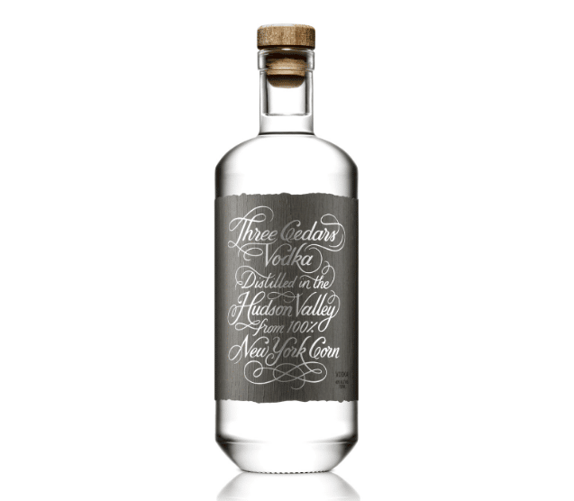
Designed by Pavement, a San Francisco Bay Area-based award-winning design and branding studio, the typography is the centerpiece of the packaging design. The elegant cursive script sits handsomely over a rustic label, making the packaging design alluring. While the design is simple, it is not minimalistic. The packaging design is a fitting tribute to the colonial history of the Hudson Valley.
Three Cedars Vodka Packaging Pays Tribute To The Colonial Heritage Of The Hudson Valley

Pavement mentions the following:

“…Their Three Cedars Vodka is distilled from 100% New York corn sourced from local organic farmers and hand-distilled using only three natural ingredients. To capture this promise, a hand-lettered preamble adorns the package, boldly announcing the quality of the ingredients and region of the distillery’s namesake. The lettering style is influenced by and pays homage to the Colonial history of the Hudson Valley, creating an uncomplicated and sleek look sure to attract today’s discerning craft spirits consumers.”

Previous slide
Next slide

Explore more great package design

Get the latest on packaging design in your inbox: