Designed by Carter Wong | Country: United Kingdom
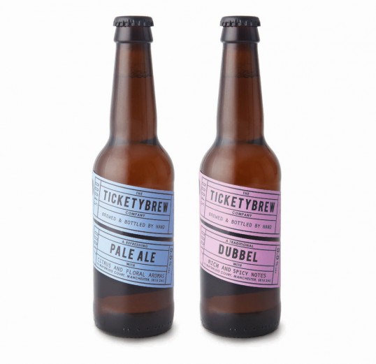
“Briefed by entrepreneurial brewer, Duncan Barton to create the name and packaging for his start up business, Carter Wong set to work trying to discover a memorable name that would then lend itself to a graphic treatment when it came to designing the label.
Beginning initially with just two brews, a Belgian Dubble and a traditional Pale Ale, and in limited numbers it was important that we found a very cost effective way of producing and printing the finished label designs.
All parts of the brief fell into place once we’d decided on the brand name being a take on the word ‘Ticketyboo’, meaning everything is going alright and proceeding quickly, something Duncan’s business was certainly starting to do. Therefore the name ‘Ticketybrew’ was agreed and from then on the design solution virtually solved itself.”
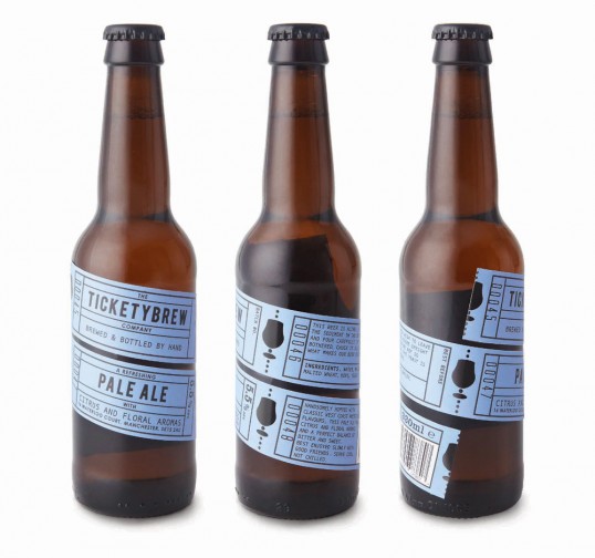
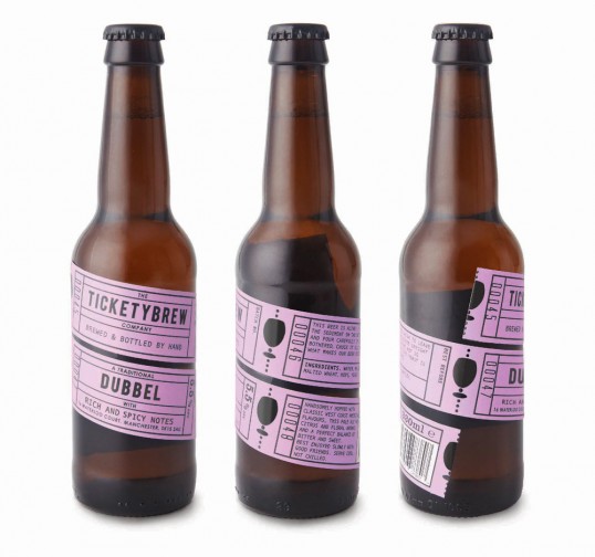
“A run of four one colour tickets, enough for all the copy necessary wraps itself around the bottle with the two tickets showing the most important information strategically placed on the one front facing.
Printed in black on one colour stock an extra visual detail is the appropriate glass shape for each of the two brews integrated into the ticket perforation. Printed as a gloss varnish this gives the impression of being a perforated shape in the label to reveal the bottle underneath.
Suitably quirky, friendly copy completes the whole package.”


