Designed by: PepsiCo Design & Innovation
Country: United States

Tiempo

Tiempo

Designed by Boheem Design | Country: Australia

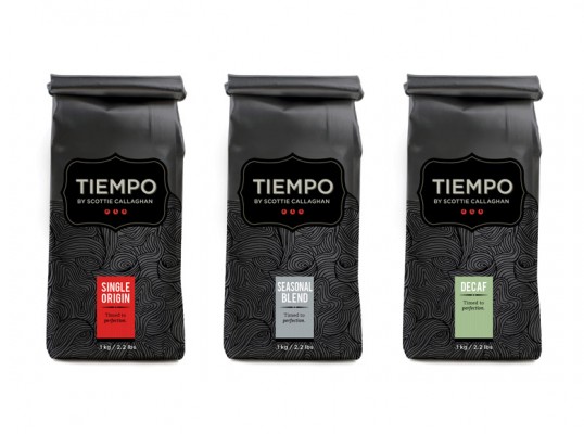
“Tiempo is a coffee brand created by world champion barista Scottie Callaghan, and endorsed by Sydney’s Belaroma Coffee. Mr Callaghan has relationships with coffee farmers all over the world, and is very selective each season about the beans he buys. The focus is on cup quality and achieving the best taste possible. ‘Tiempo’ is Spanish for time, and the superiority of the Tiempo flavour is a result of perfect timing: when picking, when processing, when shipping, and when roasting.

The Tiempo packaging was developed with reference to the hand-drawn and hand-made. The packaging encompasses some nostalgic type treatment and combines that with detailed illustrative line work. By using a spot varnish it combines rustic, uncoated finishes with smooth, polished textures. The result is a personalised and unique design which expresses warmth and quiet, confident sophistication.”

Get the latest packaging design inspiration in your inbox:

Popular designs

Over the wave

This Kombucha originates in Lombok, Indonesia, where its paradise beaches attract hundreds of surfers eager to ride the waves. When you surf,

The Port Vodka Lemon Water

Overview: In response to my client’s vision for a Cape Cod themed beverage brand, I embarked on the journey to create The Port

Burma Love Rebrand

Love at First BiteAs an extension of the Burma Superstar restaurant in San Francisco, Burma Love Foods gives diners an opportunity to

Designed by: PepsiCo Design & Innovation
Country: United States

Tiempo

lovely-package-tiempo1

Tiempo

Designed by Boheem Design | Country: Australia

“Tiempo is a coffee brand created by world champion barista Scottie Callaghan, and endorsed by Sydney’s Belaroma Coffee. Mr Callaghan has relationships with coffee farmers all over the world, and is very selective each season about the beans he buys. The focus is on cup quality and achieving the best taste possible. ‘Tiempo’ is Spanish for time, and the superiority of the Tiempo flavour is a result of perfect timing: when picking, when processing, when shipping, and when roasting.

The Tiempo packaging was developed with reference to the hand-drawn and hand-made. The packaging encompasses some nostalgic type treatment and combines that with detailed illustrative line work. By using a spot varnish it combines rustic, uncoated finishes with smooth, polished textures. The result is a personalised and unique design which expresses warmth and quiet, confident sophistication.”

Explore more great package design

Get the latest on packaging design in your inbox: